- Home
- :
- All Communities
- :
- Products
- :
- ArcGIS Experience Builder
- :
- ArcGIS Experience Builder Documents
- :
- What's New in this Beta Release
- Subscribe to RSS Feed
- Mark as New
- Mark as Read
- Bookmark
- Subscribe
- Printer Friendly Page
What's New in this Beta Release
What's New in this Beta Release
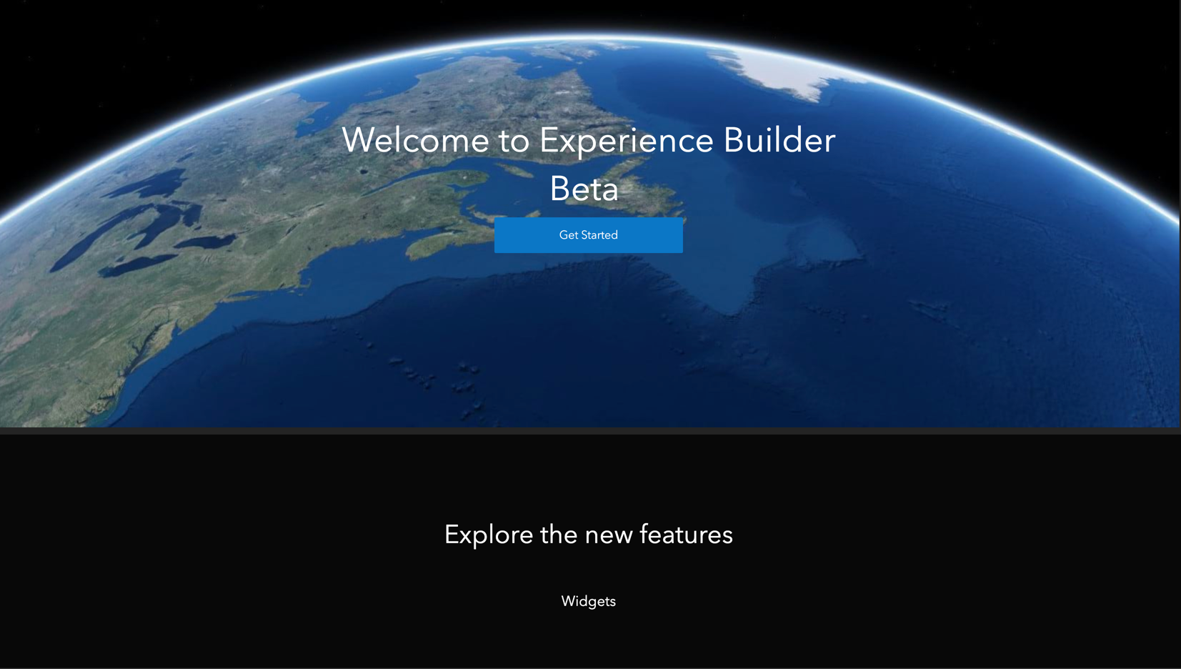
Over the last three months since the release of our first beta of Experience Builder (ExB), you have provided us with valuable feedback regarding features, workflows, and UI/UX enhancements. We would like to say thank you. We appreciate you taking the time and effort to thoroughly test ExB and to help us identify areas for improvement so that we can deliver the best user experience. Now, with that being said, let’s get into the current state of ExB. This is our second beta release and we are still planning on releasing version 1.0 in January 2020. We are really excited to share with you some of the newest features and improvements we have been working on.
Templates
We have added several new out-of-the-box map-centric templates to address your most common workflows. These include the following:
- Foldable
- Launchpad
- JewelryBox
- Billboard
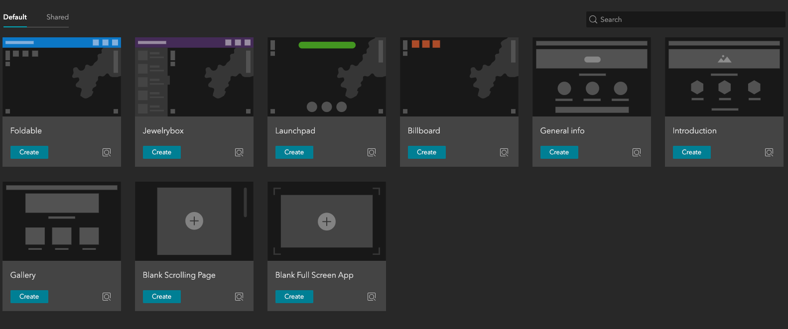
To configure these templates, you select a map, add your widgets to the controller widget (more details on this new widget below), configure your widgets, save your experience, and select publish. The great thing about ExB is that it provides you with full control to change the layout and design of any template that we publish. We have added a new Lock layout feature that unlocks these templates for those who require more advanced customization.
We have introduced a new concept called "Block". A block represents a row in a scrolling page. We have created new templates (General info, Introduction, and Gallery) that utilize this concept and also to help you create web pages quickly.
You will find additional templates shared with you via your organization or through a group on the shared tab.
Theme
The customization of themes is now possible directly in Experience Builder. Each theme has its default colors with the ability to change the color palette and options to change the color mode. You can also define the colors for the header, body, and footer elements and set the font selection and size.
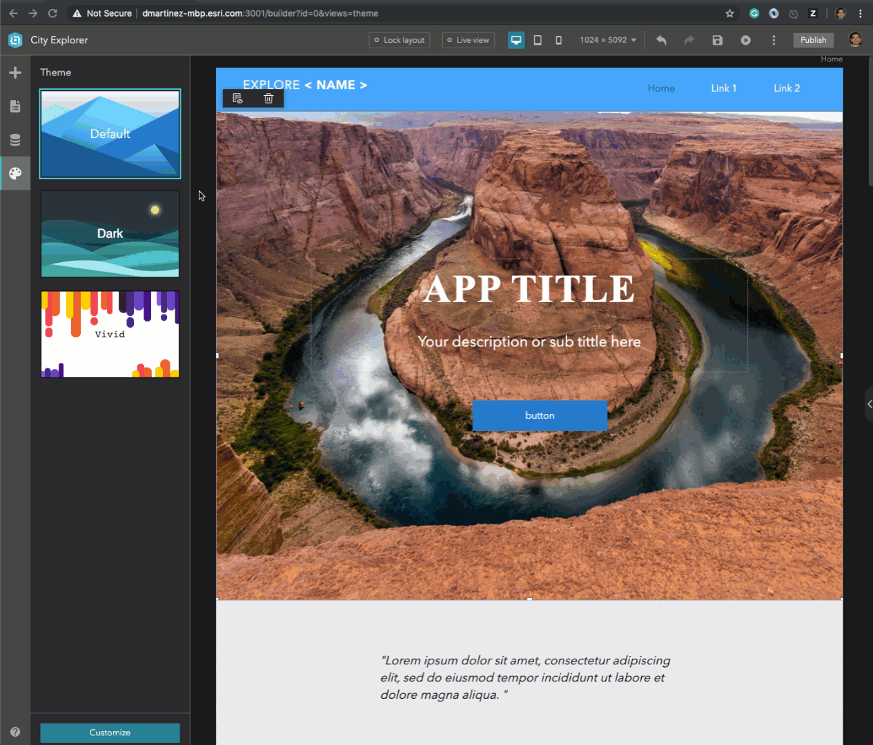
Builder UI
We have simplified the user interface by moving more options into the top toolbar to allow a more consistent flow of actions when you need to see your experience in live view, in multiple layouts, preview, publish, etc. In addition, we have done a major overhaul on the design of ExB with new icons, new sidebar nav, and improved other areas that we believe will provide a better user experience.
Page
A page is a document that is the foundation for the layout, and we have added more template pages for you to choose from when adding a new page.
Widgets
Widgets are the building blocks of your apps, and we have added several new widgets and enhanced the majority of all the widgets from the beta 1 release. Here are a few of the widget updates/additions:
New Widgets
- Map Layers – provides a list of operational layers, their symbols and it provides two options for configurations. The first option is the ability to show layers from a data source that does not require a map. The second option allows you to enable actions to interact with a map including zoom to, adjust layer transparency, and view layer details.
- Feature Info – displays the popup content defined in the feature layer. If no popup content is defined for the feature layer, it will return all the attributes from the feature layer by default. The widget is independent of the map and displays information about a feature without the use of a popup.
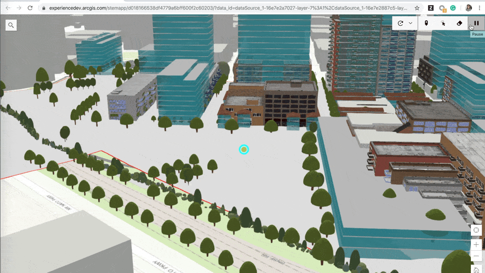
- Fly Controller – allows you to draw a point or select an existing point feature from a map with 3D data (scene) to rotate around. You can also draw a path or select an existing line to fly along.
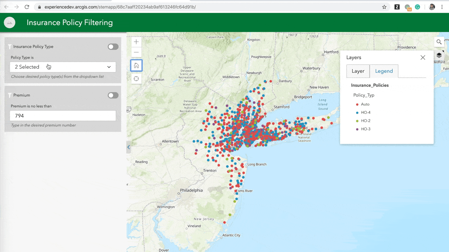
- Filter – allows you to filter data in feature layers. It will only return the features that meet the expression criteria.
- Share – provides you with the ability to share an app by posting it to your social media account, sending an email with a link, or embedding it in a website or blog.
- Legend – displays labels and symbols for layers in the map. There are options to select a card style for the legend.
- Widget Controller – provides you with a container to organize your widgets. You can change the direction of how you would like your widgets to appear in the controller either horizontal or vertical. There are also settings for you to control how many widgets can be opened on the map and how you would like those widgets to display either stacked or side by side.
- Placeholder – designed for templates that you may create for your users as a widget placeholder.
- Sidebar – enables you to easily compare the content of different layers or datasets. It includes options to create horizontal and vertical modes to allow users to view collections of information simultaneously.
Updates to Existing Widgets
- Map – The map widget now includes the following new tools:
- Layers – displays a list of layers and a legend.
- BaseMap – allows you to select basemaps from ArcGIS.com.
- Measure – provides multiple measurement tools for all types of layers.
- FullScreen – presents the experience view using the entire screen.
- There are new Layout options to change the position of the tools on the map. There is also a new option to disable pop-ups on the map. This feature is very useful when you're working with the Feature Info widget.
- List – new templates were added to provide you with more options for card designs. We have also added new tool options to configure fields for search as well as added the ability to include sorting fields for your list. A highly requested feature that we have implemented includes the ability to set filters on your data.
- Survey – has included the ability to interact with a map and send data to a survey when a feature is selected in the layer.
- Image – we have added more shapes to change the outline appearance of your image.
- Text – you can now enable dynamic links by creating a hyperlink for an attribute in your feature layer that contains a URL.
- Button – we have completely redesigned how you style buttons with quick styles. This presents you with multiple button designs directly on the canvas.
- Menu – types have been introduced to allow you to select the type of menu that best suits your experience. One of the most requested types from beta 1 was the ability to have a hamburger menu. Happy to announce, the hamburger has arrived! Via the icon type (unfortunately, fries not included). You can keep the default icon, select one from ExB or upload your own custom icon. States have been added for regular, selected, and hover to provide users with visual representations on the status of a UI element.
- View Navigation (formerly Navigator) – we have also added states for regular, selected, and hover.
As always, we appreciate your feedback.
Hi David,
I can't find the Experience Builder Dev Edition Beta 2 on Early Adopter ressources.
Gaëtan Lavenu
Esri France
The sample San Diego app gives a 404 error.
Fetch error: 404 Not Found Instantiating https://experience.arcgis.com/stemapp/../widgets/common/list/dist/runtime/actions/query-action.js Loading widgets/common/list/dist/runtime/actions/query-action
I get the same on an experience I put together earlier, can an experience created in the first version be upgraded to this new release?
Thanks.
.png "DavidMartinez")
Hi Ryan,
Unfortunately, any experiences created with the previous beta will be broken due to a lot of changes we made underneath the hood. Basically, any experience created from beta 1 will need to be created in the beta 2 release. Please let me know if you have more questions. This is something we will address in the FAQ.
Thanks,
David
Hi Gaetan,
It will be up there today.
Thanks,
David
Ryan,
The example app has been updated with the latest url on the product page. I forgot to update it on the release blog. Now it is updated.
The example app on the product page
Hi,
I have created my own app with the Experience Builder and I also have the Fetch error: 404 Instantiating https://experience.arcgis.com/stemapp/../widgets/common/list/dist/runtime/actions/query-action.js Loading widgets/common/list/dist/runtime/actions/query-action
So before I start this work all over again, I wanted to be sure there is nothing I can do to get back my work.
Thank you.
Hi Sarah,
Was this an app you created in the previous version? If so, please check out this post: https://community.esri.com/thread/245633-how-to-access-online-apps-created-with-arcgis-experience-bu...
If you have any questions please feel free to reach out to us.
Thanks,
David
Hi ArcGIS Experience Builder Beta team,
Is the release of V1 of Experience Builder still planned for January?
Thanks,
Amanda
Jianxia Song, thank you for the update!
Since I have lost the app I had made with the Beta 1 after the last update, I had to start again my project in the new beta version of Experience Builder. I am therefore wondering if my work done will still be available after the official release?
Thank you!
Jianxia Song just a few more quick questions. Will Enterprise Logins (The Benefits of using Enterprise Logins for ArcGIS Online ) for Portal data be supported in this first release? Will arcade web map visualizations be supported? We have a flagship WAB app that we would like to rebuild in Experience builder but these are the current limitations.
Thanks,
Amanda Huber
Sorry for the delay Amanda. The first release of Experience Builder online edition will support Enterprise logins. As far as Arcade is concerned, only the popup on the map supports it.
Hello Jianxia Song,
is the date of the first release of Experience Builder available now? Can you confirm the mid of February 2020 as the expected date?
Thanks,
Cyril