- Home
- :
- All Communities
- :
- Products
- :
- ArcGIS Dashboards
- :
- ArcGIS Dashboards Questions
- :
- Two line graphs on operation dashboard
- Subscribe to RSS Feed
- Mark Topic as New
- Mark Topic as Read
- Float this Topic for Current User
- Bookmark
- Subscribe
- Mute
- Printer Friendly Page
Two line graphs on operation dashboard
- Mark as New
- Bookmark
- Subscribe
- Mute
- Subscribe to RSS Feed
- Permalink
Hi there,
I have got data of crime data along with the date column. Now I want to display two lines graph in such a way that one line graph shows the current year average crime data (on monthly basis) and other line graph shows the average crime rate of the last 5 years (on monthly basis). I tried to use the serial chart to achieve the desired output, but no luck. Could anyone please guide me on how to generate these line graphs on the operation dashboard?
- Mark as New
- Bookmark
- Subscribe
- Mute
- Subscribe to RSS Feed
- Permalink
Gee Fernando, got any advice for this?
- Mark as New
- Bookmark
- Subscribe
- Mute
- Subscribe to RSS Feed
- Permalink
Wow, that's wired that I have not got any response back and two-person already marked it helpful.
- Mark as New
- Bookmark
- Subscribe
- Mute
- Subscribe to RSS Feed
- Permalink
Hi Muhammad,
Can you please create it in Excel and upload the xls file with the graph+data? We can try and recreate it in Dashboard.
- Mark as New
- Bookmark
- Subscribe
- Mute
- Subscribe to RSS Feed
- Permalink
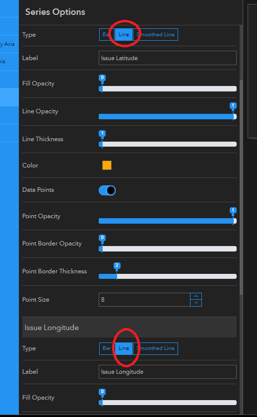
I have somehow managed to plot bar graphs in a serial chart as shown in the picture. Now I want to change the type of one bar graph (orange color) from bar to line graph.
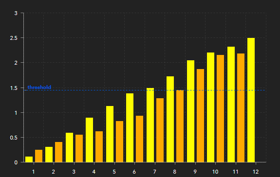
Is it possible to do that in the operation dashboard?
- Mark as New
- Bookmark
- Subscribe
- Mute
- Subscribe to RSS Feed
- Permalink
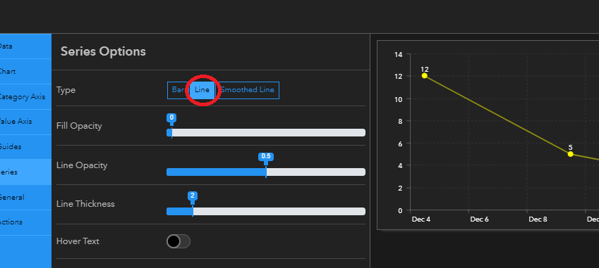
Did you select the Line button at the top of the Series Options?
- Mark as New
- Bookmark
- Subscribe
- Mute
- Subscribe to RSS Feed
- Permalink
Yes, I did. But it converted both bars into lines graph
- Mark as New
- Bookmark
- Subscribe
- Mute
- Subscribe to RSS Feed
- Permalink
I get it.
I don't think it can be done on Dashboard. I think your best option might be creating two graphs and merging them into one view above each other (or side by side). For example:
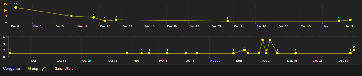
The Infograph Widget in the web apps can handle two lines, so if it fits your purposes maybe you try and use it on a web app, but for the dashboard we'll have to wait for this to be implemented.
- Mark as New
- Bookmark
- Subscribe
- Mute
- Subscribe to RSS Feed
- Permalink
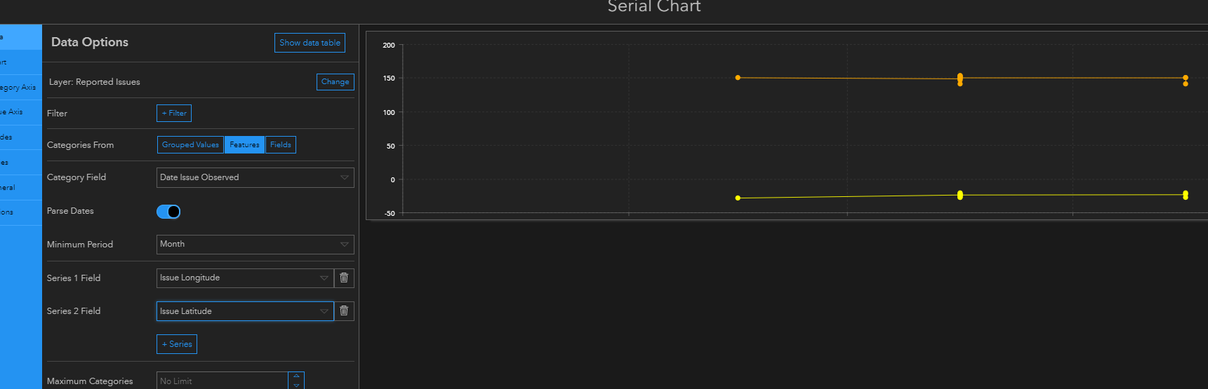
Correction:
Not sure it would fit your data, but you can create more than one series if you use categories from features:
- Mark as New
- Bookmark
- Subscribe
- Mute
- Subscribe to RSS Feed
- Permalink
Thanks Uri. You gave me food for thoughts. I think I should do some feature engineering to show the bar and line graphs on serial chart (as shown by you).