Turn on suggestions
Auto-suggest helps you quickly narrow down your search results by suggesting possible matches as you type.
Cancel
- Home
- :
- All Communities
- :
- Products
- :
- ArcGIS Dashboards
- :
- ArcGIS Dashboards Questions
- :
- Is there a way to keep the search bar expanded by ...
Options
- Subscribe to RSS Feed
- Mark Topic as New
- Mark Topic as Read
- Float this Topic for Current User
- Bookmark
- Subscribe
- Mute
- Printer Friendly Page
Is there a way to keep the search bar expanded by default in an ArcGIS Dashboard map?
Subscribe
1550
2
06-24-2020 02:17 PM
06-24-2020
02:17 PM
- Mark as New
- Bookmark
- Subscribe
- Mute
- Subscribe to RSS Feed
- Permalink
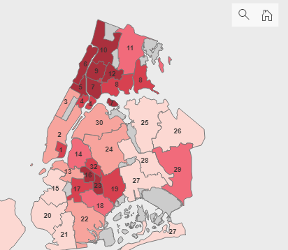
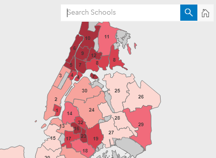
When users click the search button, a bar pops out to the left with some text that explains what can be searched. I'd like it expanded by default so it's obvious to users what they can use the search for. Is there a way to do this?


2 Replies
03-11-2021
01:53 PM
- Mark as New
- Bookmark
- Subscribe
- Mute
- Subscribe to RSS Feed
- Permalink
I'd love to see this feature adjustment, or something similar. The small search icon is not ideal for most public users who typically wont even see the search function.
12-28-2021
06:46 AM
- Mark as New
- Bookmark
- Subscribe
- Mute
- Subscribe to RSS Feed
- Permalink
I also agree that a more "intentional" search widget is needed in Ops Dash. Perhaps functionality like Experience Builder?