ArcGIS Dashboard - Configuring Chart to use layer's symbology (similar to WAB's Infographic Widget)

1425
1
01-20-2021 10:36 PM
Labels (1)

ArcGIS Dashboard - Configuring Chart to use layer's symbology (similar to WAB's Infographic Widget)

The current Dashboard allows one to manually assign different colours to individual categories and it would be really handy if there was an option we can select to get configuration to pick up the layer's symbology.
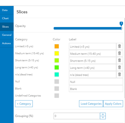
DerrickWong_1-1611210667579.png

This has been implemented in the Web AppBuilder's Infographic Widget and have been requested several times by clients.
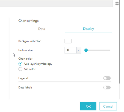
DerrickWong_0-1611210251474.png


Regards,


Derrick


Labels (1)
Comments

Agreed. You would think all chart widgets would allow, by default, the option to use layer symbology.

Version history
Last update:
‎01-20-2021 10:36 PM
Updated by: