- Home
- :
- All Communities
- :
- Products
- :
- ArcGIS Collector
- :
- ArcGIS Collector Questions
- :
- Background layers fade to nearly invisible when ad...
- Subscribe to RSS Feed
- Mark Topic as New
- Mark Topic as Read
- Float this Topic for Current User
- Bookmark
- Subscribe
- Mute
- Printer Friendly Page
Background layers fade to nearly invisible when adding new feature
- Mark as New
- Bookmark
- Subscribe
- Mute
- Subscribe to RSS Feed
- Permalink
When editing in Collector, say creating a new line feature, any background feature layers in the map fade to nearly invisible. This makes it really hard to see what you're doing or to reference existing data in new feature creation. Is there any way to control this behavior, or a workaround so the background layers don't disappear? I don't know if it would be any better, but generating image tile layers for all background data is not a feasible solution- querying background data via popups is necessary.
Solved! Go to Solution.
Accepted Solutions
- Mark as New
- Bookmark
- Subscribe
- Mute
- Subscribe to RSS Feed
- Permalink
Hi Aaron -- This is something the team is aware of and evaluating. Could you post some screen captures so that we can see your data both before starting to edit and while editing?
Thanks!
- Mark as New
- Bookmark
- Subscribe
- Mute
- Subscribe to RSS Feed
- Permalink
Hi Aaron -- This is something the team is aware of and evaluating. Could you post some screen captures so that we can see your data both before starting to edit and while editing?
Thanks!
- Mark as New
- Bookmark
- Subscribe
- Mute
- Subscribe to RSS Feed
- Permalink
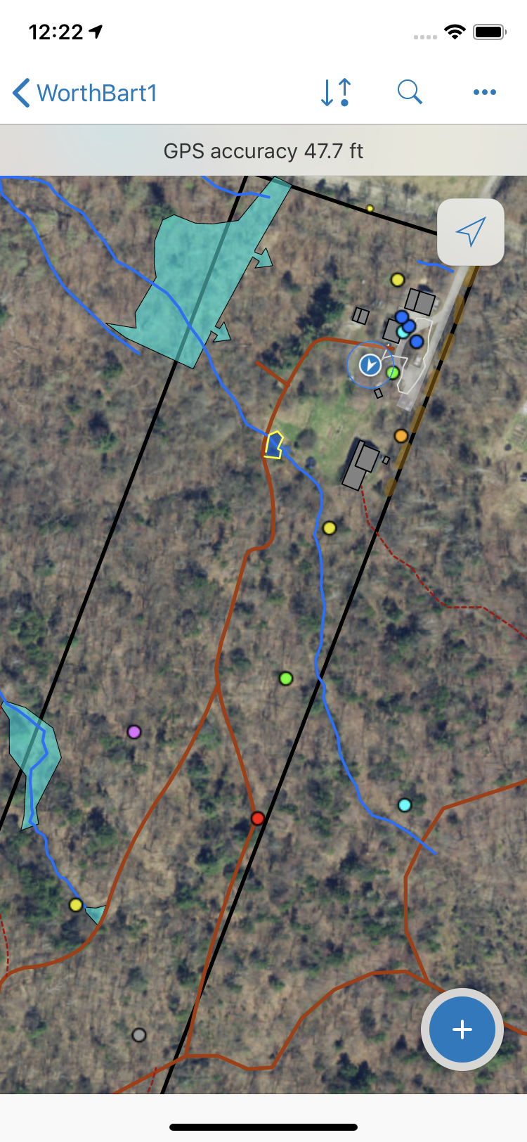
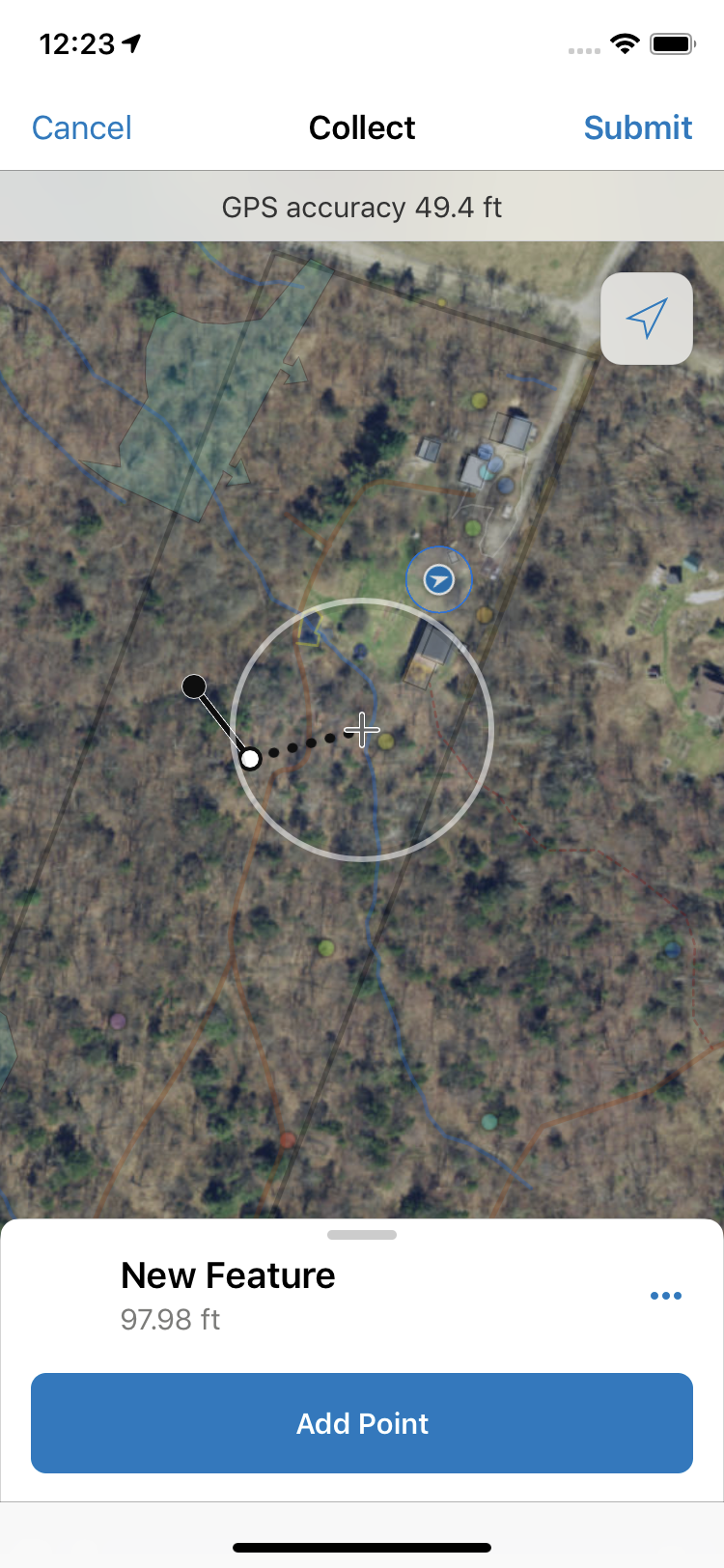
Sure, here are a couple of screenshots. One normal view, the second while in the process of drawing a line. In this case I'm manually drawing, but the same happens when streaming. Notice everything except the basemap fades out and is very hard to see, especially out in the sunlight. This behavior makes the map all but unusable while editing, I really hope this will be addressed soon as it's a significant issue for fieldworkers.


- Mark as New
- Bookmark
- Subscribe
- Mute
- Subscribe to RSS Feed
- Permalink
Perfect, thanks! I'll add these to our examples of where people are having trouble seeing reference data while editing.
As to what you can do now, unfortunately, your options are to change the symbology in your map, or wait until this is changed in the app as there is no setting for this. I don't have a timeframe for an update or change in the app.
- Mark as New
- Bookmark
- Subscribe
- Mute
- Subscribe to RSS Feed
- Permalink
What symbology could I use that would not be subject to this issue? Everything seems to fade to nearly invisible except the basemap.
- Mark as New
- Bookmark
- Subscribe
- Mute
- Subscribe to RSS Feed
- Permalink
I'd try something with more contrast to your basemap. I think often when people are reporting this, it is on the imagery basemap where it is harder to get contrasting (or consistently contrasting) symbology.
- Mark as New
- Bookmark
- Subscribe
- Mute
- Subscribe to RSS Feed
- Permalink
Tried with as contrasty a symbology set as I could come up with, and also with very low variablity basemap (light grey, dark grey, topographic, etc) to no avail. It is not better enough to make a functional difference out in the field.
- Mark as New
- Bookmark
- Subscribe
- Mute
- Subscribe to RSS Feed
- Permalink
Thanks for trying Aaron! The team is looking into this.
- Mark as New
- Bookmark
- Subscribe
- Mute
- Subscribe to RSS Feed
- Permalink
Please add me to the list to notify when this is resolved. Note that there is another thread that you may want to reference for others w/ the same issue (it is a suggestion thread):
https://community.esri.com/ideas/16051-collector-layers-transparent-when-editing
If you have an idea on what release this issue will be fixed in, please update us - and thank you!
- Mark as New
- Bookmark
- Subscribe
- Mute
- Subscribe to RSS Feed
- Permalink
We desperately need this change aswell KDonia-esristaff ! Thanks! Take this as my vote to change it asap!