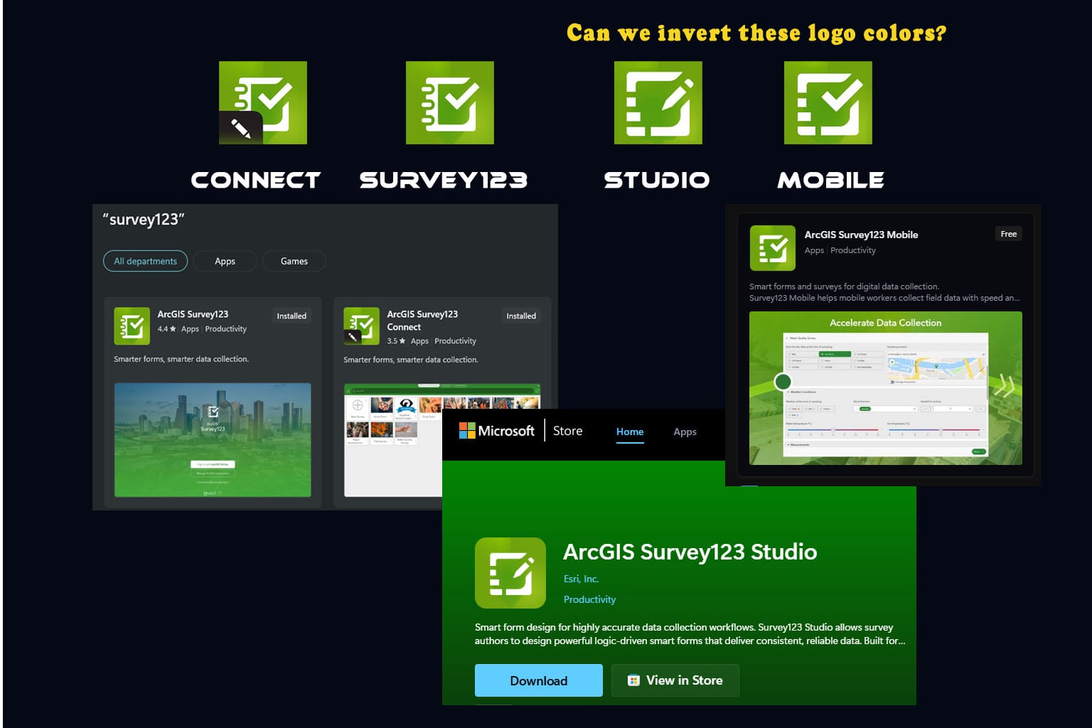
This is a slide I made for my students, and I'd love to have the Next Gen logos be more diffrent. Maybe inverted, or make the white icon dark green with a white score around it.
Symbology is so important to us, and these are so close; you really have to know what you are looking at.
Next, I'd love for you to change the Classic names in the app stores so they say "CLASSIC".
Thank you so much!