- Home
- :
- All Communities
- :
- Products
- :
- ArcGIS Dashboards
- :
- ArcGIS Dashboards Questions
- :
- Multiple Y-axis Serial Chart: Operations Dashboard
- Subscribe to RSS Feed
- Mark Topic as New
- Mark Topic as Read
- Float this Topic for Current User
- Bookmark
- Subscribe
- Mute
- Printer Friendly Page
Multiple Y-axis Serial Chart: Operations Dashboard
- Mark as New
- Bookmark
- Subscribe
- Mute
- Subscribe to RSS Feed
- Permalink
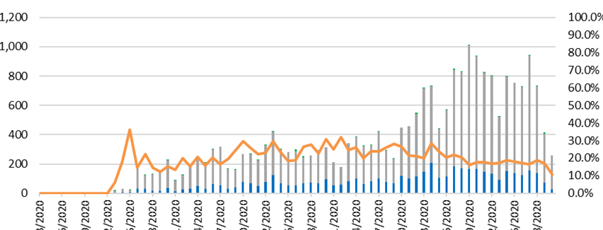
I would like to create a serial chart that includes multiple elements using more than one y-axis. Please see the screenshot for an example of the chart I am looking to re-create. As you can see below, the bars in this chart reference the left y-axis for a total value of something, while the line references the right y-axis for a percent total of something.
- Mark as New
- Bookmark
- Subscribe
- Mute
- Subscribe to RSS Feed
- Permalink
Hi Kevin,
Multiple y axes are currently not supported in Dashboards. We have an Idea submitted for the same and you can upvote here: https://community.esri.com/ideas/14625
Is there a specific use case you would like to use this feature for? Thanks!
-Vivek.
- Mark as New
- Bookmark
- Subscribe
- Mute
- Subscribe to RSS Feed
- Permalink
Vivek,
I have viewed the linked Idea and have upvoted it to increase visibility.
As for the use specific use case, with out giving up too much information due to privacy concerns, basically it would show testing results. Where the bar graphs would describe the testing results ("Yes"/"No", "Positive"/"Negative") while the trend line/line graph would describe the total number of "Yes" or "No" value over the total number of tests given/taken.
- Mark as New
- Bookmark
- Subscribe
- Mute
- Subscribe to RSS Feed
- Permalink
Thanks, Kevin. And, thanks for sharing your use case.
- Mark as New
- Bookmark
- Subscribe
- Mute
- Subscribe to RSS Feed
- Permalink
Hi Vivek,
I have another use case, I have several variables that I want to compare over time, something like this.
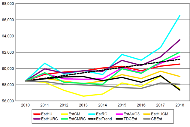
I have this data for all the 254 counties in Texas, so counties in rows and all these variables, by year in columns, how would you suggest doing this in Dashboards
Thanks
- Mark as New
- Bookmark
- Subscribe
- Mute
- Subscribe to RSS Feed
- Permalink
Hi Saloni,
The above chart can be made in Dashboards with some data preparation. Your data should resemble this table:
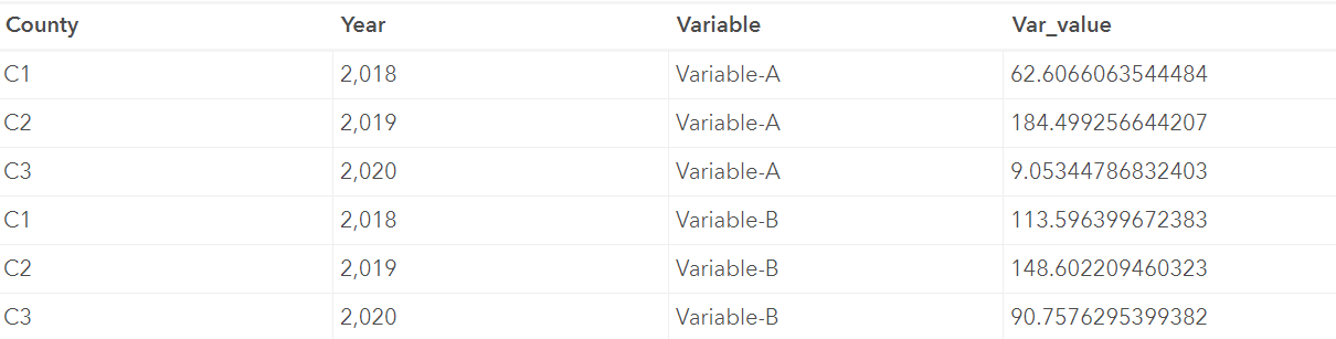
Basically, County, Year, Variable being measured and value of the variable all need to be separate columns as a 'wide' table.
You can then create a time series chart using the serial chart element using 'Categories from Grouped values'. The grouped value should be a date-based field. You can then split by the 'Variable' field and get one series per variable. Below is a screenshot of the configuration options and the resulting chart:

Hope this helps. Regarding multi-axes charts, could you provide more details of your use case? Is it for the same chart?
-Vivek.