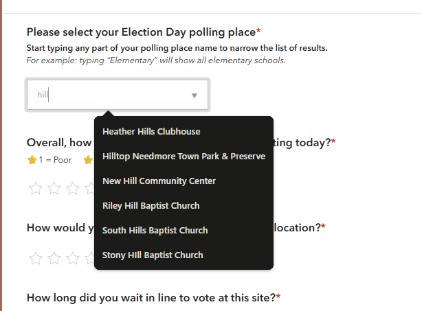
I developed a Survey123 form that includes a Field List question used for selecting a polling location. The question is configured so that users can begin typing a location name and then select the correct option from the filtered list of results.
Expected behavior: When a user starts typing, a dropdown list of matching locations should appear directly below the field, allowing them to select the correct polling place.
Actual Behavior on iPhone (iOS 26): On iPhones running iOS 26, the filtered results do not appear as a dropdown beneath the field. Instead, the suggestions are displayed in the iPhone keyboard's predictive text area. This makes the interaction much less obvious and significantly more confusing for users.
I tested the same survey on an Android device, and it behaves as expected. The filtered results appear in a dropdown list below the field, making it easy to find and select the correct location.
The screenshots below show the difference:
- Left: iPhone running iOS 26 (results appear in the keyboard suggestion area)
- Right: Android device (results appear in a dropdown list)
I intentionally chose this approach instead of a traditional dropdown because the list of polling locations changes from election to election, and typing part of the location name is much easier for users than scrolling through a long list.
If this behavior is specific to iOS 26, it could create significant confusion for respondents and negatively impact survey completion rates. We expect this survey to receive between 20,000 and 40,000 responses, so usability on iPhone devices is a major concern.
So I guess my question is:
- Has anyone else encountered this behavior with Survey123 on iOS 26?
- Is this a known issue or limitation?
- Are there any recommended workarounds or alternative configurations that would provide a more consistent experience across devices?
- If this is a bug, is Esri aware of it?
Any ideas or suggestions would be greatly appreciated.