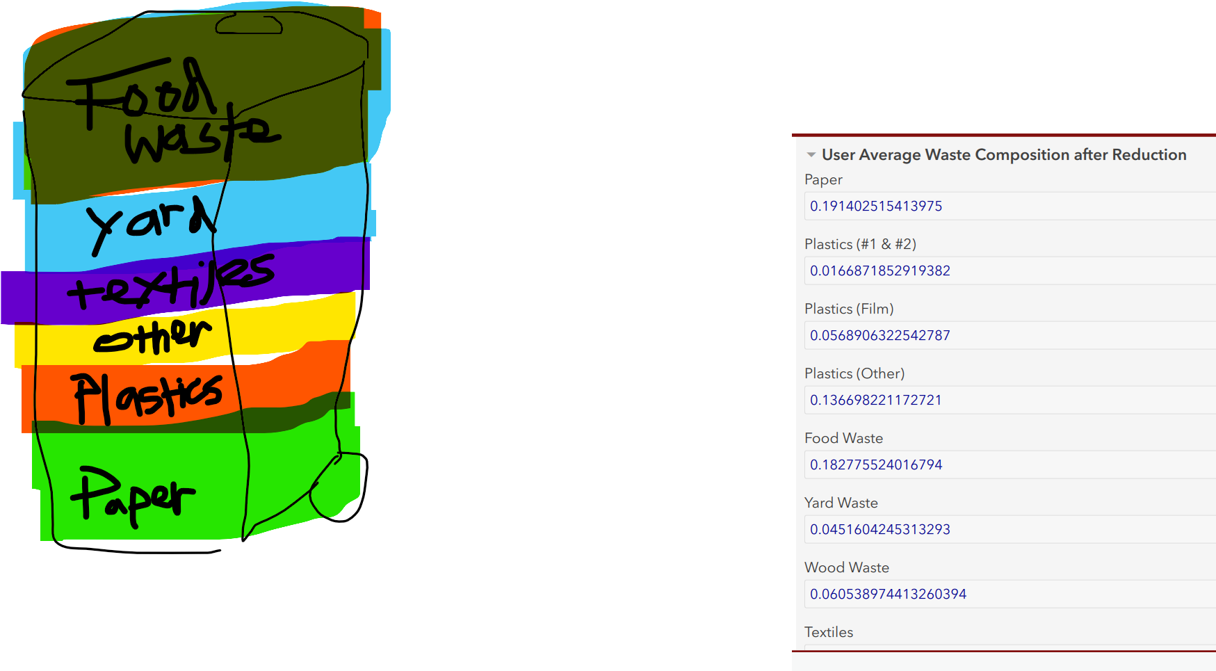
I'm trying to design a survey related to waste reduction, that also has a nice visualization integrated into the survey.
1. Users input their personal reduction commitment for various waste categories, a stream of calculations run in the survey, the user gets to find out what their personal waste composition results are, in comparison to the communities average.
This is the tricky part, we'd like the visualization to output like a pie/column chart, but in the shape of a trash can.
While having this appear after submitting, in like a dashboard/report or something would be cool - I'd really like to see a trashcan outline graphic that fills up with the various percentages, while the survey is filled out. I'm not sure how possible it is or how I might explore this - or what it would even entail - so looking for input.
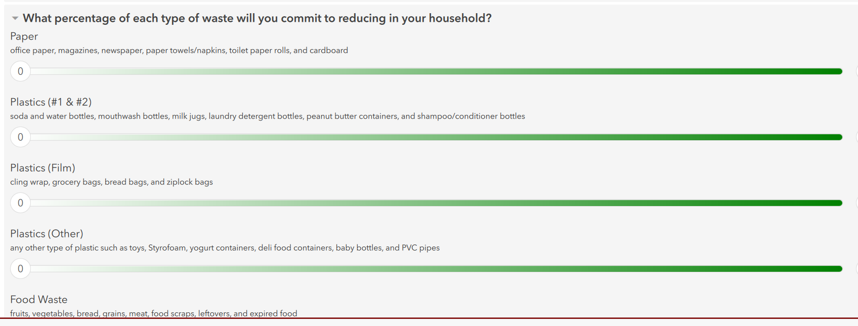
Once those ranges are set, the below calculations are updated and each of these values adds up to 100%. So these values would sort of dynamically fill up a trash can with different colors. Is this at all possible????