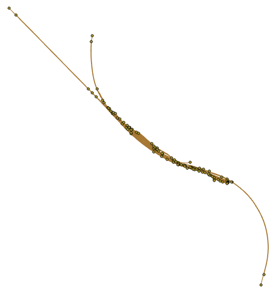
Hey guys, very green geospatial engineer here. I've set myself a task to learn how to create track diagrams with ArcGIS Pro. I created the following diagram by using railroad track data and by using the "Apply Relative Mainline Tool". For a first run of the tool I think its looking fairly good (or maybe I've spent so long on it I am lying to myself to make myself feel better).
My task now is to try and make the diagram look a bit neeter (e.g. have the main line be on the same Y-coordinate, get rid of all the weird divits etc...).
I have managed to do this by hand by using the move, edit vertices, and reshape tools but I was wondering if it was possible to do this programmatically?
I'd appreciate any help on this, thanks 🙂

I created this diagram from this data: