The ExB app developers have decided to remove the arrows from the views navigation for small screens, see: https://support.esri.com/en-us/knowledge-base/faq-why-is-the-views-navigation-arrow-not-displayed-on--000031980
With this design choice, users may not be aware that there are more views available and may not know they can swipe left/right to reveal more options. This is especially true when the views buttons perfectly end on one button, without partially showing part of the next button. This is poor UX design in my opinion. Users have given me feedback that they couldn't find header buttons or didn't know they existed. In the screenshot example below, it's not intuitive that there are more options in the button header:
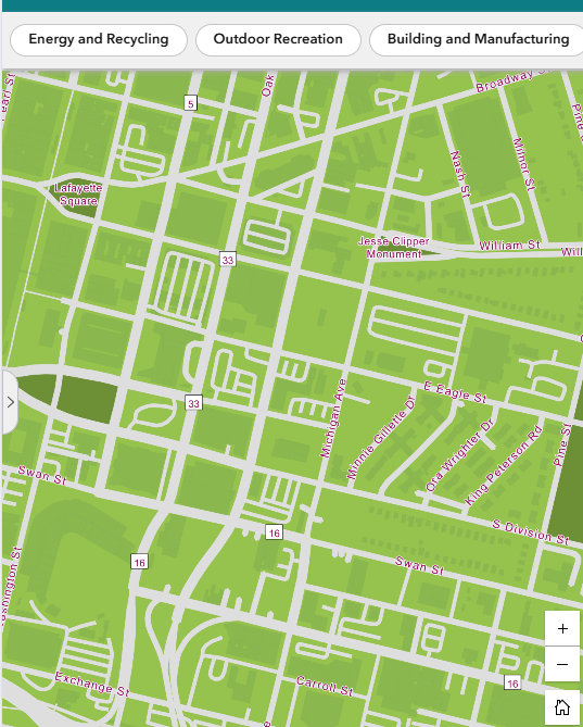
Idea: In the Views Navigation widget, add small indicator arrows that could cue the existence and direction of other headers. Users would still use a finger scroll directly. Give the app designers the option to toggle the arrows so they appear similar to larger screens.
Related: https://community.esri.com/t5/arcgis-experience-builder-questions/views-navigation-arrow-missing-for-small-screen/td-p/1357678