With regards to the align edge tool in ArcGIS Pro 3.1
https://pro.arcgis.com/en/pro-app/3.1/help/editing/align-topology-edges.htm
We are aligning polygons in our planning controls layers to polygons in our cadastral parcel layer. Both these layers are in a geodatabse topology
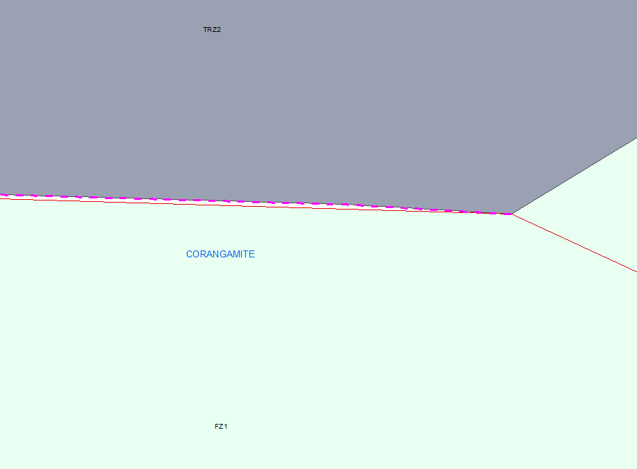
We have an issue with our workflow and the symbology that is generated in PRO compared to what we were previously seeing with ArcMap. We are frequently aligning very small gaps such as in the example below. When using ArcMap a single thin dotted purple line appears as shown here. This makes it still very easy to see our underlying symbology and differentiate the edges we want to align
When using Pro all topology polygon edges are highlighted with thick purple lines (see below) making it impossible to differentiate which edge belongs to which dataset visually to decide which edge to hover over. The resultant yellow lines are also very thick
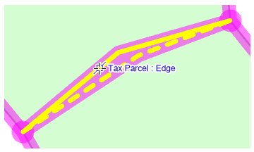
Is there a way to adjust the symbology of the highlighted edges when this tool is used or make it similar in appearance to how it worked in ArcMap