- Home
- :
- All Communities
- :
- Industries
- :
- Business
- :
- Business Blog
- :
- Color me Impressed with Attribute-driven Symbology
Color me Impressed with Attribute-driven Symbology
- Subscribe to RSS Feed
- Mark as New
- Mark as Read
- Bookmark
- Subscribe
- Printer Friendly Page
- Report Inappropriate Content
When I was in grad school, I spent a lot of time working with remotely sensed data. When the June 2018 release of ArcGIS Online introduced the Relationship mapping style, it immediately activated the same parts of my brain that really appreciates false color imagery. Relationship mapping makes it easier than ever to use color to explore the relationships between variables.
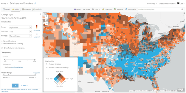
If you haven’t seen read them yet, Lisa Berry’s introduction to Relationship mapping and “how to” guide provide a great overview of relationship mapping with several use cases. In the map below from Lisa’s blog, relationship mapping is used to show the similarities and differences in the spatial patterns of persons who smoke and persons who drink:

But what if I wanted to map the relationship between drinking, smoking, and some other variable at the same time?
Enter attribute-driven symbology in ArcGIS Pro. Attribute-driven symbology allows you to customize symbols to reflect different aspects of the data by connecting your rendering properties to feature attributes. These feature attributes can include normal attributes in your data, as well as Arcade functions. The ability to leverage Arcade becomes particularly useful. As you’ll see below, we can use an Arcade function to transform three columns of data into an rgb or rgba code.
Getting Started
When I try to learn something new, I always find it helpful to start with inputs for which I know what the expected result should be. Since color combinations are important here, working with an image was a helpful starting point, so I decided to create some test data using an image from the Esri User Conference in 2019:

To use attribute driven symbology, the first thing that needed to happen was transferring the RGB values from the image to a polygon dataset. Without getting too deep into the weeds, the workflow involves converting the raster data into a polygon dataset, then using analysis tools to effectively transfer the average RGB values to a new set of polygons:

This result is a polygon feature class with three attribute fields that I wanted to use to set the red, green, and blue color values for each feature. In this case, the values represent the average red, green, and blue values from the source image within each polygon, but they could be any fields in your data.
With test data in hand, the next step is to enable attribute driven symbology, and add the Arcade function.

Because our test data already has red, green, and blue fields, all I need to do is write an Arcade function that returns something like “rgb(111, 222, 333)”. Here’s the code I used, but you could also write an Arcade function to create RGB values from your data, or use HSL, CMYK, or one of the many other supported color formats:
function getRGB(r, g, b) {
return "rgb(" + r + ", " + g + ", " + b + ")";
}
getRGB($feature.MEAN_Red, $feature.MEAN_Green, $feature.MEAN_Blue)With attribute-driven symbology now controlling the features’ colors, the last step is to click apply and enjoy the result:

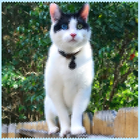
At this point, I was eager to apply this to some real data. But first I had to answer a few questions from around the office. The first one was “Did you reproject your face?” followed by “How exactly is this working?” and lastly “Can you do this to a picture of my cat?” – to which the answers were “no,” “let me show you,” and “of course!”:

Bringing it all back together
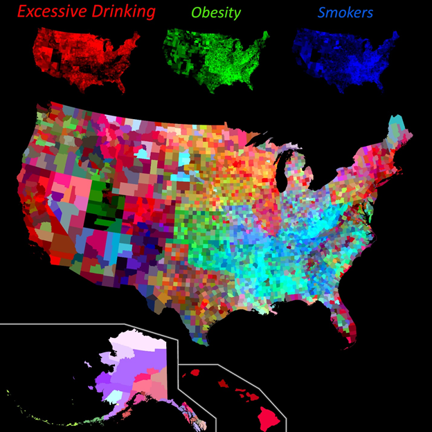
I hope that this (less than) practical example helps paint the picture of how you can use Attribute Driven Symbology in ArcGIS Pro to link the color in your maps to the attributes in your data. Using the example I showed from the beginning of this blog, what would a map look like if we wanted to show the relationship between smoking, drinking, and obesity?
Using Attribute Driven Symbology, we can create just this map! In this case, I used Arcade to rescale all three values from 0 – 255, and return that value as an RGB code. In the new map, red represents excessive drinking, green represents obesity, and blue represents smokers. The way that the colors combine contains a lot of information. For example, yellow areas are high in both excessive drinking and obesity, but relatively lower in smoking.

Try it out!
Hopefully, there’s enough information in this post for you to start experimenting with attribute driven symbology on your own. As you experiment, it’s important to consider your audience and use case. Using color as the only way to convey information on your map can have serious implications for how accessible your maps are and may not always be a good option. Esri’s Javascript API documentation has a great reference page where you can find color ramps that meet specific criteria, including being colorblind-friendly.
For fun (and to the benefit of your social media accounts) feel free to check out this python toolbox that should make it easier to start with a picture & a polygon dataset and end up with a new dataset which you can use for attribute driven symbology. Ever wonder what a family picture would look like when mapped to US County boundaries? There’s only one way to find out!
You must be a registered user to add a comment. If you've already registered, sign in. Otherwise, register and sign in.