ArcGIS Tutorials Blog

cancel
Showing results for 
Show  only  | Search instead for 
Did you mean: 

Other Boards in This Place


Latest Activity

(91 Posts)
SilpaGadi
Esri Contributor

New ArcGIS tutorials
 
ArcGIS tutorial is a step-by-step workflow that uses a real-world scenario to introduce key ArcGIS tools, products and modern best practices. Here's a roundup of new tutorials in the ArcGIS tutorial Gallery that have appeared in the last month.
 
Collect site data for ATMs 

collect-site-data-for-atms.png

ArcGIS Business Analyst Mobile App is a companion app to Business Analyst Web App. It enables field workers to collect information about sites from their phones or mobile devices. The data they collect can be accessed in the web app to perform analysis, create infographics, or perform any other Business Analyst function.

In this tutorial, you'll use the mobile app to collect data about candidate ATM locations to help a bank expand its ATM network. First, you'll share the Business Analyst project you want to collect data for. Then, you'll access the project in the mobile app, verify and update information in the field, take photos of ATM locations, and collect additional data. Lastly, you'll review your changes in the web app.


Identify regions using bioclimatic data and multivariate clustering 

identify-regions-using-bioclimatic-data-and-multivariate-clustering.png

In this tutorial, you will take the role of a conservation professional in Puerto Rico, identifying different bioclimatic regions in El Yunque National Forest for conservation efforts to meet targets of the UN Kunming-Montreal Global Biodiversity Framework (GBF).

You will use bioclimatic data layers and multivariate clustering tools to identify the zones, a process called regionalization. The results can be used to better understand, manage, and conserve key habitats to reduce species extinction, as outlined in GBF Target 4, and to conserve at least 30 percent of terrestrial land (Target 2 and Target 3).

The primary factors that drive species distributions are environmental factors and ecological interactions. To ensure the success of the species, it is crucial to preserve its habitat. However, preserving habitats presents many challenges. Habitats are very complex and consist of interrelated environmental characteristics. To make informed decisions for conservation, it is important to understand the existing habitats, their spatial extent, and their rarity.

Depending on your specific goals and specific locations, you will use different layers, including data from national mapping agencies and your own organization, but many of these layers are freely available online.

The approach outlined in this tutorial is intended to demonstrate some of the data available for conservation, and the tools that you can apply. It is not intended to prescribe a workflow or specific data layers.
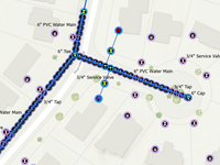
 

Get started with ArcGIS Utility Network for water 

utility-network-for-water-card.png

In this tutorial, you will act as a GIS analyst who works for a water distribution utility. A new residential development is being built in your service territory and you will use ArcGIS Utility Network to provide the operations, planning, and engineering departments with the information they need to complete the work. Once construction is complete, you will use the editing and validation capabilities of Utility Network to ensure the geographic information system (GIS) accurately reflects the way equipment was constructed in the field.

Along the way, you'll learn how to trace subnetworks, identify affected customers, create and edit utility network features, validate topology, and update subnetworks.

 

Get started with ArcGIS Utility Network for electric 

electric_gallery_image.png

The Public Works Department of the City of Lisle, Illinois, has been using the geometric network to manage its municipal electric network. Your manager has tasked you with exploring the capabilities of a utility network in ArcGIS to model and analyze your network's assets.

To help you get started, a consultant has populated a small subset of your service territory with data from the Electric Utility Network Essentials Foundation. In this tutorial, you'll use this sample data to experiment with the utility network's functionality. You'll perform traces to answer questions about your network, run reports to identify customer count, and perform a service line extension to bring power to a new customer followed by an update subnetwork operation to incorporate this service line into the subnetwork.


Create catchment areas for a cancer center 

create-catchment-areas-for-a-cancer-center.png

Since 2012, delineating catchment areas has become an imperative for National Cancer Institute (NCI)-designated cancer centers. These catchment areas are contiguous geographic areas from which cancer centers draw most of their patient population. They are foundational for planning, resource allocation, engagement, and ensuring equitable access to services.

In this tutorial, you'll create four potential catchment areas for a fictitious cancer center in Baton Rouge, Louisiana, using the following methods:

  • Identifying counties adjacent to the county the cancer center is in
  • Creating a 60-mile buffer around the cancer center
  • Creating a 60-mile driving distance service area around the cancer center
  • Identifying the area where the cancer center's core patients live, with outliers excluded

Using infographics and a map series layout, you'll compare the four potential catchment areas so the center's leadership can make an informed decision about which to submit to the NCI.
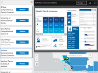
 

Create a custom application to analyze cancer center catchment areas 

create-a-custom-application-to-analyze-cancer-center-catchment-areas.png

In 1971, through the National Cancer Act, the National Cancer Institute (NCI) Cancer Centers Program was created. This program recognizes and funds leading cancer centers performing state-of-the-art research that deliver cutting-edge treatments to the patients in their service areas, commonly called cancer center catchment areas.

In this tutorial, you will learn how to create a map that visualizes the coverage of National Cancer Institute cancer center catchment areas across the United States, including their designated cancer centers and then further analyze the demographic composition of each catchment area to learn more about the population being served. In the context of health care, catchment areas are the geographic regions where patients are referred to a specific health-care facility or service. This allows for strategic planning and resource allocation for the cancer center facilities to ensure they are serving their patients effectively. Cancer center catchment areas are self-defined geographic areas that each NCI-Designated Cancer Center serves or intends to serve in the research it conducts, communities it engages, and the outreach it performs.
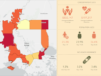
 

Create a custom infographic for a catchment area 

create-a-custom-infographic-for-a-catchment-area-card.png

In the United States, the National Cancer Institute (NCI), part of the National Institutes of Health, awards grants to support cancer control measures for organizations that meet rigorous standards. The process is highly competitive and achieving the concomitant NCI designation is prestigious. The NCI designation and the grant award continue for five to seven years before renewal is required.

In this tutorial, you will take on the role of analyst as part of the team preparing a renewal application for their NCI sponsored Cancer Center Support Grant. You will examine the current cancer center catchment area for your organization and make plans for strategic expansion of the catchment, knowing that NCI will appreciate your cancer center's effort to serve more people. To share information about the population contained within the catchment, you'll customize an infographic that you can include in your grant application.
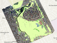
 

Extract high-resolution land cover with GeoAI 

land-cover-dl-gallery.png

High-resolution land cover layers are valuable tools for mapping and understanding the environment. They provide detailed information about the different types of land cover—such as vegetation, buildings, water bodies, and roads—at a fine-grained spatial resolution. One approach to creating such layers is to use GeoAI applied to drone imagery, classifying the imagery pixels into their corresponding land cover types. While it is possible to train your own deep learning model for this task, you can also take advantage of a pretrained model provided by ArcGIS Living Atlas.

In this tutorial, focused on the Township of Alexandra, South Africa, you'll try out this approach in ArcGIS Pro, with the goal of identifying green spaces and computing their overall surface area. Information about green space distribution is crucial for urban planning, resource allocation, and social development initiatives.

 

Perform species distribution modeling 

perform-species-distribution-modeling-card.png

Feral swine (Sus scrofa) are an invasive species that destroy or degrade acres of natural habitat each year, threatening biodiversity and disrupting native species. Their rooting and foraging can also damage agriculture and irrigation systems, and they can carry infectious diseases that pass to domestic cattle. Modeling the distribution of these animals based on observations from iNaturalist can help wildlife and conservation managers track, assess, and contain the destruction.

In this tutorial, you'll focus on two methods for species distribution modeling, Forest-based and Boosted Classification and Regression, and Presence-only Prediction. Both methods can be used individually or in combination to create and assess species distribution.

The approach outlined in this tutorial is intended to demonstrate some of the methods available for species distribution modeling. It is not intended to prescribe a workflow or singular approach to the topic. When using these methods in your work, be sure to apply your own subject matter expertise on the phenomena being modeled to produce the best results.


Use an AI assistant to explore the pickleball market 

use-assistant-ai-to-map-pickleball-customers-card.png

Whether you work for a commercial company that's trying to start a new business or are part of a local government promoting economic development, or anyone simply trying to understand an area, ArcGIS Business Analyst provides data, tools, and workflows for everyone. Gain access to thousands of demographic and business variables that help in many private and public sector workflows, including expanding to a new business location or promoting economic development. Business Analyst Web App includes an AI assistant—Business Analyst Assistant (Beta). It can be used by new users to learn about the app and existing users for productivity. It can be used to get you started creating a map or as an embedded part of your workflow.

In this tutorial, you are interested in expanding a business that sells pickleball equipment. You will start by creating a map showing the locations of recreation centers and where people have bought more recreation sporting goods than the national average. Using the assistant, you will generate a color-coded map showing pickleball activity to help inform where your next target market should be located.


more
1 0 244
HeatherSmith
Esri Contributor

This new five-part tutorial series teaches how to build professional quality web maps and apps with Map Viewer and ArcGIS StoryMaps.

Read more...

more
2 0 293
SilpaGadi
Esri Contributor

New ArcGIS tutorials
 
ArcGIS tutorial is a step-by-step workflow that uses a real-world scenario to introduce key ArcGIS tools, products and modern best practices. Here's a roundup of new tutorials in the ArcGIS tutorial Gallery that have appeared in the last month.
 
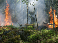
Calculate landslide potential for communities affected by wildfires 

calculate-landslide-risk-for-communities-affected-by-wildfires.png

Wildfires make the landscape more susceptible to landslides when rainstorms pass through an area after wildfires. Post-fire debris flows are particularly hazardous because they can occur with little warning, can exert great impulsive loads on objects in their paths, and can strip vegetation, block drainage ways, damage structures, and endanger human life. Often there is not enough time between a fire and a rainstorm to implement an effective emergency response plan. However, various post-fire debris-flow hazard as

Prepare data for species distribution modeling 

prepare-data-for-species-distribution-modeling-card.png

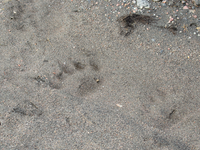
The European badger (Meles meles) plays an important role in shaping species diversity. Considered an ecosystem engineer, badgers provide three main ecosystem services: seed dispersal, topsoil disturbances, and microhabitat creation. While the European badger is not considered threatened, it is a widely hunted species, and is also susceptible to many diseases. Decreases in the badger population may cause disruption to its important ecosystem services.

In this tutorial, you'll focus on acquiring and setting up the data that would be needed for species distribution modeling, such as land cover, slope and elevation, and bioclimate. The data available for European badgers represents presence, or locations where a badger has been observed. Most models, such as random forest and regression, also require some kind of data on where the species wasn't present. While you can't create true absence data, which shows definitively that a species is not present in a location, you can use a variety of methods to create pseudo absence, or background data. These points provide additional information to the model about environmental conditions. Pseudo absence or background points can be generated in multiple ways depending on the analysis you plan to run, potential bias within the presence data, and the analysis question you hope to answer. You'll create pseudo absence points using random generation.

Finally, you'll extract environmental data to these points. According to the Global Biodiversity Information Facility (GBIF), badgers prefer easily dug, well-drained soils, with good vegetation cover within foraging habitats. In central Spain, badgers prefer mid-elevation mountain areas with woodland and pastures, and avoid lower elevations.

Use demographic data to study regional markets 

regional_gallery.png

You work for a regional convenience store chain, Casey's General Stores. You are hoping to expand your market to the southwest side of your existing territory, and do not want to intrude on the territory of your competitor to the southwest, Allsup's. You will work to gain a better understanding of your chain's region and plan an ideal location using GIS tools, business and demographic data, and the geographic approach. In this tutorial, you will use points of interest search and color-coded maps to examine the data. You will study the chains' territories, examine their sales volume, incorporate projected population numbers, and propose a new market based on your analysis.


more
4 0 645
SilpaGadi
Esri Contributor

New ArcGIS tutorials
 
ArcGIS tutorial is a step-by-step workflow that uses a real-world scenario to introduce key ArcGIS tools, products and modern best practices. Here's a roundup of new tutorials in the ArcGIS tutorial Gallery that have appeared in the last month.
 
Choose candidate areas for a convenience store 

select-candidate-areas-for-a-convenience-store.png

A regional convenience store chain seeks to expand its network by opening a new store. There are many variables and considerations that go into determining where to open a store, but you've settled on three: distance from competitor stores, the consumption habits of the nearby population, and proximity to major roads.

In this tutorial, you'll use ArcGIS Business Analyst Web App to find candidate locations for the new store. Using points of interest search, suitability analysis, and historical traffic data, you'll consider all three criteria within your area of interest.

Derive products from satellite imagery with ArcGIS Reality for ArcGIS Pro 

reality-sat-gallery.png

As a remote sensing specialist working with the City of San Diego, you have been tasked with generating Reality mapping products—a digital surface model (DSM), a True Ortho, and an integrated DSM mesh—from high resolution satellite imagery to support an upcoming harbor expansion project. The input data comprises multiple overlapping high-resolution multispectral images captured by Maxar's WorldView-3 and WorldView-2 satellite sensors. To process these images and derive high quality Reality mapping products, you'll use ArcGIS Reality for ArcGIS Pro.

In this tutorial, you'll download the input data and create a workspace to manage it. You'll then improve the image alignment using tie points and other photogrammetric processes. Finally, you'll generate a high-resolution DSM, a True Ortho, and an integrated DSM mesh from the aligned images. While this workflow will be performed at a small extent for brevity, ArcGIS Reality for ArcGIS Pro is routinely used to process much larger extents, such as the DSM mesh displayed in this example 3D scene.

Explore an urban model 

explore-an-urban-model-card.png

The City of Fullerton, California, is planning an update to its general plan. California state law requires that general plans address land use, circulation, housing, open space, conservation, safety, and noise. A city may include additional elements based on the topics important to the city. In this tutorial, you'll review the proposed Rail District Specific Plan that city planners have built in ArcGIS Urban to give feedback. You'll also explore several other building projects around the city using analysis tool including shadow and line of sight analysis to better understand how the community landscape might change.

Manage and communicate emergency information 

manage-and-communcate-emergency-information.png

Emergencies—such as floods, fires, earthquakes, and storms—present recurring challenges to communities around the world. Sharing a common operational picture allows organizations to respond quickly and effectively, tracking impacts and coordinating and allocating resources. In this tutorial, you will take the role of an emergency manager in Bay St. Louis, Mississippi, responding to flooding. You will install and configure the Emergency Management Operations Solution and use it to share data with other responders and the community.

Map floods with SAR data and deep learning 

sar-flood-gallerly.png

Flooding is one of the most frequent and costly types of natural disasters. Flood mapping is traditionally performed using local aerial observations or ground surveys. However, when flooding is widespread, these methods become prohibitively expensive and time-consuming. Moreover, aerial observation can be challenging or impossible due to obstructive weather conditions. During flooding events, thick clouds can also prevent the use of optical satellite imagery for visualization and analysis. In such cases, synthetic aperture radar (SAR) satellite imagery is valuable, since it can penetrate through clouds and hazy atmospheric conditions, allowing continuous observation and mapping of floods.

In the Spring of 2019, severe flooding, referred to as the Great Flood of 2019, impacted 14 million people across multiple states in the Midwest of the United States. The St. Louis, Missouri, region experienced significant flooding. In this tutorial, as an image analyst for the disaster management regional agency, you are tasked with mapping the flood using a pretrained deep learning model and Sentinel-1 SAR imagery in ArcGIS Pro

Prepare an indicator layer for an equity index 

indicators_gallery_image.png

Local, state, and federal governments aim to understand their community, either through listening sessions or community meetings, and even by working across departments to build indices. An index is often used to inform decision-making but, more importantly, help leaders and communities understand the current conditions.

In this tutorial, your organization wants to build an index to help the community measure equity and identify areas for improvement. You are tasked with developing a set of indicators to identify which areas of the city are experiencing cumulative burdens.

Set up data to expand an ATM network 

set-up-data-to-expand-an-atm-network.png

A bank wants to expand its ATM network. It plans to use ArcGIS Business Analyst Web App to analyze potential ATM locations based on attributes such as visibility, distance from the street, and the number of nearby parking spaces. However, sites in a default Business Analyst project don't have these attributes.

In this tutorial, you'll create a project with custom site attributes to suit the bank's needs. Then, you'll create sites for candidate ATM locations and existing ATM locations that include these attributes. When you complete this tutorial, your project will be set up for on-site data collection and analysis.

more
2 0 319
SilpaGadi
Esri Contributor

New ArcGIS tutorials
 
ArcGIS tutorial is a step-by-step workflow that uses a real-world scenario to introduce key ArcGIS tools, products and modern best practices. Here's a roundup of new tutorials in the ArcGIS tutorial Gallery that have appeared in the last month.
 
Inspect infrastructure with ArcGIS Drone2Map 

inspect-infrastructure-with-arcgis-drone2map.png

You work as a private drone consultant helping the Federal Aviation Administration (FAA) with their air traffic control tower inspections. The control tower at Buchanan Field Airport in California is due for an inspection and you have been tasked to ensure it is in good condition to eliminate any possible downtime.

In this tutorial, you'll perform an inspection using your drone imagery in ArcGIS Drone2Map. Creating an inspection allows you to review the images from the flight and find any potential problems or areas that require maintenance safely. The inspection results will then be shared out through an inspection report and your ArcGIS organization.


Model conservation suitability 

model-conservation-suitability.png

In this tutorial, you will take the role of a Kenyan conservation professional using spatially informed decision making tools to prioritize areas for conservation to reach 30x30 in Kenya.

You will use layers from ArcGIS Living Atlas of the World to determine how much area is currently conserved and how much more needs to be conserved to meet that goal. Once you have done so, you will use Suitability Modeler in ArcGIS Pro to analyze multiple data layers to determine high priority areas for conservation in order to meet targets of the UN Kunming-Montreal Global Biodiversity Framework (GBF).


Create a Python script tool 

create-a-python-script-tool_card.jpg

Python scripting makes it possible to automate workflows in ArcGIS Pro. In this tutorial, you will start with a working script that automates a typical geoprocessing workflow. You will use this script to create a custom Python script tool that can be used by others in ArcGIS Pro. Making a script tool allows your code to be shared with others, who can use it without knowing Python.


Explore imagery – Spatial resolution 

spatial-res-gallery2.png

One important characteristic of imagery data is its resolution. There are four types of resolution: spatial, temporal, spectral, and radiometric. In this tutorial, you'll learn about spatial resolution.

You'll become familiar with the concept of spatial resolution and examine satellite imagery of different spatial resolutions in ArcGIS Pro. Your exploration will focus on the region of Pembamoto, Tanzania, where an innovative regreening project is taking place. You'll also apply your knowledge of spatial resolution to change the cell size of imagery using resampling and verify your results using the measuring tools.

 
Get started with ArcGIS Data Pipelines 

get-started-with-arcgis-data-pipelines.png

The New York City Department of Parks and Recreation (DPR) maintains a database of capital improvement projects as a .csv table. However, other departments within the city would like to know additional information about each capital project, such as the age of each project from its initial design or which neighborhood contains each capital project.

In the past, adding additional information to this list of park projects has been a time-consuming, manual process. Specifically, it entails:

  • Querying projects that are in the construction phase
  • Projecting data to an appropriate coordinate system for New York City
  • Calculating the amount of time that has passed since the project was initially designed
  • Determining which neighborhood tabulation area the project falls within
  • Determining which community district each project falls within
  • Removing numerous attributes that are not necessary for the stakeholders
  • Renaming three attribute fields whose current names are vague and unintuitive

To automate this workflow and keep your data up to date, you'll use ArcGIS Data Pipelines to extract information from the New York City's OpenData website, load it into ArcGIS Online, and transform it by adding the requested attributes. Finally, you'll have this data pipeline run on a schedule to keep your list of capital projects current.


more
5 0 526
HeatherSmith
Esri Contributor

Three videos about choosing colors in cartography.

Read more...

more
2 0 584
HeatherSmith
Esri Contributor

Two short videos about how to use color more effectively in map design.

Read more...

more
5 3 760
SilpaGadi
Esri Contributor

New ArcGIS tutorials
 
ArcGIS tutorial is a step-by-step workflow that uses a real-world scenario to introduce key ArcGIS tools, products and modern best practices. Here's a roundup of new tutorials in the ArcGIS tutorial Gallery that have appeared in the last month.
 
Symbolize by size 

symbolize-by-size-card.png

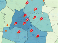
An affordable housing advocacy group is studying vacant housing in the United States. To support this effort, you'll map vacant housing units to show potential housing supply. This map will be one of several included in an internal report to help your group decide on their priorities and plans.

In this tutorial, you'll use symbols of different sizes to map the count of vacant housing units in each county. You'll experiment with and learn about the different possibilities for symbolizing with size in ArcGIS Map Viewer. This tutorial will help you make better choices when using symbol size in your own maps.


Generate DSMs and True Orthos with ArcGIS Reality for ArcGIS Pro 

ortho-gallery-image.png

In this scenario, the City of San Francisco is expanding its GIS open data program to include high-resolution digital surface models (DSM) and True Ortho imagery. These new 2D products will be used to enhance citizen engagement through access to accurate and current high-quality imagery and other GIS data products. As an image analyst working for the city, you have been tasked with processing some newly acquired aerial imagery to generate these products.

You will do that using ArcGIS Reality for ArcGIS Pro. You'll download the input data and create a workspace to manage it. You'll then improve the image alignment using tie points, ground control points, and other photogrammetric processes. Finally, you'll generate a high-resolution DSM and a True Ortho. While this workflow is demonstrated on a small extent for brevity, ArcGIS Reality for ArcGIS Pro is routinely used to process much larger extents, as seen in this layer example hosted online.


Edit a building layer 

image gallery2.png

Building information models (BIM) in ArcGIS provide a detailed representation of buildings and other construction elements, presented within rich 3D backdrop scenes. They can also be enabled for editing and be used to maintain up-to-date information about the real-life objects they represent.

In this tutorial, as the real estate manager working on the De Zalmhaven tower project in Rotterdam, Netherlands, you need to keep real estate agents and project stakeholders up to date on the status of the units available for sale or lease in the tower. You will create a 3D scene in which the building appears as an editable scene layer. You will edit attributes about unit availability in ArcGIS Pro, and you will share your latest updates with the real estate agents and project stakeholders as a web scene on your ArcGIS Enterprise portal.


Detect ships with SAR imagery 

LearnTutorial-03_card.png

In this tutorial, as an analyst for the Panama Traffic Services agency, you will help determine ship congestion by detecting ships in Synthetic Aperture Radar (SAR) imagery and you’ll use the result to generate a vessel density map. A vessel density map shows the distribution of ships (that is, maritime traffic), based on the number of ships per unit area. SAR satellite sensors send and receive back microwaves to create high-resolution images of the Earth's surface. Unlike traditional methods such as the Automatic Identification System (AIS), which relies on broadcast systems aboard ships, SAR can help detect ships even in areas where AIS data may not be available or reliable. Understanding port congestion by incorporating a SAR-based approach can improve maritime traffic safety and efficiency.

Use network diagrams for quality assurance 

gallery_image_diagram.png

In this tutorial, you will act as a GIS analyst for an electrical utility. In response to several user reports, the department is performing quality assurance checks on its network data. The GIS at a utility company is used by different departments for asset management, engineering analysis, and planning purposes. Supporting a modern utility requires maintaining a high standard of data quality. GIS is no longer only about making good-looking maps; it's about modeling the relationships and connectivity of all the assets maintained by the utility company so they can be leveraged by other systems and users. Quality assurance and quality control (QAQC) is an important part of maintaining any dataset, and as datasets grow larger and get more complicated, it is even more important to have robust tools that help to visualize and analyze the data in intuitive ways. You will use ArcGIS Pro tools, ArcGIS Utility Network, and network diagrams to explore associations between features and correct them if necessary. While the data and terminology presented in this tutorial are specific to the electric industry, the tools and processes translate to the data and workflows used by other industries, such as water or gas utilities.

Create 2D products with ArcGIS Drone2Map 

create-2d-products-with-arcgis-drone2map.png

You are a drone operator who has just finished capturing data for a residential construction site by collecting aerial images. Your manager would like you to take these raw drone images and use them to calculate the volume of stockpile on site.

In this tutorial, you'll use ArcGIS Drone2Map to convert your raw drone imagery into a highly accurate True Ortho using ground control points and perform the required measurement. Additionally, you'll publish your imagery products to the web so they can be made accessible to others at your organization.

New ArcGIS tutorial series

A tutorial series delivers multiple onboarding resources in a single-page experience. Here's a roundup of some new series in the ArcGIS tutorial Gallery that have appeared in the last month. 

Design a layout in ArcGIS Pro 

design-a-layout-in-arcgis-pro-card.png

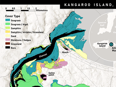
A layout includes a map, along with surrounding information such as a title, legend, scale bar, or credit text. These elements—called map surrounds—help to explain the map. It is important that the layout be well designed so the map is easy to interpret. It should be balanced, consistent, uncluttered, and have a clear visual hierarchy.

You have been hired to create a printed map of a marine estuary for a small museum in South Australia. It should show the different land cover types and tidal class areas in the estuary, which are described in other displays in the museum. In this tutorial series, you'll use ArcGIS Pro to design a layout for the client.


more
2 0 531
HeatherSmith
Esri Contributor

Watch this short video to learn how to choose color schemes that work well with light or dark basemaps.

Read more...

more
1 0 479
NikiWong
Esri Contributor

Announcing the release of the Community Mapping for Racial Equity and Social Justice tutorial collection, designed to equip young mappers with essential ArcGIS skills and focuses on mapping local communities through the lens of Racial Equity and Social Justice (RESJ) workflow.   

Read more...

more
1 0 701
129 Subscribers