- Home
- :
- All Communities
- :
- Products
- :
- ArcGIS Survey123
- :
- ArcGIS Survey123 Blog
- :
- Survey123 Tricks of the Trade: Groups, Grids and P...
Survey123 Tricks of the Trade: Groups, Grids and Pages
- Subscribe to RSS Feed
- Mark as New
- Mark as Read
- Bookmark
- Subscribe
- Printer Friendly Page
- Report Inappropriate Content
Updated November 16, 2021 [Updated Grid Layout section]
In this blog post I will explore a handful of XLSForm techniques to help you better control the organization and layout of questions within a form. You will learn about groups, grids and pages, but also other tricks to refine the size, placement and look and feel of questions within your form.
Groups
Groups: XLSForm Basics
Groups organize questions into sections, helping users more easily navigate complex forms. Our Survey123 for ArcGIS: Using Groups to split your survey into sections - YouTube video is about the quickest way there is to learn the basics of XLSForm groups. I strongly suggest you watch it, it's only 2 minutes long.
As described in the video, you can create sections in your form by enclosing a set of questions within a begin group/end group block. You need to specify a value in the name column of the begin group row, and this name must be unique. If it helps you navigate the spreadsheet, you can also add a name to the end group row, but it is not compulsory.
You can add as many groups as you like to a form, and you can nest them too: you can add groups within groups!
On occasion, you may want to display groups collapsed and let the end-user expand them if needed. This can be achieved by setting the appearance column to compact. It is not possible to dynamically expand or collapse a group with an XLSForm expression.
Formatting Group Headers
Since groups are fundamentally used to help users navigate long surveys, it is important to take pride in the headers. The group headers, if formatted appropriately, can really make a big difference for people.
The font of group labels by default is a bit bigger and bolder than the labels of questions. This helps the group header stand out. Using HTML formatting within the label column of the begin group row, you can bring your own style to the group header. For example, you can center the label in the screen, change its color, and size.
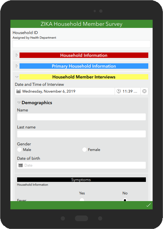
In the example below, the group headers have been given different background colors to help users navigate more quickly between them. Note that the first two groups, in red and blue, are collapsed but users can choose to expand them.
The style your survey help topic shows the HTML tags you can use to format your labels. When setting colors, you can use either their HTML code name or their hexadecimal representation. At W3Schools you can use the handy color picker for HTML colors. All the properties described in the documentation are supported in the Survey123 field and web apps except for the background color, which is only supported in the field app.
The next XLSForm sample shows the syntax for defining the background color of the group header.
Dynamic Labels for your Groups
When working with labels for your groups (and questions, actually), remember that on top of the formatting syntax described above, you can also dynamically change the label content. For example, say you have a health household interview survey where we you need to capture all symptoms detected in each of the household members. You can present the symptoms group with a label that matches the name of the household member for which you are capturing the data. This could help eliminate confusion. Below is the actual example. Look how the group header in black changes depending on the household member name entered.
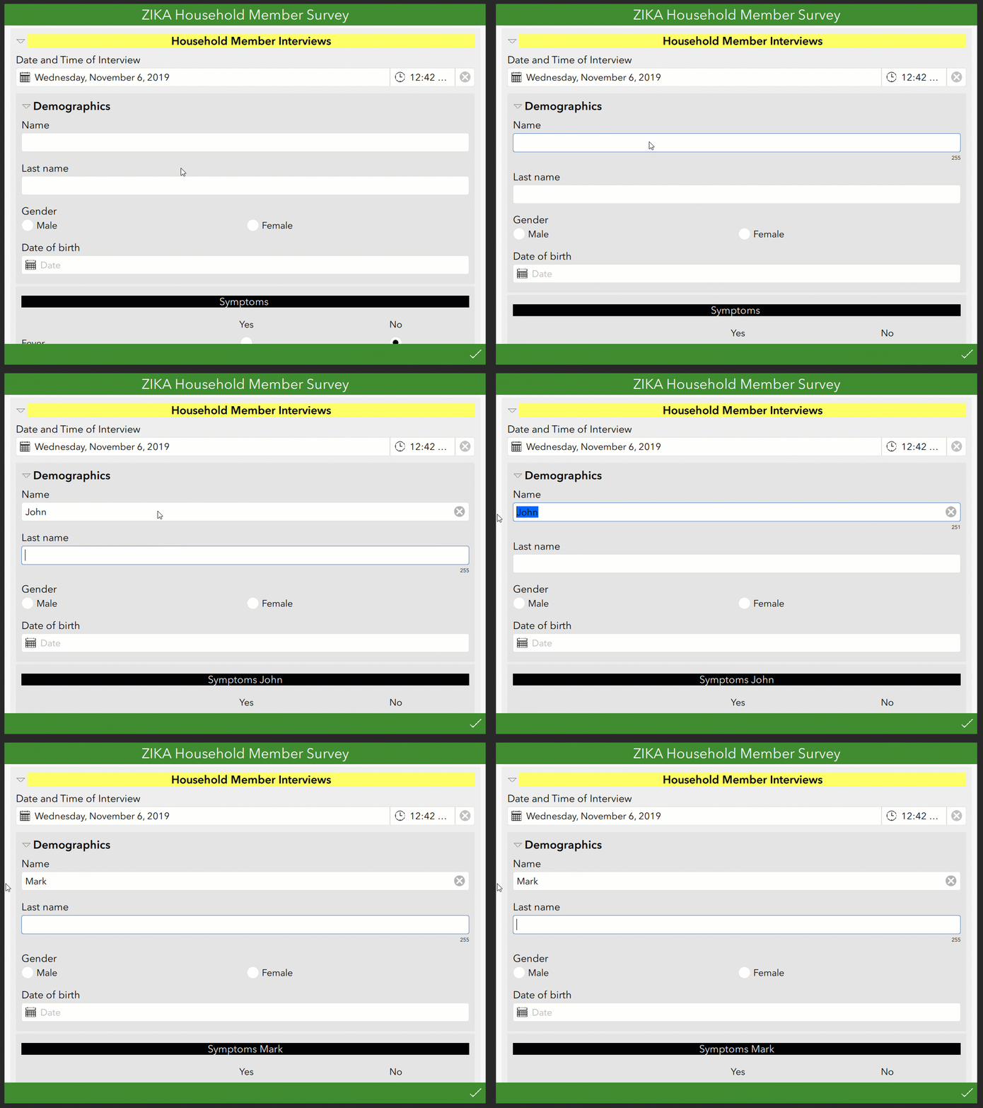
Check out https://community.esri.com/groups/survey123/blog/2018/11/01/understanding-dynamic-labels-in-survey12... to learn more about this technique.
Visibility of Groups
One final note on groups relates to their visibility within the survey, which is controlled through the relevant XLSForm column. If an expression written in the relevant columns evaluates to true, the group is shown, otherwise it is hidden to the user.
A common bad practice with form design consists on repeating the same relevant statement to a large collection of consecutive questions. This slows down your survey, because the same expression needs to be evaluated again and again for each of the questions. If a sequential set of questions shares the same relevant statement, it is good practice to group them and apply the relevant expression to the begin group row only. If the group is relevant, all questions within the group will show. If the group is not relevant, all questions inside the group will be hidden. There is no need to duplicate the relevant expression again and again.
Pages
Introduction to Pages
Pages are particularly useful when working with large forms, helping you logically organize your questions and giving end users a sense of progress across the entire survey.
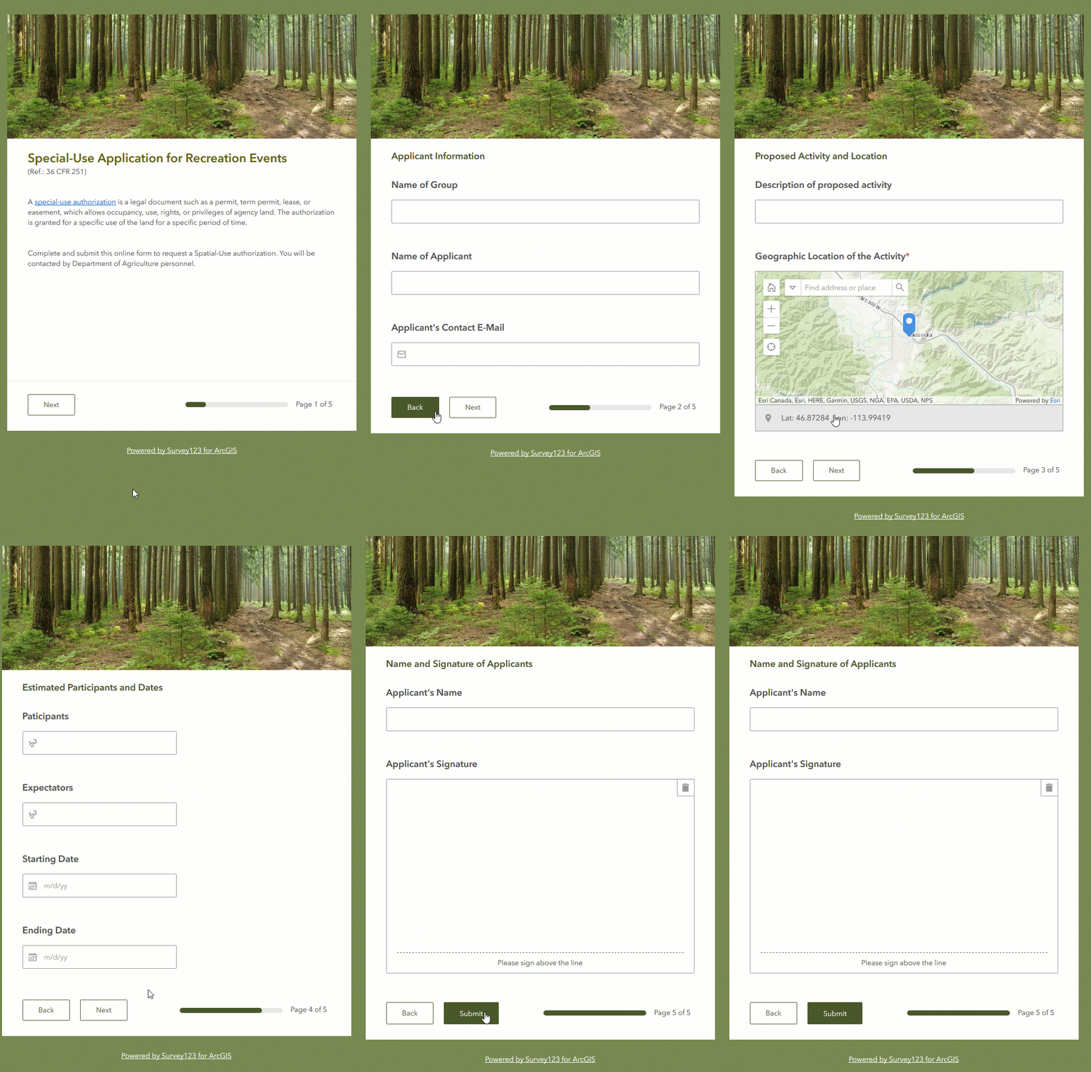
Even for smaller surveys, pages can be useful. In the example below we have a Special-Use application permit form. I added a welcome image and text on the first page to create a cover for the form. Note that the first page does not expect any input from the user. It is just a welcome page, or cover page to the survey. Next, I organized the actual questions within my form into pages, giving each page a descriptive title at the top. As users move from page to page, a progress bar at the bottom shows how close they are to the end of the survey.
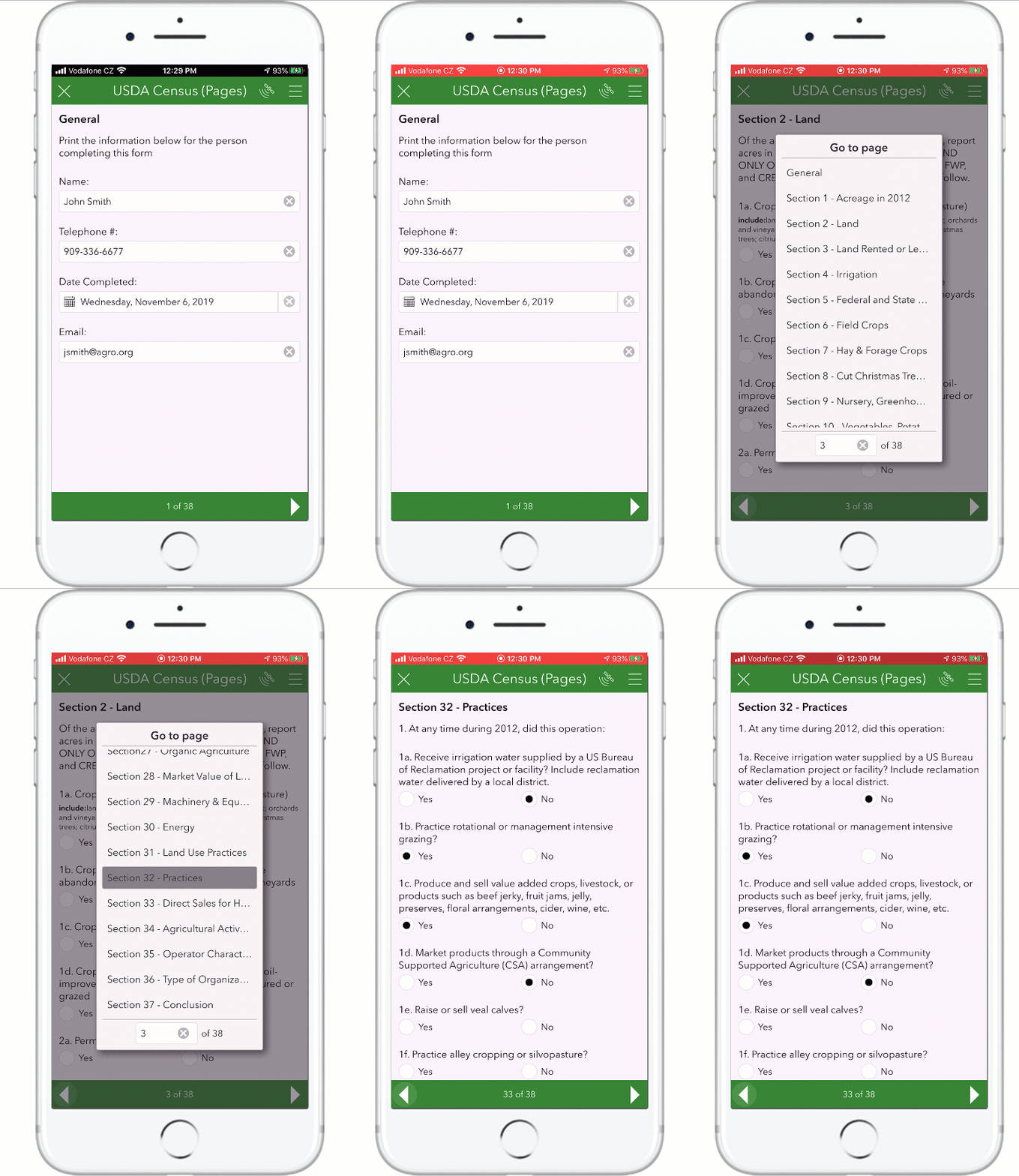
In the Survey123 field app, users can easily move through pages in the form one by one. Alternatively, a page menu lets users jump to any of the pages in the form with a simple selection. In the example shown below, the page menu helps the user jump from page 3 to 32 with just a couple of taps.
Pages: XLSForm basics
If you want to add pages into your form, firstly you need to set the style of your XLSForm to pages. This is done through the settings XLSForm worksheet as shown below.
Once the style is set, add one group for every page you want and set the appearance of the group to field-list. For example
When working with the pages style, it is good practice to have all questions within a page. That is: make sure all your questions in the form are within an existing group with an appearance set to field-list. If you leave questions outside of a page, you will get erratic behavior across the web and field apps where a single question may appear on every page.
You can combine groups and pages. That is, you can include groups within a page. Groups do not become pages unless you set their appearance to field-list.
All the header HTML formatting tricks described for groups above, also apply to pages. The same goes for the behavior with the relevant expressions. You can hide pages by using relevant statements, however keep in mind that the behavior across the web and field app is different. In the web app, non-relevant pages will be truly hidden, you will not even see them in the page navigator controls. This will cause the total count of pages in the page navigation control to vary as pages become visible or hidden. In the case of the field app, as of version 3.7, the pages will still show in the page navigation control, but will be shown blank. This is a known issue (BUG) in the field app.
Hidden (non-relevant) pages in the field app will be shown blank. This is a known issue as of version 3.7.
Grids
Grids: Introduction
Typically, questions within a form are arranged to take the full width of the screen. It is possible however to arrange multiple questions side by side using a grid layout. This is particularly useful when you are designing a form for use on a tablet.
With a grid layout, you can maximize the number of questions shown within the width of screen, reducing the need for users to scroll up and down. Grids can also help you mimic legacy paper forms. Copying the layout of paper forms is not necessarily a good idea, but in some cases achieving some level of resemblance can make nostalgic users happier.
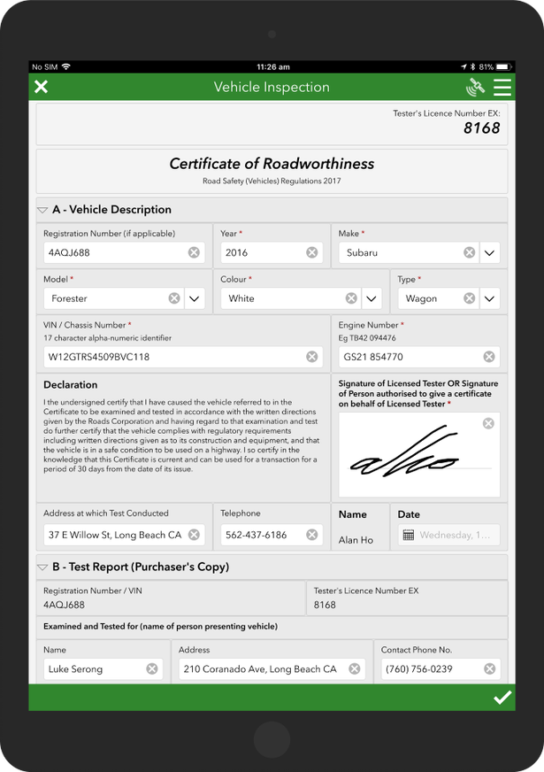
In the example below, you can see how questions can be arranged side by side. Crafting such a survey, defining exactly the placement of questions takes some thought and trial and error, but the experience it provides to the end user is significantly better than with a regular layout. This type of design is generally put together with a specific form factor in mind. That is, you design your survey for a particular minimum screen size. If a grid design like the one shown is loaded in a smart phone, the form is not going to look right. I have seen some people creating two flavors of the same survey: one for tablets and one for smart phones. It clearly adds an overhead during design, but if your survey questions are not going to change much it is a good thing to consider.
Grid layouts are not supported in the web app. This functionality is only supported in Survey123 Connect and field app.
Grids: XLSForm Basics
To arrange questions in a grid layout, you first need to set the style of your survey to either fixed-grid or dynamic-grid. This is done in the settings sheet of your XLSForm. We will get into the differences between these two styles later, but for now we are going to go with fixed-grid.
Once the grid style is set, all groups within your survey will contain questions using a four-column grid layout. You can change the number of columns in a grid by simply adding the w (as in width) property to the appearance column of your group. For example, w2 means two columns, w8 means eight columns.
Unless specified otherwise, questions within a group will always take one column of the grid. In the example above, the GPS Location and Address will be placed side by side in one row, and the City and ZIP Code will complete a second row.
Using the w property for the individual questions within the group, you can choose how many columns you want each question to take. In the example below, I gave two columns (one full row, since the grid has two columns) to the GPS Location question, and another full row (two columns) to the address. I then arranged the City and ZIP Code questions side by side giving them a w1 appearance.
When using a grid layout, questions outside of a group always take the full width of the screen. In the example above, the Household ID question is outside the group and as such, will take the full width.
Grid layout styles: fixed-grid and dynamic-grid
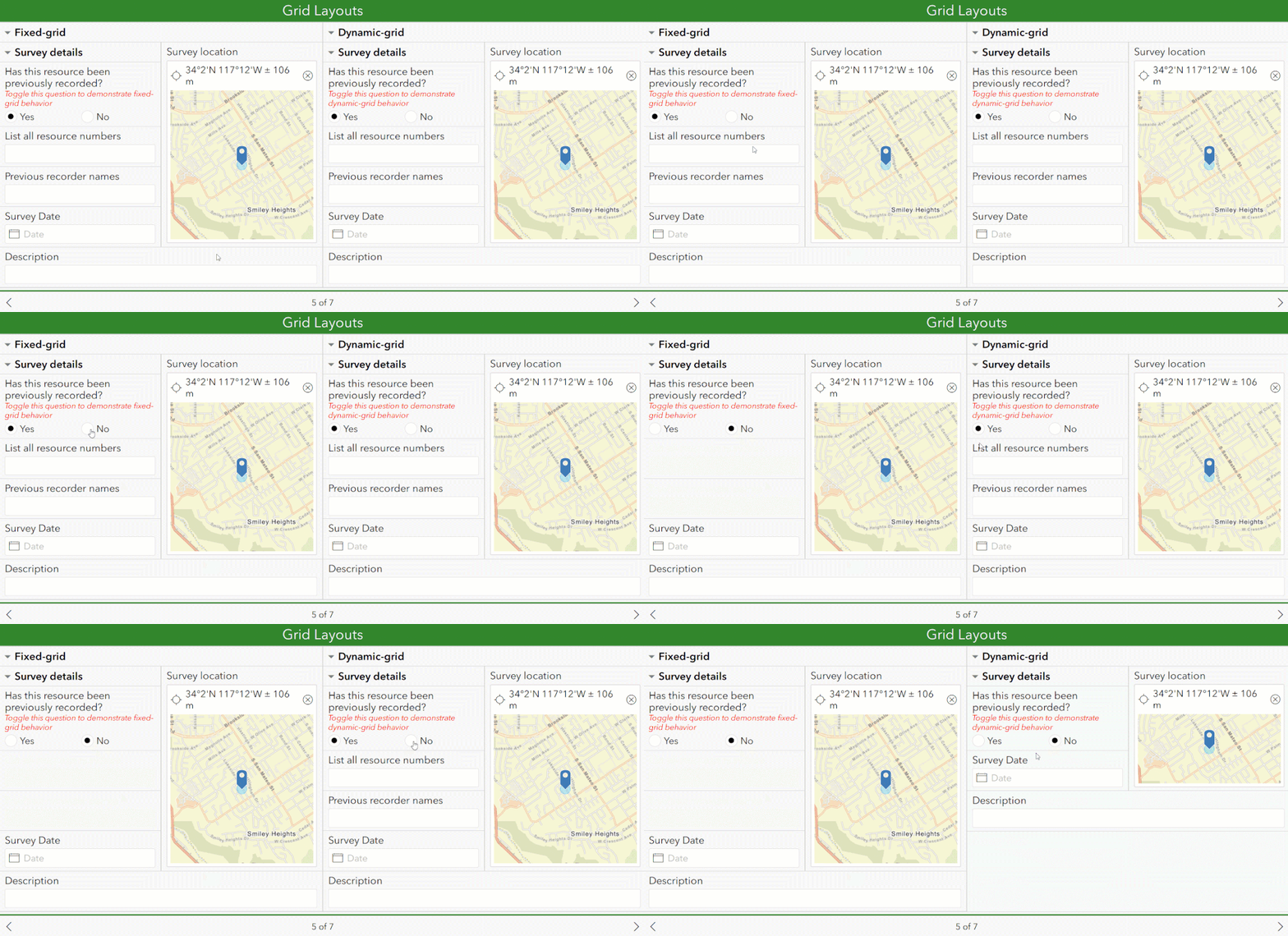
The difference between fixed-grid and dynamic-grid styles is how Survey123 questions are positioned within the grid. When using the dynamic-grid style, questions and groups may move around on the form in an attempt to make best use of the screen real estate. The fixed-grid style is more predictable. A question will appear if its relevant/visibility conditions are met, otherwise a blank space will occupy that part of the form. No questions will move or stretch to fill available space.
Here is an example showing how the two different styles behave. On the left side, the fixed-grid style is used. Note how the positioning of questions never changes, just their visibility. On the right side the dynamic-grid style is used. In this case, the Survey123 app attempts to optimize the positioning of the questions as they are hidden or shown.
The dynamic-grid style is equivalent to the theme-grid style in the XLSForm specification.
When you apply a grid style through the settings worksheet of your XLSForm, the style is applied to all groups within your XLSForm design. You can however overwrite the style for a group using the layout property in the body::esri:style column.
In the example below, the grid style for the Case_Info group is overwritten using the body::esri:style column.
Working with nested groups (and repeats) in grids
To work with nested groups (groups within groups) and repeats (a repeatable group of questions) in a grid layout, you need to specify not only how many columns you want for questions within a group, but also what you want the span of the group to be within its containing group. This is accomplished through the following syntax:
w<columns>:<span>
Grids: A few extra tips and things you should know
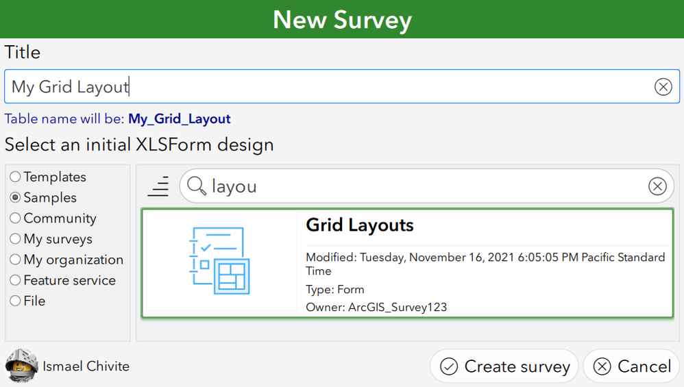
- Survey123 Connect includes a handy XLSForm sample called Grid Layouts. It shows some advanced techniques, including arranging repeats and geopoint questions side by side, combining pages with grids, etc.
- Working with grid layouts gives you a lot of flexibility, but mastering it takes time and trial and error. Always test your designs on a mobile device that you are targeting to make sure things look as you expect.
- Do not expect the grid layout, or questions within a grid, to automatically adjust to the size of the screen. If you do not give enough space to your questions, they will look ugly. For example, in practice, you can't work with more than 2 columns on a smartphone. Even when working with 2 columns you need to be careful when working on small screens: you need to keep the labels of questions and choices short and avoid question types like geopoint or dateTime which tend to take more space. Do not take this the wrong way, you can use 2 columns in a smart phone, but with caution.
- I know I said this before, but I will say it again: grid layouts are not supported in the web app. This functionality is only supported in the Survey123 field app.
- You can combine pages and grids. Simply set the style of your form as fixed-grid pages or dynamic-grid pages.
- When using a grid layout style, questions outside of a group (grid) will always take the full width of the screen.
- If you do not define a width (w parameter) for a group, the number of columns in the grid will be four (as in w4)
- If you do not define a width (w parameter) for a question within a group, it will default to w1.
- If using the fixed-grid style, non-relevant questions will still take space in your layout. If a question is non-relevant, you will see an empty space in your grid.
- Be careful with or_other. If you use a select question with the or_other option, your question will always take one extra cell (column). This is in anticipation that the end-user selects the 'other' choice. In that case, a new free text question appears, taking the extra space.
You cannot apply a width parameter to a repeat, but you can apply it to a group within a repeat. If you want to learn how to arrange repeats side by side, have a look at the Grid Style Groups XLSForm sample in Survey123 Connect.- The table-list appearance does not work in combination with theme-grid or pages.
- The body::esri:style XLSForm column can help you refine the height of questions. This can be useful, particularly when working with the theme-grid. For example, if you put a text and a geopoint question side by side, the layout will show unbalanced, because the text question by default is not as tall as a geopoint question. You can change the height of geopoint, geotrace, geoshape signature and multiline text questions. Learn more at Esri custom columns—Survey123 for ArcGIS | Documentation
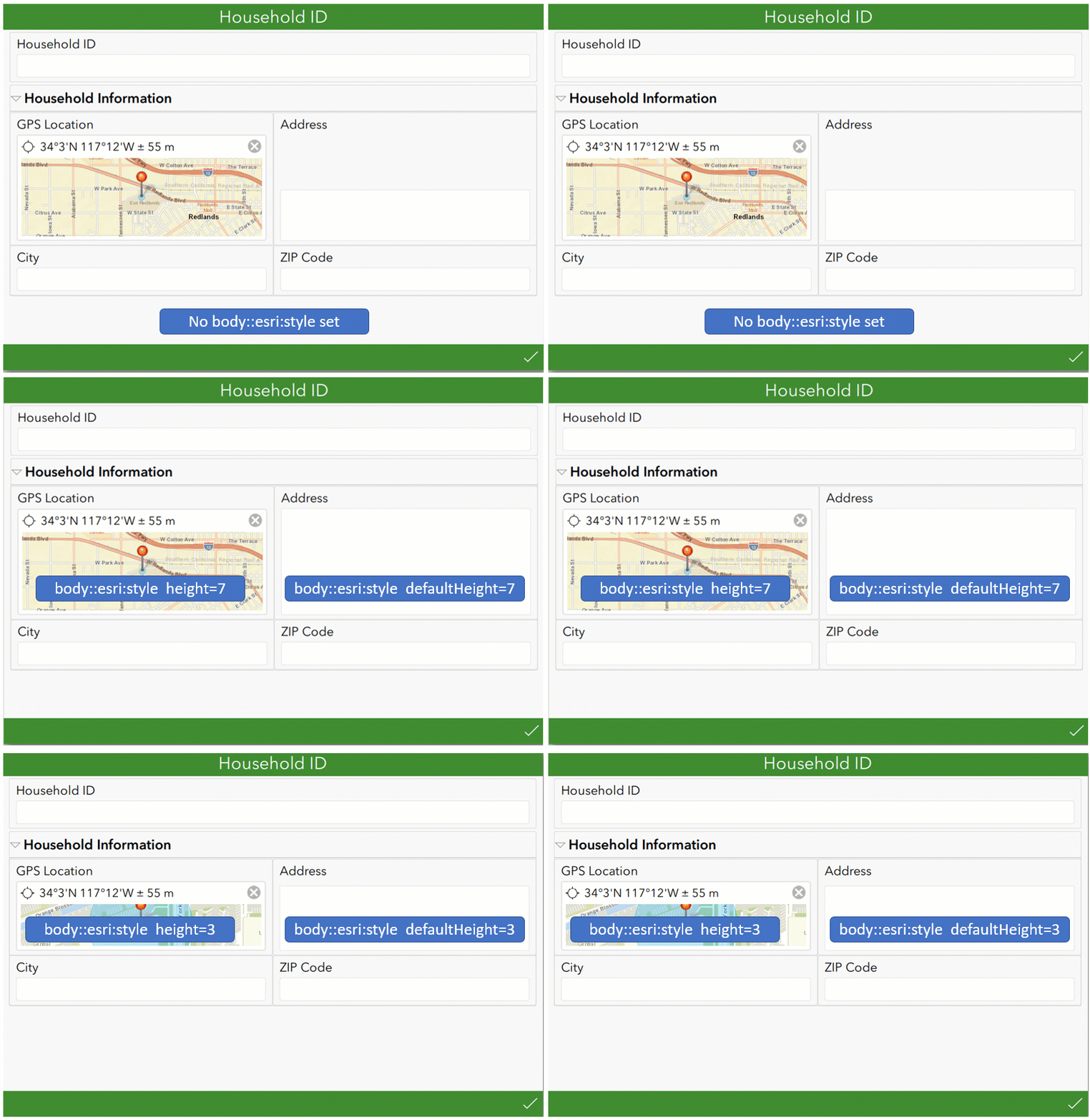
When using the body:esri:style column, keep in mind that some properties are not compatible with theme-grid. For example, borderColor is not supported (do you need border colors? If so Vote for this GeoNet idea), and repeats inside of grid style groups do not support backgroundColor either.
You must be a registered user to add a comment. If you've already registered, sign in. Otherwise, register and sign in.

