- Home
- :
- All Communities
- :
- Products
- :
- ArcGIS StoryMaps
- :
- ArcGIS StoryMaps Questions
- :
- Issues with display on Classic Shortlist replica t...
- Subscribe to RSS Feed
- Mark Topic as New
- Mark Topic as Read
- Float this Topic for Current User
- Bookmark
- Subscribe
- Mute
- Printer Friendly Page
Issues with display on Classic Shortlist replica template
- Mark as New
- Bookmark
- Subscribe
- Mute
- Subscribe to RSS Feed
- Permalink
- Report Inappropriate Content
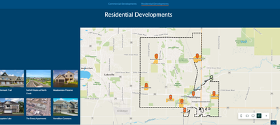
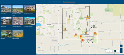
I used this resource to create a StoryMap template similar to the "Shortlist" layout from the classic templates. My issue is that when turning on Story Navigation (7:00 mark in the tutorial video), clicking on the headings doesn't display the grid icons in a visually pleasing way. Instead of all of the grid icons being centered on the screen upon clicking the heading, you have to scroll to view all of the icons. The map is also not fully in display and you're required to scroll a bit to see the entire map window. At 8:46 in the video, you can see what I mean. Is there any way to fix this? The classic Shortlist layout visually compartmentalized things better.
I've tried to replicate this layout in Experience Builder but haven't had much luck.
What the layout looks like when you click on a section:
What I wish it would look like:
- Mark as New
- Bookmark
- Subscribe
- Mute
- Subscribe to RSS Feed
- Permalink
- Report Inappropriate Content
Hi @dolson_farmington ,
This isn't something that can currently be changed within the Map Tour. This has been requested in the past and is on our radar as a potential enhancement down the line.
We can see the reasoning for wanting to have the locations top aligned in some scenarios, though the reasoning for centering the locations on the narrative panel is to allow the locations to be scrolled through and keep the map static. Without the spacing at the top, the scrolling would be less dynamic and that map tour would be set in place within the story.
Thank you for bringing this behavior up! You could potentially embed another ArcGIS app like you mentioned, but I'm not sure which could give this alignment you're looking for. I'll let you know if I see any that could give a similar layout.
--Abby

