- Home
- :
- All Communities
- :
- Products
- :
- ArcGIS Online
- :
- ArcGIS Online Questions
- :
- Extract data from ArcGIS Web App
- Subscribe to RSS Feed
- Mark Topic as New
- Mark Topic as Read
- Float this Topic for Current User
- Bookmark
- Subscribe
- Mute
- Printer Friendly Page
Extract data from ArcGIS Web App
- Mark as New
- Bookmark
- Subscribe
- Mute
- Subscribe to RSS Feed
- Permalink
Hi,
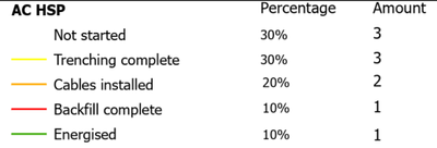
I have an issue with ArcGIS Web Appbuilder. A project have been set up to monitor the construction of solar parks with Field Maps and Web Map Application for a customer. Different objects like "solar panels" and "AC cables" have been giving various status attributes like "not started" and "energised" for example. The different attributes are symbolized with different colors for easy display of the construction site. They request a possibility to either print a map where the count of objects that have a specific status attribute can be shown in the legend or this data to be extracted/exported as a table, bar graph, or likewise. A table like the first example below would be just great:
The problem is that I can not find any widget, print setting or dynamic text with a custom print setting to do this.
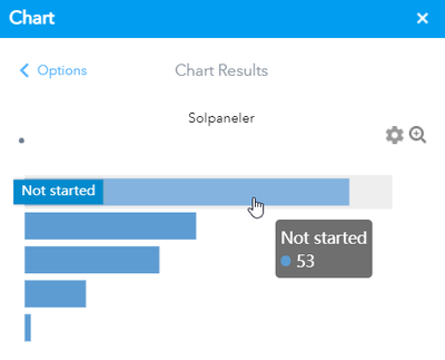
When using the Chart widget I can not get the colors to match the status symbology on the bars and no setting to add labels to the bars unless you hover with the mouse over a specific bar. If is is possible to add labels and adjust colors to match the symbology, a solution could have been to just print screen this since the widget does not seem to have any extract/export tool ready:
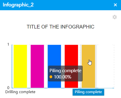
Next up is the Infographic which has similar problems but here I am able to match the color symbology to the bars but they all show 100% and you need to hover with the mouse to see the label:
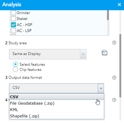
After that I have tried the analysis tool and set it to "Extract data", but there is no option to extract a count summary including symbology or legend, etc. Just CSV, shapefile, kml, and fgdb. None which makes any sense in this case:
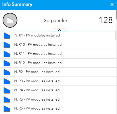
The Info summary widget does not seem to able to count each attribute in each feature and just displays a list of all features:
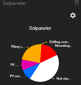
Pie charts do not display the percentage unless you hover the mouse over each slice, but symbolizes the colors correctly:
I've tried all widgets but the ones above are my "usual suspects". Also tried to make it work with dynamic text in ArcGIS Pro but I can not find a solution and at this point I think I'm going bald trying. It seems like this task should be reasonable, fairly simple, and a straight forward thing to do, right!?
Unfortunately I'm not experienced with programming which otherwise could have been the solution.
Much grateful for any tips, tricks, workaround, or just random replies at this point 🙂
Thanks!
