- Home
- :
- All Communities
- :
- Products
- :
- ArcGIS Hub
- :
- ArcGIS Hub Blog
- :
- Make your site dynamite with Calcite Design
Make your site dynamite with Calcite Design
- Subscribe to RSS Feed
- Mark as New
- Mark as Read
- Bookmark
- Subscribe
- Printer Friendly Page
- Report Inappropriate Content
ArcGIS Hub and Enterprise Sites (11.2 forward) support Calcite Design System components within the Text card. This gives site and page editors a simple way to add a variety of interactive elements to their site layouts. Calcite components are a “distributed set of composable, purpose-built web components for building great web experiences” (Developer documentation).
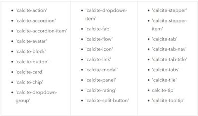
In the Text card, you can use nearly 30 different Calcite components. For layout editors, these components are easier to modify and maintain than the HTML snippets previously used. For site visitors, the components contribute to a clean, efficient, and positive user experience.
Calcite components supported by Hub and Enterprise Sites
Look to the Calcite documentation for recommended uses, code samples, best practices (including Accessibility), and more for each component. Under “Overview,” you can find a description and purpose of the component, as well as other components to use with it. The “Usage” section provides suggestions on when to use the component.
Within “Sample,” you may want to browse examples to find one close to what you want to do. Try out the different options in the “WYSIWG” component editor; your changes will appear in the preview and in the code.
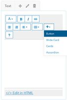
When you have a suitable block of code, copy the code snippet. In Hub, paste the code into the HTML editor of your Text card to refine. Within the Text card, four Calcite components are readily available from the Insert "+" dropdown menu (Button, Wide Card, Cards, and Accordion).
Insert component menu on text card
Buttons
Buttons and Links are functionally different. Buttons indicate that the user can take some action or perform a task such as “Download.” Buttons may include a link.
Use a Link for users to navigate to another location, such as “Resources,” a section within a page via an anchor link, or to a different page within a site.
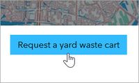
Calcite button with link live
Calcite is in action when creating a button with a link, so you need to edit the underlying HTML; do not use the link tool.
In the href tag, enter URL in place of # and link text in place of Button (“Request a yard waste cart” in the example).
Button code: <div><calcite-button href="#">Button</calcite-button></div>
Wide card and Cards
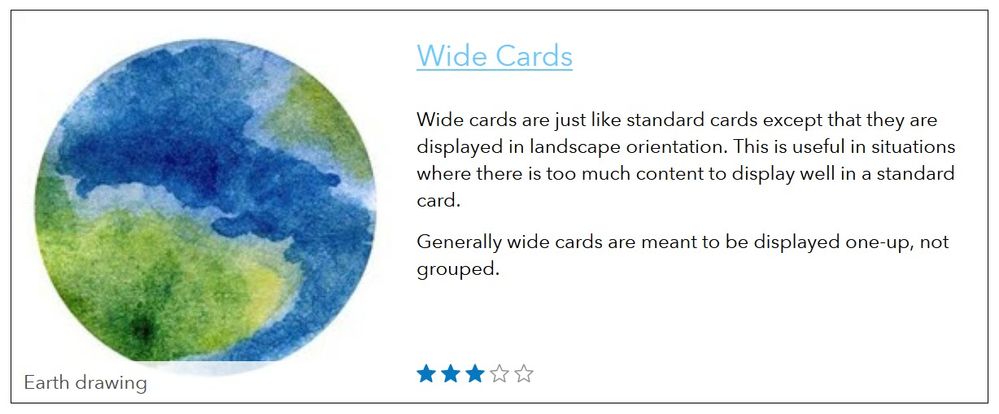
Cards are rectangular containers that can hold buttons, images, and other content. The Wide card and Cards options are customized versions of the Calcite “Cards” component. Wide cards are essentially the same as a regular card but appear in landscape format.
Calcite Wide card live
Calcite Wide card code
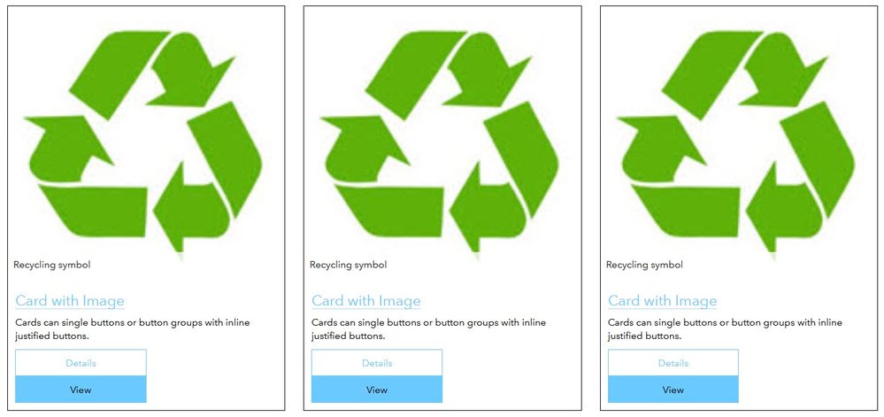
The Cards option adds three cards to the row card in the layout. You can add images, text, and singular or grouped buttons.
Calcite Cards live
To add images to a wide card and the cards template, the most common workflow is to use the URL of an image hosted online. Don't forget to add alt text for screen readers and captions.
Accordions
Accordion components organize related text and can improve navigation on your sites and pages. They shorten pages by collapsing menus and lists and reduce unnecessary scrolling. Accordions are useful for adding frequently asked questions.
Calcite Accordion code
Repeat the accordion item tag <calcite-accordion-item></calcite-accordion-item> and attributes to add more sets of text to your list.
Calcite Accordion video
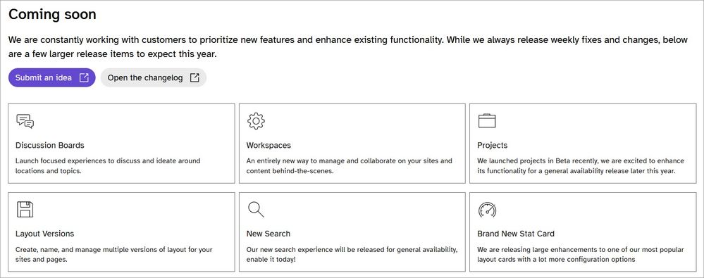
Calcite Tiles live
In this example from a Hub site built for the User Conference, you can see the use of Calcite Tiles and Buttons (with theming and rounded corners from Calcite).
Code for three of the tiles:
<div>
<div style="margin-top:1rem;display:grid;grid-auto-flow:column;grid-auto-columns:1fr;gap:0.5rem;">
<calcite-tile heading="Discussion Boards" description="Launch focused experiences to discuss and ideate around locations and topics." icon="speech-bubbles"></calcite-tile>
<calcite-tile heading="Workspaces" description="An entirely new way to manage and collaborate on your sites and content behind-the-scenes." icon="gear"></calcite-tile>
<calcite-tile heading="Projects" description="We launched projects in Beta recently, we are excited to enhance its functionality for a general availability release later this year." icon="projects"></calcite-tile>
</div>
More ways to use Calcite
Here are some other ways to utilize Calcite components in Hub (in order from more to less applicable, and from more to less complex).
- Use calcite-tabs + tab-nav + tab-title + tab to separate content into separate tabbed sections.
- Modify a calcite-button with dropdown + dropdown-group + dropdown-item to provide multiple options from a single button.
- Combine calcite-link and calcite-tooltip to add in-line annotations within text.
So, integrate some Calcite to make your site more lean and light. For more information and detailed workflows, consult the Hub web help and Enterprise Sites web help. Thanks for reading!
You must be a registered user to add a comment. If you've already registered, sign in. Otherwise, register and sign in.
