- Home
- :
- All Communities
- :
- Products
- :
- ArcGIS Experience Builder
- :
- ArcGIS Experience Builder Questions
- :
- ArcGIS Experience Builder- Issue with list widget ...
- Subscribe to RSS Feed
- Mark Topic as New
- Mark Topic as Read
- Float this Topic for Current User
- Bookmark
- Subscribe
- Mute
- Printer Friendly Page
ArcGIS Experience Builder- Issue with list widget sizing
- Mark as New
- Bookmark
- Subscribe
- Mute
- Subscribe to RSS Feed
- Permalink
- Report Inappropriate Content
Hello EB team,
We're recently noticed an issue with the Experience builder list widget. The list is set to pages, and height is set to auto. When filtering the list the size of the list widget does not shrink leading to an excessively long page design.
If we shrink the text box or use custom size, the text box opts for a scrollbar leading to a double scrollbar effect on the webpage (not ideal for UX).
Is there any workaround or planned fix for this?
Thanks,
Amanda Huber
- Mark as New
- Bookmark
- Subscribe
- Mute
- Subscribe to RSS Feed
- Permalink
- Report Inappropriate Content
I think you are talking about two different questions.
Regarding #1, I can't reproduce your problem. I added a multi-page list widget and when the filter is applied, the list widget does shrink as expected. Which version of Experience Builder are you using?
For #2, the double scrollbar only shows up in edit mode, and at runtime, an arrow appears in the text on hover.
Regards,
Shengdi
- Mark as New
- Bookmark
- Subscribe
- Mute
- Subscribe to RSS Feed
- Permalink
- Report Inappropriate Content
Hi @ShengdiZhang ,
Thank you for your response. I'll add some additional details below:
#1- We are using ArcGIS Online's Experience Builder. To clarify- auto height does shrink to size (but still has issue in #2), custom size does not shrink to filtered area.
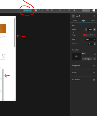
#2- In live view we see the double scroll bar when set to auto:
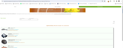
and out of edit mode we also see this double scroll behavior:
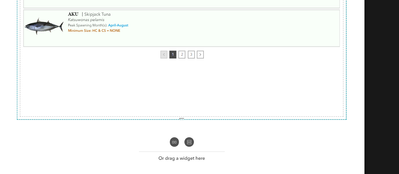
The container for this list is much larger than the list as well therefore there should be no reason for a double scroll:
Thank you,
Amanda
- Mark as New
- Bookmark
- Subscribe
- Mute
- Subscribe to RSS Feed
- Permalink
- Report Inappropriate Content
Hi @Amanda__Huber ,
The maximum value of the auto height of the list is limited to one screen height, because without any limitations it can lead to many errors.
One solution is to set a proper custom height for the list widget. For row, multi-page lists, the height should be around [Item height * Items per page + Vertical spacing * (Items per page -1) +30] in px.
However, if the list items are filtered to only one or two records, there will still be some extra spacing.
Regards,
Shengdi
- Mark as New
- Bookmark
- Subscribe
- Mute
- Subscribe to RSS Feed
- Permalink
- Report Inappropriate Content
Hi @ShengdiZhang ,
I'm not clear what that formula is, nor do I see that in the EB's documentation.
That being said, I've included a screen recording of what we're seeing for the list widget with a multi page setting and custom height . Please let me know if this is the behavior you see on your end as well.
Thank you,
Amanda Huber
- Mark as New
- Bookmark
- Subscribe
- Mute
- Subscribe to RSS Feed
- Permalink
- Report Inappropriate Content
Hi @KatieGaut ,
The current behavior is by design, as the list widget has a fixed height, so filtering the list does not modify its height. What I'm suggesting is to decrease the number of items per page for the list widget to reduce the noticeable spacing.
Additionally, after reviewing your app, an enhancement we could make in the next release is removing the maximum height restriction on multi-page lists. This would prevent scroll bars and extra spacing from appearing if the multi-page list height is set to auto.
Regards,
Shengdi


