Hi there,
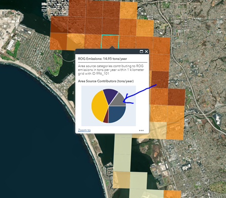
i created a pie chart to display the data within the features in pop-up media in ArcGIS Portal. I would like to modify the color schemes in the pie charts but i can't seem to find a way to do so. Basically, instead of different colors on the pie chart as shown on the image below, i wanted to make more customize e.g. gradient of purple color scheme, gradient of orange color scheme. Can anyone please help out? thanks!
-Jenny