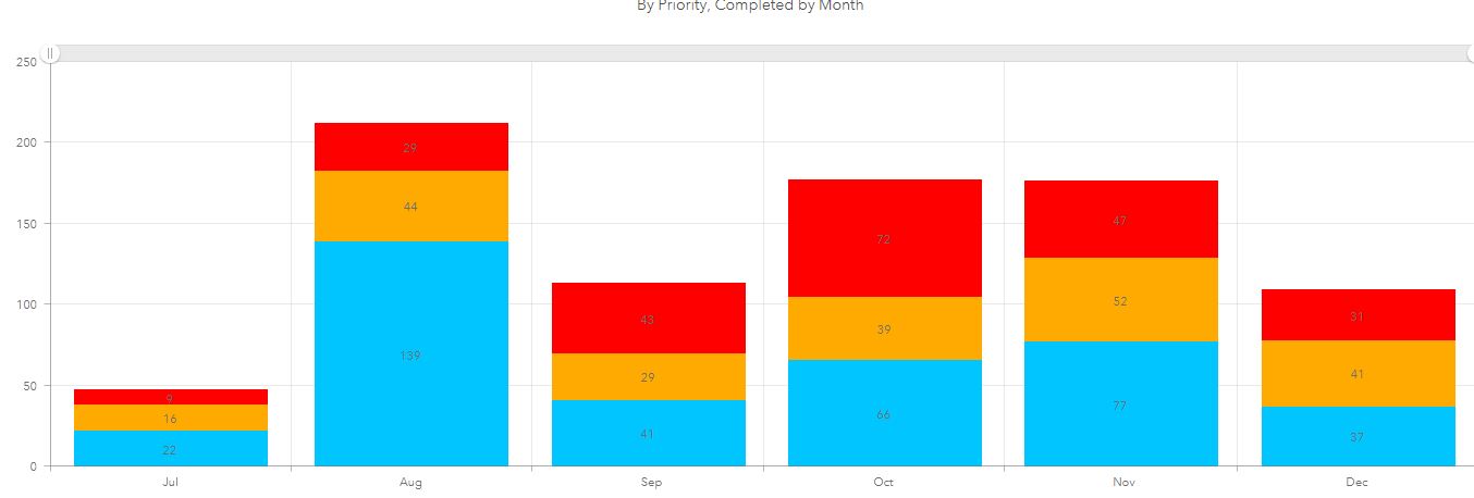
I have a panel in a dashboard showing the total orders completed by month in a bar chart. Each bar is divided into 3 sub categories showing total number of priorities. When I show all months the chart is stacked as
Priority 3 (red)
Priority 2 (orange)
Priority 1 (blue)
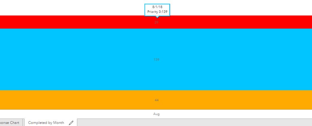
If I change to show a specific month the single bar re-arranges the sub categories seemingly randomly. For August I might get (starting from the top) red, blue, orange. For October it is orange, blue, red. I thought it might be ordering (ascending or descending) by the total number in each category but that is not the case.
Is this a known issue? Is there a way to preserve the order?