I've been having some difficulty with gauges in my dashboard. When ungrouped, they would occasionally show incorrect visual references when the dash was first loaded, but corrected themselves after a refresh. While grouped (shift+click+drag), they consistently show incorrect references, despite displaying correctly while still in the dashboard editing interface.
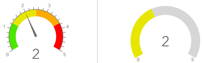
Below are two examples from the editing interface, showing how they're supposed to look. These gauges are grouped together in the dashboard. The progress-style gauge on the right has the same thresholds as the one the left (green, yellow, orange, red, every 25%).
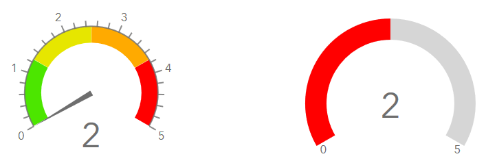
Below is how these same gauges appear in the dashboard after it's saved and accessed directly. Even though the correct number is being shown, the visual reference is incorrect. The meter-style gauge always defaults to 0, while the progress-style gauge defaults to 50% while showing an incorrect threshold color. Unlike when they were ungrouped, no amount of refreshing the dashboard will correct the data shown on these gauges.
Is this a bug? Is someone else able to reproduce this?


