I have some WebApp Builder based Dashboards that I need to migrate to ArcGIS Dashboards and one WAB chart has me frustrated and the Dashboards help is useless. These are the settings of the WAB chart:
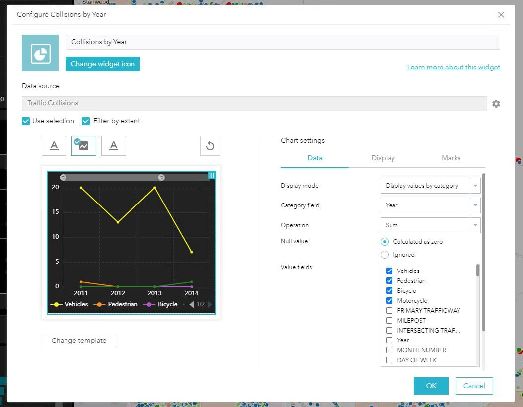
I've added a serial chart in Dashboards and have the categories from Grouped Values option specified but I can't seem to break out the chart values across 4 different fields like I have in the WAB chart (Dashboards doesn't seem to support it summary by more than one field).
If I select categories from features, I can kind of replicate the chart but the values shown don't seem correct. What am I missing?
Steve