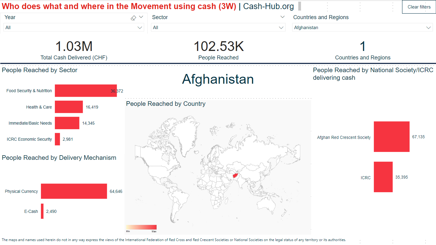
I would like to be able to show dynamic text data in a Dashboard. When I create dashboards in PowerBI I use the "Card" visualisation:
A single number, such as total sales, market share year over year, or total opportunities, is sometimes the most important thing you want to track. A type of visualization in Power BI called a card may be the best way to view that number.
https://learn.microsoft.com/en-us/power-bi/visuals/power-bi-visualization-card?tabs=powerbi-desktop
Microsoft's summary suggests this is only available to use with numerical data, but it isn't. I use "Cards" as big, obvious labels that tell end-users what data is being shown on the visualisation. Below is an example of using a "Card" with text data. The card is the Country name, which changes based on the data selection:
The closest comparable visualisation widget in ArcGIS Dashboards is, as far as I can see, the "Indicator", however this only accepts numerical values:
An indicator is a card that you can add to your dashboard to show the numeric attributes of individual features or display a summary statistic. Indicators can also be used to compare the calculated value to a reference value.
https://doc.arcgis.com/en/dashboards/latest/get-started/indicator.htm
Thus, I am unable to create a similar label in ArcGIS Dashboards. I would really like to be able to do so!