Hello
I'm trying to make a time vs. company fee chart to display how my company's consulting fee's have fluctuated over the years (I'm working with mock values for now).
I would like it to look something like this:
 (this screenshot is from this Esri events video. Time stamp 7:30 https://youtu.be/50zlRRvygYA)
I attempted to follow the same process with my fee values. However, when I go to 'Series' -> 'Type' -> 'Line' and then turn on 'Connect gaps' this occurs:
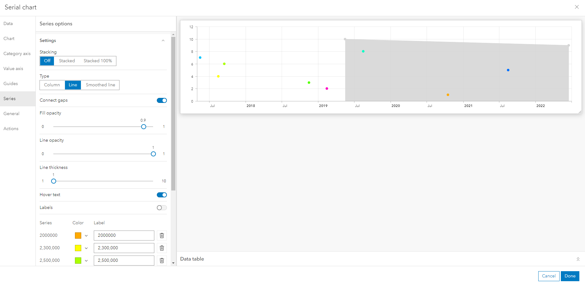
The grey points are the only two projects that have the same company fee (15,000,000) and they are the only two points that connect. The second problem is when I adjust the 'Fill opacity' only half the points are included in that fill.
My two questions are:
1: Is it not possible to 'connect gaps' when you have two or more points with the same value?
2: Why are only half the data points included in the shading and the other half excluded? I've been trying to play "spot the difference" to determine what the unshaded points have that that unshaded points don't but I haven't been having much luck - perhaps there is something I've been overlooking in my survey responses that may lead me to some solution.
Any suggestions would be helpful. Thanks !