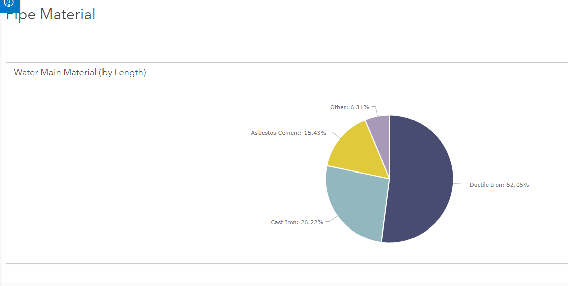
I'm creating a pie chart on an ArcGIS Hub page. There are six categories that I want to display in my pie chart, but when I build the chart, three categories are grouped together in an Other category.
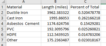
Here is the Excel spreadsheet that I've uploaded to AGOL to create the feature layer which feeds the pie chart:
However, this is how the chart renders when I use Material as my Category and Length as my Value for the pie chart:
I've also tried using the JSON option to specify my chart definition as follows:
{
  "type": "pie",
  "datasets": [
    {
      "name": "dataset1",
      "query": {
        "orderByFields": "Length__miles__sum DESC",
        "groupByFieldsForStatistics": "Material",
        "outStatistics": [
          {
            "statisticType": "sum",
            "onStatisticField": "Length__miles_",
            "outStatisticFieldName": "Length__miles__sum"
          }
        ]
      },
      "url": "URL WOULD BE HERE, BUT I REMOVED"
    }
  ],
  "series": [
    {
      "source": "dataset1",
      "category": {
        "field": "Material",
        "label": "Material"
      },
      "value": {
        "field": "Length__miles__sum",
        "label": "Length (miles)"
      }
    }
  ],
  "style": {
    "padding": {
      "top": 30,
      "bottom": 10
    },
    "pie": {
      "expand": 0
    },
"colors": [
      "#484C70",
      "#93B7BE",
      "#E0CA3C",
      "#A799B7",
      "#048A81",
      "#CD8987"
    ]
  }
}
However, I couldn't find any documentation that specified how I might add additional slices to my pie chart. If anyone has experience doing this, I'd greatly appreciate some help. Thanks