Hi all,
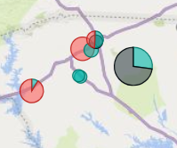
I have a long list of suppliers with lat and long and what they supply in different categories. I want to show a map of all suppliers with bubbles representing total volume per geographic location and divided into the different categories, ie a pie chart instead of a normal bubble.
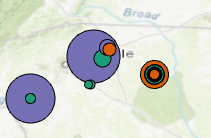
I can make this display in Power Bi as per below example and want to reproduce this in ArcGis Pro but cannot find a way. I keep getting multiple bubbles per geographic location.
Wanted state:
ArcGis representation:
Any ideas?
Best,
Marcus