I've created a search widget using JS 3.17
Our app is wrapped up in bootstrap
I'm using chrome dev tools to test the look and functionality in various mobile formats and I've noticed that the input text box does not seem to be responsive. I changed the CSS width of the classes .arcgisSearch .searchGroup .searchInput from pixels to a percentage thinking that would help but the size of the search input box remains fixed. Am I missing something? Has anyone found a work around to this?
View in iphone 6 (how it should look)
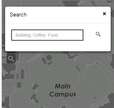
View representing iphone 5 - the search button gets pushed down
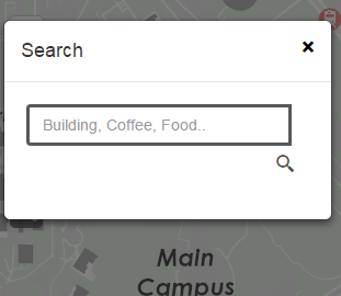
View in responsive mode: here you can see that the text box stays fixed
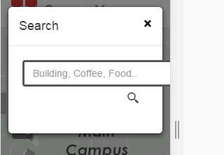
CSS
.arcgisSearch .searchGroup .searchInput {
  position: relative;
  z-index: 2;
  margin: 0;
  float: left;
  display: block;
  height: 20px;
  width: 100%;
  padding: 6px 24px 6px 12px;
  font-size: 14px;
  line-height: 20px;
  color: #4C4C4C;
  background-color: #fff;
  border: 1px solid #57585A;
  -webkit-border-radius: 4px 0 0 4px;
  border-radius: 4px 0 0 4px;
  -webkit-transition: width .175s ease-in;
  -moz-transition: width .175s ease-in;
  -ms-transition: width .175s ease-in;
  -o-transition: width .175s ease-in;
  transition: width .175s ease-in;
  -moz-box-sizing: content-box;
  -webkit-box-sizing: content-box;
  box-sizing: content-box;
}


