ArcGIS Online just received a pretty major update on 6/24 and I wanted to take a minute to highlight just 3 of the updates and relate them to university/higher education use cases. These highlights cover both administrative and academic concepts, so buckle up!
Administrative updates
While I feel like I am ‘cheating’ a little bit by saying this is 1 update (of the 3)… let’s just go with it. I really just wanted to make sure everyone is aware of some of the latest features to make your lives easier when managing large numbers of student and university users.
One of the biggest ones… although I know it’s a bit late for many of you because we’ve talked on the phone through it… is the ability to turn existing named user accounts into SAML accounts. In the past, when SAML was enabled for an organization, it would end up creating duplicate accounts for users, so those days are now gone. You can now setup SAML and have existing user accounts that will now use that SAML login process.
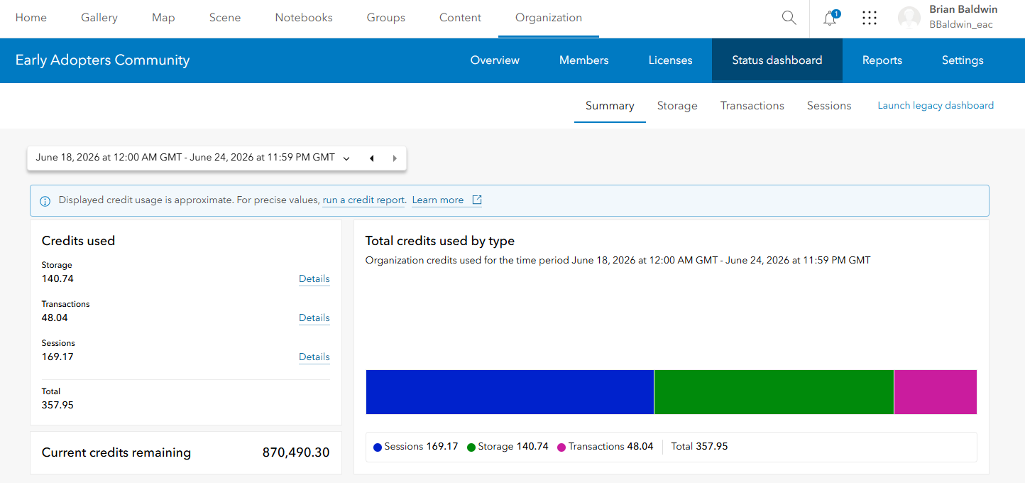
An enhancement that is now available as a general release, is the organization status dashboard. I have reviewed this with a lot of customers and people have been really happy with it. You can now select ‘Organization’ and then ‘Status dashboard’ to see the new tool.
The only ‘gotcha’ is to ensure that you set the timeframe for your report in the upper left-hand corner, then, all of the metrics will reflect that span of time. It’s a great way to see what and who are burning through your credits and storage.
AI Assistants in General Availability
There have been a wide-range of AI assistants that have been getting released across the ArcGIS technology stack, from Survey123 to Business Analyst to StoryMaps. While a lot of faculty and students have been excited about some of these releases, we have heard from a number of universities that ‘beta’ functionality is not typically enabled per IT policies. So… some good news for this release is the Survey123, Business Analyst, and the translation assistant are now in general availability.
One of the assistants that I have used a lot (and is a great one to start with) is the Survey123 assistant. Unlike a prompt to a 3rd party LLM (ChatGPT or Claude) to ‘build you a survey based on XYZ’, the assistant is just part of Survey123, which can help students think through survey design using natural language, and then immediately see those results. If students are collecting campus accessibility issues, tree inventory information, pedestrian safety observations, or field notes, an assistant can help them move from “I need a survey” to a better-designed survey faster. I like the idea of having a standard data collection problem and then seeing how students build their prompt and then refine, structure, and re-structure the survey/data model.
A different application that I constantly remind the academic community about is Business Analyst Web. The ease of use and accessibility to such a rich trove of data impresses me every time I use the tool. With the Business Analyst assistant, my hope is that students and faculty can now dive more quickly into discovering workflows, data, infographics, and insights. In any classroom setting where students are learning how GIS supports site selection, retail planning, market areas, or economic development. Instead of spending all their time figuring out where to begin, students can start asking better questions: Who lives near this proposed location? What services are nearby? How does one neighborhood compare with another?
A common industry use case would be a local government planning department evaluating where to expand community services. A GIS analyst might need to understand population characteristics, access to transportation, nearby facilities, and neighborhood-level trends. The Business Analyst assistant can help guide that exploration, while the student still needs to interpret the results and decide what is meaningful.
Interactive Maps + Interactive Charts = Better
ArcGIS Online has been receiving a lot of updates related to imagery over the past year, with the ability to host more imagery types, build raster analysis workflows, and ready-to use analysis layers in the Living Atlas. Students entering GIS, planning, environmental science, agriculture, public safety, or climate-related careers need to understand how imagery can be explored and analyzed. The update that brings interactive charting for imagery layers into Map Viewer helps make that more approachable.
With this capability, students can create charts such as histograms, bar charts, and scatter plots from imagery layers and see results as they explore the map. That gives students a more direct way to connect what they see visually with what the data values are telling them.
A great example is an inquiry I see included in a lot of courses: urban heat analysis. Students could use imagery to compare areas with dense tree canopy, impervious surfaces, and different land cover types. Interactive charts can help reveal how pixel values vary across neighborhoods or land cover classes, which can help with a richer exploration of environmental justice, public health, and urban planning vs. what ‘just’ the map provides.
Another example is monitoring landscape change. Students could explore land cover or vegetation patterns before and after a wildfire, flood, drought, or development project. The chart becomes a bridge between the image and the analysis, helping students move beyond “this looks different” toward “the data shows this pattern.”
In a GIS or remote sensing course, this could be used in a lab where students compare imagery across different places or time periods. Faculty could ask students to use Map Viewer to explore an imagery layer, create an interactive chart, identify a spatial pattern, and write a short interpretation. This is especially helpful in introductory courses because students can begin working with imagery in a web environment before moving into more advanced raster analysis in ArcGIS Pro.
Close
That’s it! There were a lot of updates in this release, let us know if there are any others that I should have highlighted! What updates or enhancements have helped make your life a bit easier or concepts a bit more fun to teach and explore.
