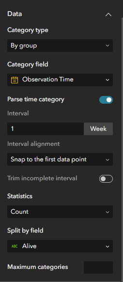
I'm working on an Experience Builder app hosted on ArcGIS Online. The app has a map with bird observation points, among other layers. The app also has a bar chart aggregating that same Bird Observations layer. The category is the observation time, it's parsed into one-week intervals, and features are grouped by whether the birds observed were alive or dead. See below:
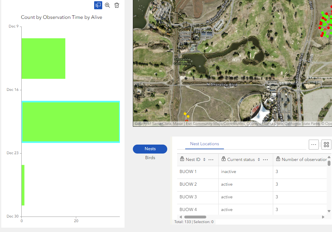
The chart looks fine, but I can't seem to get it to filter the map features. I want people to be able to select the bar for the week they are interested in and filter the map to show only those observations.
I have set a message trigger where the trigger data is the output view of the chart and the action data is the Bird Observations layer. The matching field is the same for the trigger data and the action data.
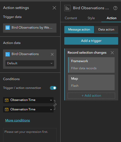
I have also tried multiple other variations of this configuration, but no matter what I do, I can't get the chart selection to filter the map features. (Don't judge these colors... I'll work on making it pretty after I get it to work.)
I have referred to this documentation and I believe I'm following all the recommendations: Chart widget—ArcGIS Experience Builder | Documentation
Does anyone have any advice? I'm out of ideas. Thanks in advance and happy new year!