Hello,
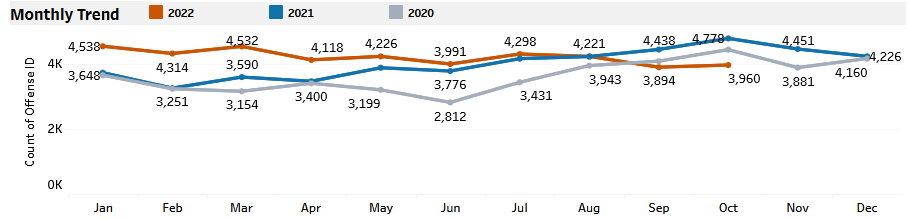
I am trying to create a line graph in ArcGIS Dashboards that shows a monthly crime trend. I am trying to make each line a different year with month on the x-axis and incident count on the y-axis, similar to this chart:
However, in Dashboards the closest I can get is this:
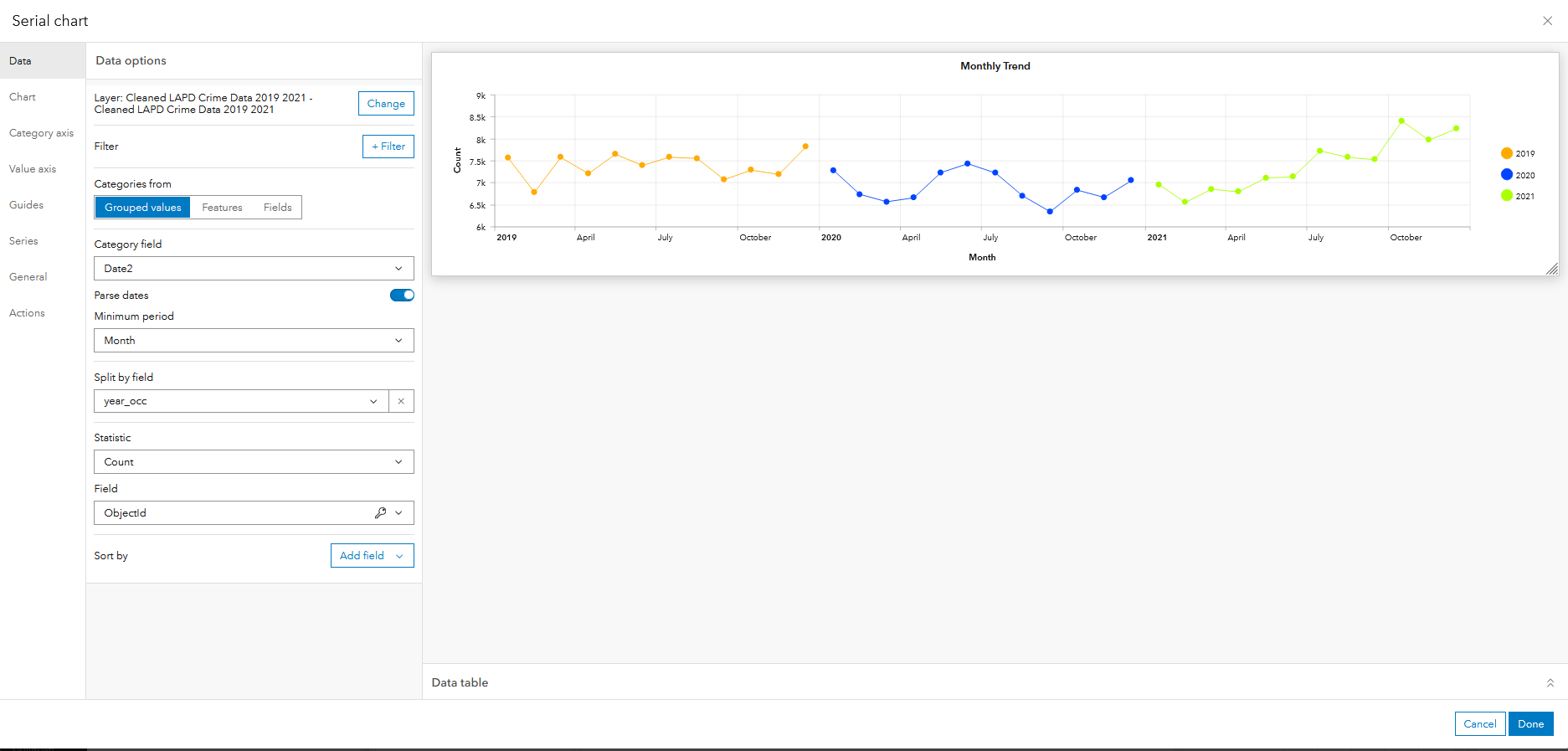
Is there a way to format it like the first chart? Any help would be appreciated. Please let me know if you need additional information.
Thank you