Hi, Somewhat new to building dashboards and I'm wanting to replicate the functionality of this example: https://www.arcgis.com/apps/dashboards/5e437e3c179241d499b5b1ad87d5f360
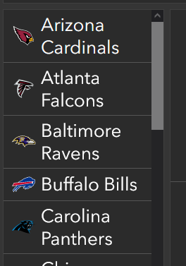
On the far left side there is a list of different teams and as you click on each, a filter is applied to other elements of the dashboard such as pie charts, and lists.
How was that filter list created in the example? What type of dashboard element is this? My web map feeding the dash has a single feature class with a names field that I'd like to use as a filter - similar to the team name in the example.
Any help is much appreciated!
Thanks,
Jason


