Any chance we can get some rhyme or reason in the font style pulldown?
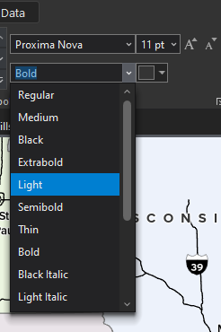
I can never find what I'm looking for. Some typefaces, like this one, have upwards of a dozen styles to choose from and they are ordered seemingly randomly. It takes way longer than it should to find what you need. Most of the time when selecting an alternate weight, I'm looking to go up or one down, or I'm looking for one in particular. When they're jumbled like this, it takes more time than necessary. Despite showing a cursor, you also can't type to select one like you can for every other pulldown that allows for type.
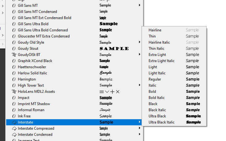
It would be preferable to sort these by weight similar to how Adobe applications sort them, or provide a user-defined sort tool.
Thank you.