In my organization, we are looking for a possible solution to deal with the different-sized bias in thematic maps at census tract level/block-group level. We need to present our data as raw counts/totals. Therefore, normalization does not make sense. Other solutions such as cartograms don't make sense either. Any ideas?
We have two problems with large census tracts/block groups. First, larger areas naturally draw the map users' attention, especially if they are styled with darker colors. Second, the population in large census tracts is not evenly distributed like in the small census tracts. In large census tracts, the population is spatially clustered in a few small areas within the tract.
Here is my solution so far. I took advantage of the Microsoft building footprint data with all building footprints in the United States as a proxy of where the population is within large census tracts. Then, I created a hexagonal tessellation of 310 meters of side and 0.25 squared Km of area. On the left map, you can see the Orlando (FL) area's result if I keep all hexagons with one or more building footprints inside. The right-hand side map contains the original census tracts.
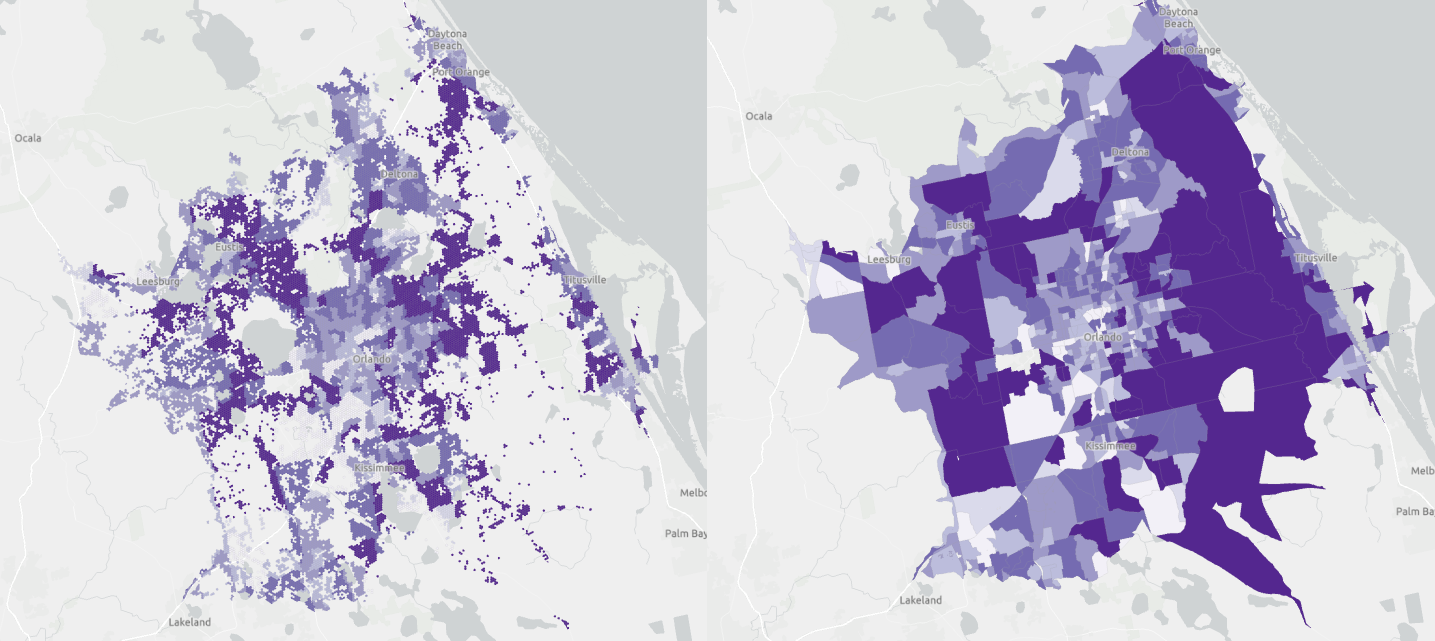
In that area of Orlando, there are one million building footprints and 40,000 hexagons. The hexagons contain between 0 to 350 buildings. If I zoom in on the left and side map, you can see that the hexagons only cover areas with buildings inside.
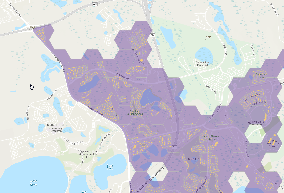
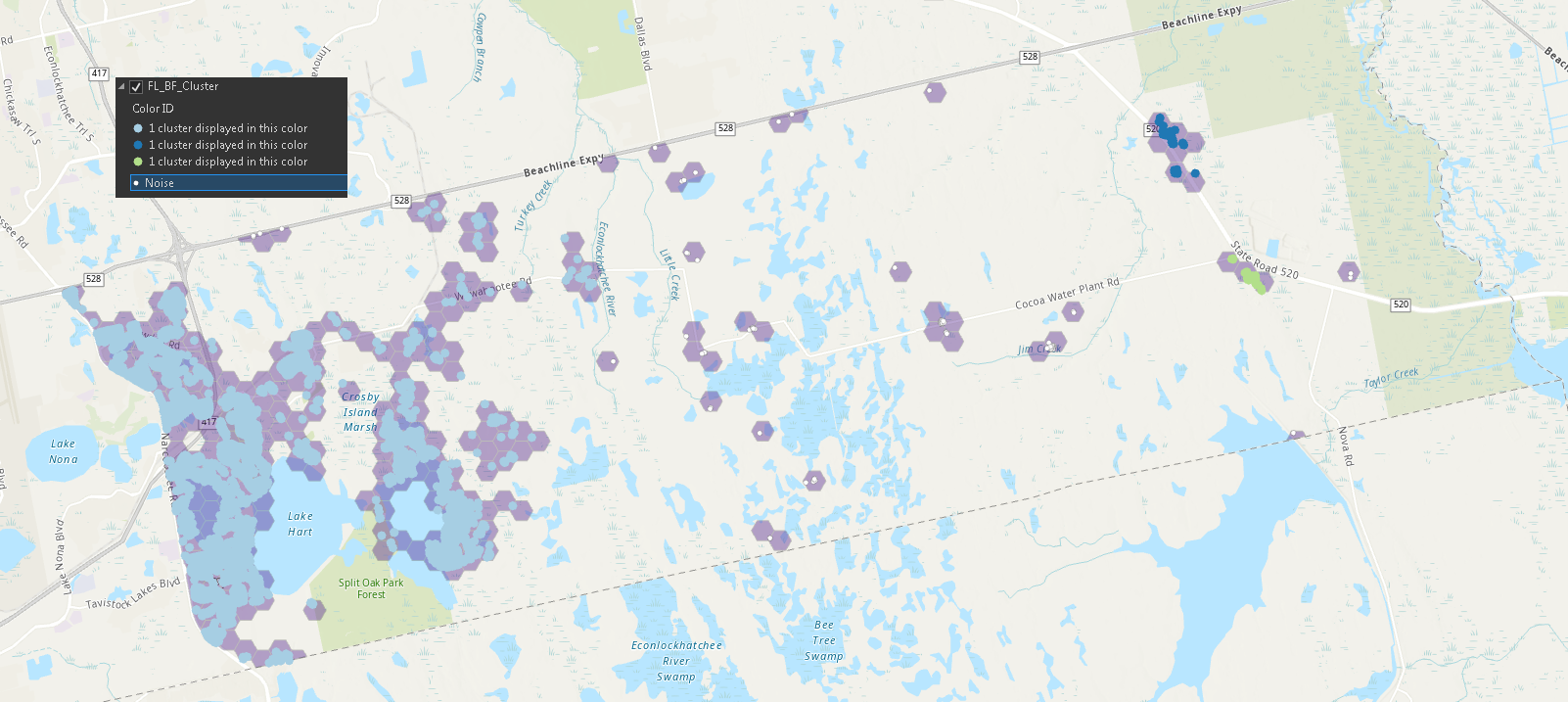
My next step will be getting rid of non-residential buildings by using land-use cover data. Finally, I am thinking of using a density-based cluster algorithm to remove the noise: isolated buildings that are not relevant for our business context:
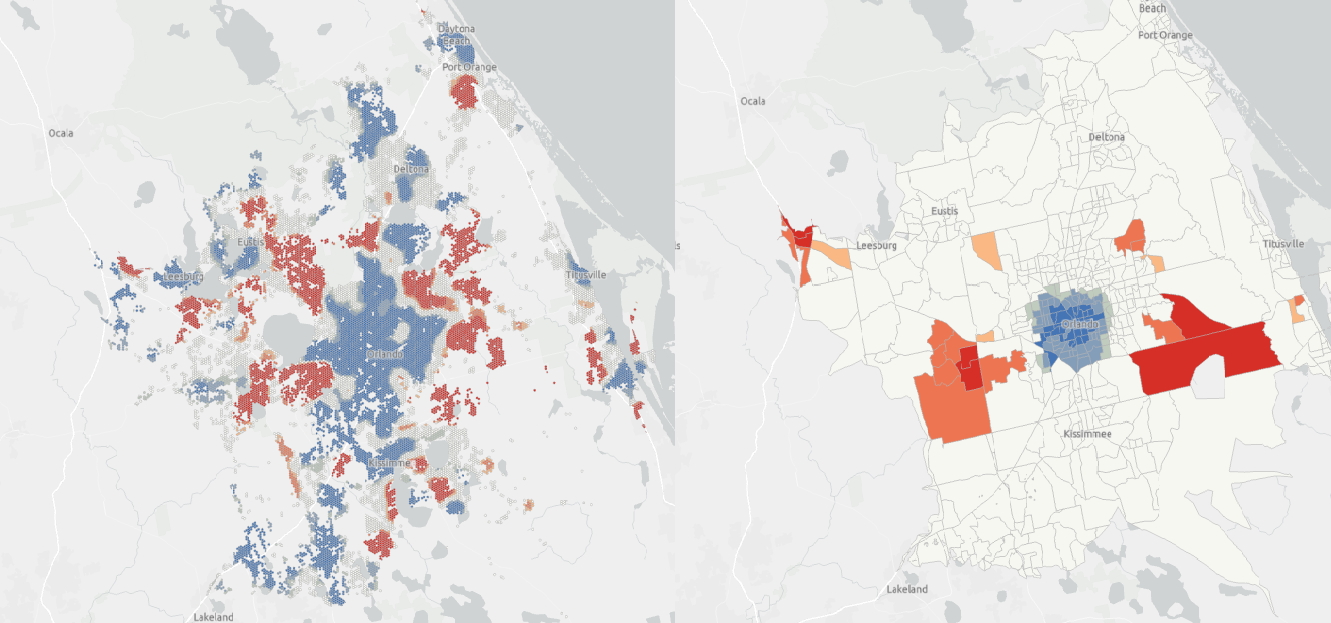
In the end, we are going to use hot spot analysis. Interestingly, the output of the hot spot analysis is quite different if we use hexagons instead of census tracts:
Do you have any idea to share with me to improve my approach or suggest a better approach?
Thanks!