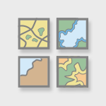
MapMakerは、教育者やジャーナリストが迅速にカスタマイズされたカラー地図を作成できる無料の地図作成ツールです。 <\/P>
ユーザーは色を選択し、地図上の個々の州をクリックして直接適用できるため、パターン、比較、および地理的概念を簡単に視覚化できます。<\/P>
USA map maker<\/A><\/P>Europe map maker<\/A><\/P>完成した地図は、課題、プレゼンテーション、授業資料、またはオープンに共有される教育リソースで使用するためにダウンロードできます。<\/P>以下についてご意見をお聞かせいただけると嬉しいです:<\/P>インターフェースは学生や非GISユーザーにとって直感的に感じられますか?<\/P><\/LI>追加すべき特定の地図はありますか?<\/P><\/LI>あなたの特定のカリキュラムに合わせてどのように改善できますか?<\/P><\/LI><\/UL>ありがとうございます!<\/P>
完成した地図は、課題、プレゼンテーション、授業資料、またはオープンに共有される教育リソースで使用するためにダウンロードできます。<\/P>
以下についてご意見をお聞かせいただけると嬉しいです:<\/P>
インターフェースは学生や非GISユーザーにとって直感的に感じられますか?<\/P><\/LI>
追加すべき特定の地図はありますか?<\/P><\/LI>
あなたの特定のカリキュラムに合わせてどのように改善できますか?<\/P><\/LI><\/UL>
ありがとうございます!<\/P>
Hi @waiteasy,It looks good for non-GIS users or students to play and learn about the basics. Do you have plans to add more features, such as filtering or comparison?Do you have a GitHub repo, and are you open to contributing?
Hi, thank you for your feedback.
I do plan to add more features, I'm trying to understand what is most useful, I'm currently thinking about adding markers to the maps.
I currently do not have a repo to share.
Would be nice to cover the rest of the globe (98.3%) 😉 but i understand you have to start somewhere.
Hi! I’m planning to keep adding more maps / features. I just want to avoid building things no one uses. Is there a particular map you’d like to see?
How about Europe?
You can access other maps from the menu, I updated this post to include the Europe map.
Pretty nice. 🙂
Infill Color/Pattern »»Render the Patterns under the Outlines. You allowed the user to enthicken the outlines, but it begins to look odd under the infill patterns. »»No Undo Option. »»Eventually, I realized I could use the Eyedropper to select an as-yet unfilled-state to set the color to the default grey, and overwrite the fill.
»»Very good use of pattern infill, for when colors may be indistinguishable.
Text »»Give the option to use a solid white background behind text? Or a translucent white? »»I zoomed in to my state, filled the surrounding states, and made a key that was hard to see atop the colors and patterns. »»Same for the Title.
Europe Map »»What projection is this? »»Iceland looks a bit weird... do you not include Greenland? Greenland would look really weird. »»Why is United Kingdom shown as single country?
I am pleased to see I can use this for annoying the English.
Nice assortment of available fonts. But they're all Bold, and only Bold.
The Map Key is in the same order as the User's order of filling polygons. It'd be nice to be able to rearrange them after the fact.
You included the weird bits far north of the "normal" Norway, but you've not included Greenland? Nope. You need to fix that. And when you fix that, pull the countries of Great Britain apart too.
I say, but this is fun!
I should probably stop soon...
The Contrast between Font and Background could use some tweaking...
I may be enjoying your application a wee bit too much.
That "Relatively" is carrying an awful lot of extra weight.
YES, but haven't had sufficient access to GitHub for free.
Thank you so much for the feedback! I really appreciate you taking the time to share all of this. It’s very helpful, I'll try to go through all of these.
Also, the maps you created look amazing!
Happy to be of service!
And thank you for your kind words. It was by far too much fun!
If I had to find one more problem with the current state of the apps - which is difficult - it would be that the layout being saved isn't always intuitive. A kind of "Boundary Line" for the Export Layout might be needed, but I've no idea how you'd do that.
I quite like what you've made!
サインインしたメンバーは投稿、更新のフォローなどができます。初めてですか?無料アカウントを登録してください。
Find useful guides, FAQs, and documents to help you navigate and make the most of Esri Community.