Hi,
Is it possible to have multiple fields within the Y axis within an Insights chart?
My data structure looks like the below, however contains up to 50,000 rows.
| KP [m] | Seabed elevation [m] | Pipe elevation [m] |
| 0 | -53 | -52.574 |
| 2 | -53.03 | -52.577 |
| 4 | -53.03 | -52.58 |
| 6 | -53.01 | -52.582 |
| 8.001 | -53 | -52.582 |
| 10.001 | -53 | -52.581 |
| 12.001 | -53 | -52.578 |
| 14.001 | -52.97 | -52.574 |
| 16.001 | -52.95 | -52.569 |
I want the KP column on the x axis and both the Seabed Elevation & Pipe elevation displayed on the Y axis.
It would like something like below (same data displayed in Power BI):
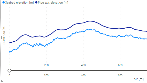
My testing within Insights thus far seems to indicate this is not possible.
Any responses would be appreciated.
Thanks