Hi
Someone else created this dashboard and I am looking to edit the colors to make them more distinguishable but struggling to find where to edit the yellow color. Thanks!
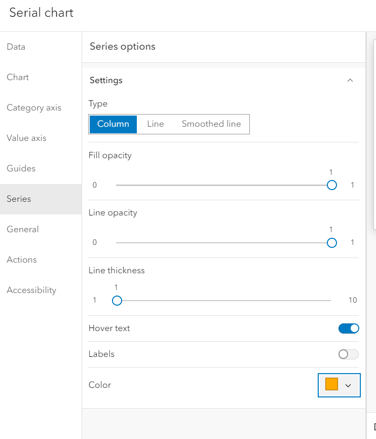
That would be in the chart's settings, under the Series tab. From there you will be able to adjust each category's colors.
Just to add the the above, it'll look something like this:
サインインしたメンバーは投稿、更新のフォローなどができます。初めてですか?無料アカウントを登録してください。
Find useful guides, FAQs, and documents to help you navigate and make the most of Esri Community.