Portfolio wasn't too mobile-friendly to begin with, but the March 2022 update made things a bit worse. Look at how much of the screen is overtaken by the tab selector and navigation:
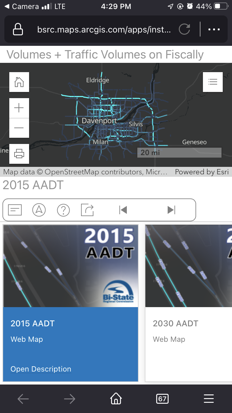
For a builder that professes its apps are designed "mobile-first," I'm a bit baffled. There is no way anyone tested this on a phone. Landscape doesn't even show you a map:
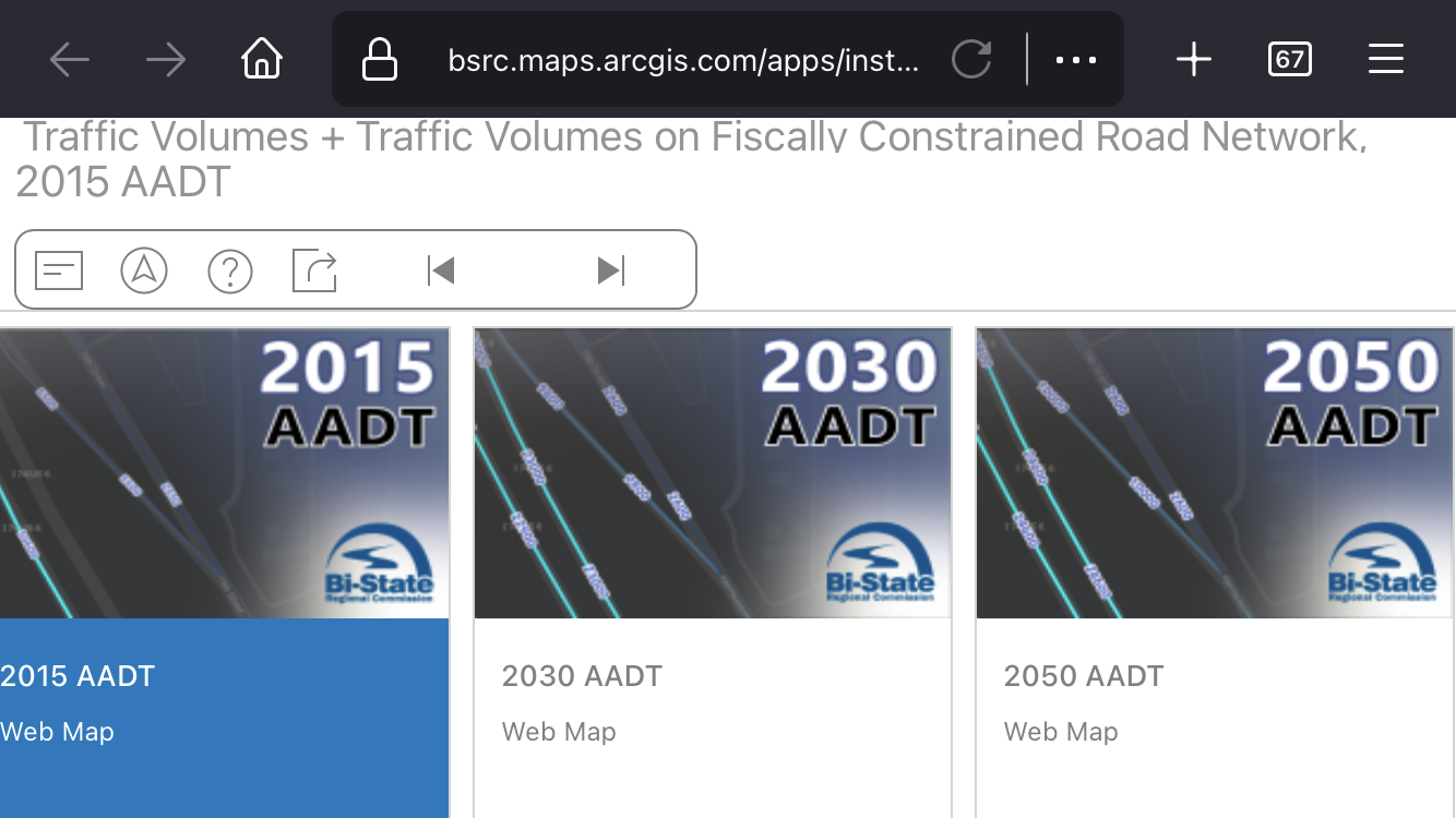
This is a public-facing app that we have and it's now an embarrassment. There's no longer an option to collapse the navigation (not that it collapsed very much before), and the other interface options do not apply to mobile. I'd like to see a larger map (or in the case of landscape - actually see a map) and improved design that can get that navigation stuff out of the way on smaller screens.