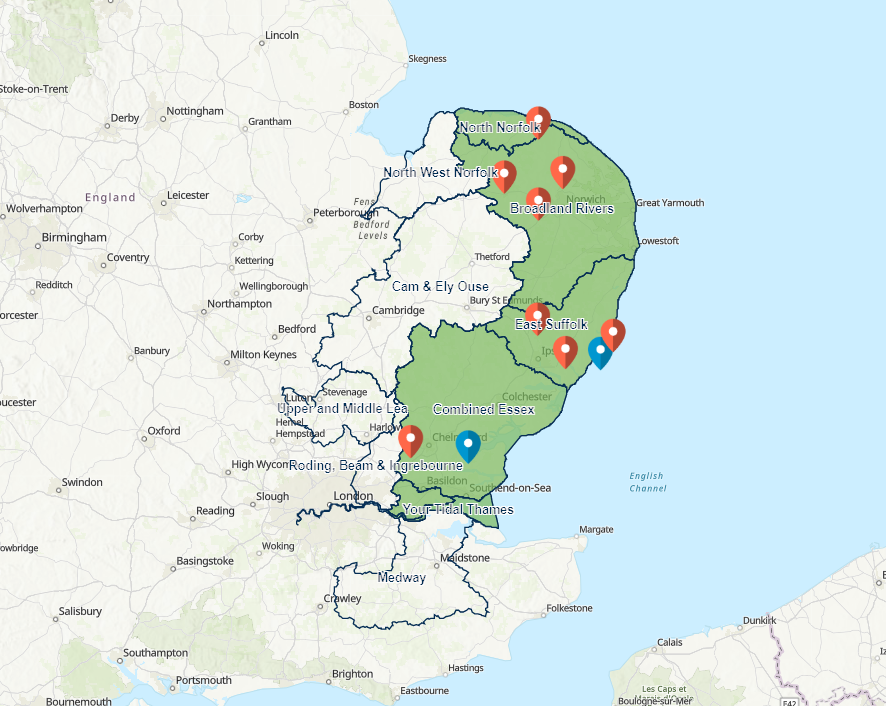
When using the spatial filter action in the list or the header panel features around the boundary of the intended filter area are captured also. The features are not inside the filtered boundary but are surrounding features. In the image below only the green area should be shown but additional areas are selected. This affects the visual appearance of the dashboard and looks untidy when using it to show areas of interest.
Hello Will Atkin
I haven't been able to reproduce this on my side. Can you confirm that it works in the production dashboard (not the beta). If you can provide a map where you can make this happen, that would help a lot.
Thanks!
Hi,
This is done using the production dashboard and not the beta: ArcGIS Dashboards
Thanks,
Will
Hey Will Atkin.
I think this is a bit of an optical illusion. I can also reproduce this in the map viewer.
If you zoom in, it shows that these points are actually inside the polygon
I suggest you reach out to the Map Viewer Beta forum as this is an issue that would be solved on their end if they address it. From my assessment, the points are in the right place, but they could visually be placed in a better spot at smaller scales.
Hi John,
Thank you and I did think the points were a bit of an optical illusion. However, the original question was more to do with when you select an area in the filter panel (say the green area in the photos) the sub-catchments do not filter to the same shape. The original photo should only show the same outline for the subcatchments and not for example Cam Ely & Ouse or Upper and Middle Lea around the edges.
Les membres connectés peuvent publier, suivre les mises à jour, et plus encore. Nouveau ici ? Inscrivez-vous gratuitement.
Find useful guides, FAQs, and documents to help you navigate and make the most of Esri Community.