As you can see... the RED part of the pie chart has this tiny, broken pop-up bubble with a "M:6" which is SUPPOSED to render as 6 Males. It looks like crap?! Is there anything I can do to adjust this?
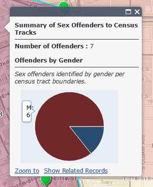
Here is the official sandbox location of the map: ArcGIS Web Application
Any help would be appreciated.


