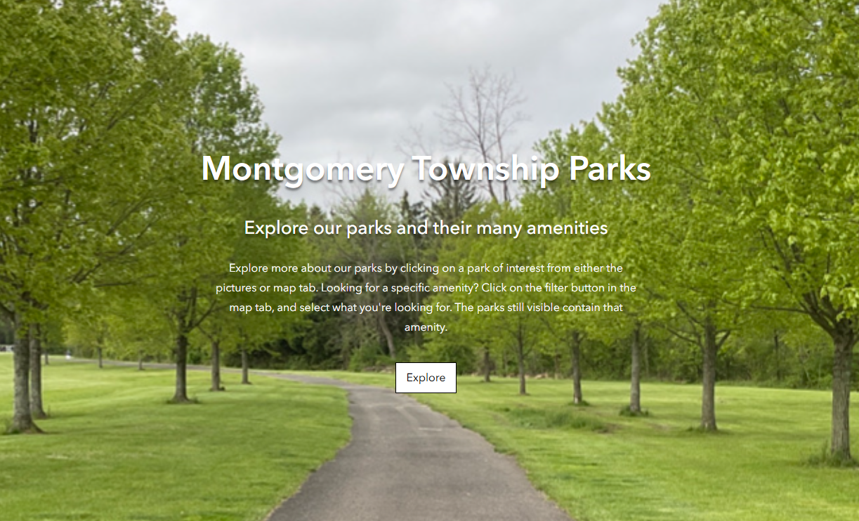
In attempting to make our public facing applications pretty and also meet digital accessibility guidelines, I've found that cover pages are really difficult to achieve both of those goals. I think it would be really helpful if the cover page had similar customization options as the cover in StoryMaps.
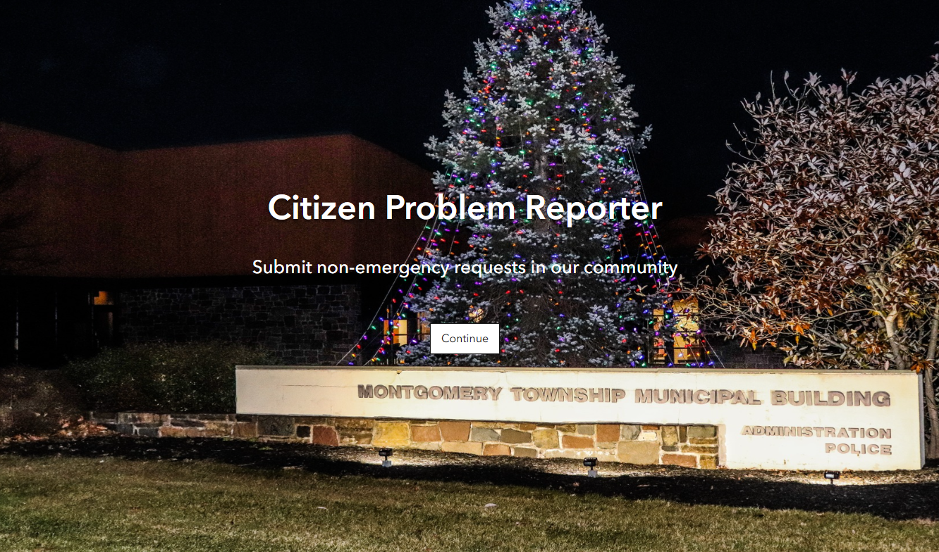
For example, on our Citizen Problem Reporter application, it would be nice to have a picture that represents the township I work for, rather than just a solid color background. However, there's definitely some color contrast issues with the text and the background, no matter what image or font color I choose:
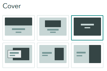
Having the ability to select a style of cover:
or the appearance of the panel with the application title/subtitle:
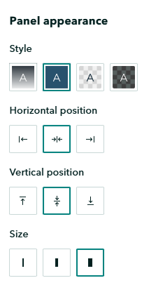
Would do a lot to improve the contrast between the text and the background image, while staying thematic to what is shown in the application.
Another example is this Attachment Viewer Instant App about our parks. I would love to use a nice picture of our parks instead of a solid background, but it's just not possible for the text to be easily legible with the current cover page settings.