As a spatial manifestation of hard data, GIS visualizations are an ideal method for science communication. Geospatial analysts serve as a global form of translator, turning abstract numbers and measurements into infinitely scalable visualizations- the same map can be adapted for the professional or the uninitiated.
My name is Michael Wade, and for two years now I have put this principle into practice, first as a researcher with St. Mary’s College, as an agent with University of Maryland Sea Grant Extension, and now a participant in NASA’s EarthRISE Developers Academy.
This blog discusses bridging the gap between coastal zone experts and their research, and coastal communities in Maryland- concepts that can be applied on a broad scale.
Coastal community culture
Climate change continues to heavily impact coastal communities. Sea level rise and nuisance flooding damages infrastructure and homes, saltwater intrusion into freshwater aquifers and agricultural areas destroys crops, and increasingly strong storm surges put lives at risk. These impacts have broad health and economic impacts on coastal communities, whose entire livelihoods are at the water’s whim.
Traditionally, these coastal communities were supported by a strong waterman economy. Here in Maryland the blue crab, striped bass, and oyster fisheries provided families with steady incomes. Watermen still exist, but declining environmental conditions have pushed many out of business- the very water that built coastal communities now threatens to destroy them. This high energy confluence leads to complex social dynamics and a contentious relationship with professionals and scientists.
Coastal communities are often geographically and socially remote. This isolation and bubble-like community leads many individuals to be unfamiliar with climate projections and associated impacts. Additionally, they may reject notions of climate change and sea level rise for political and social reasons.
I share this history as a way to preface the complexities behind interacting with coastal communities. Every individual deserves access to scientific research and climate projection data to help them make informed decisions, but the methods through which data is shared will vary. Through this process, I have learned how crucial it is to leverage the strength of the communities you are trying to serve. More remote coastal communities, despite often lacking access to data and modern scientific equipment, have a rich understanding of their local waters.
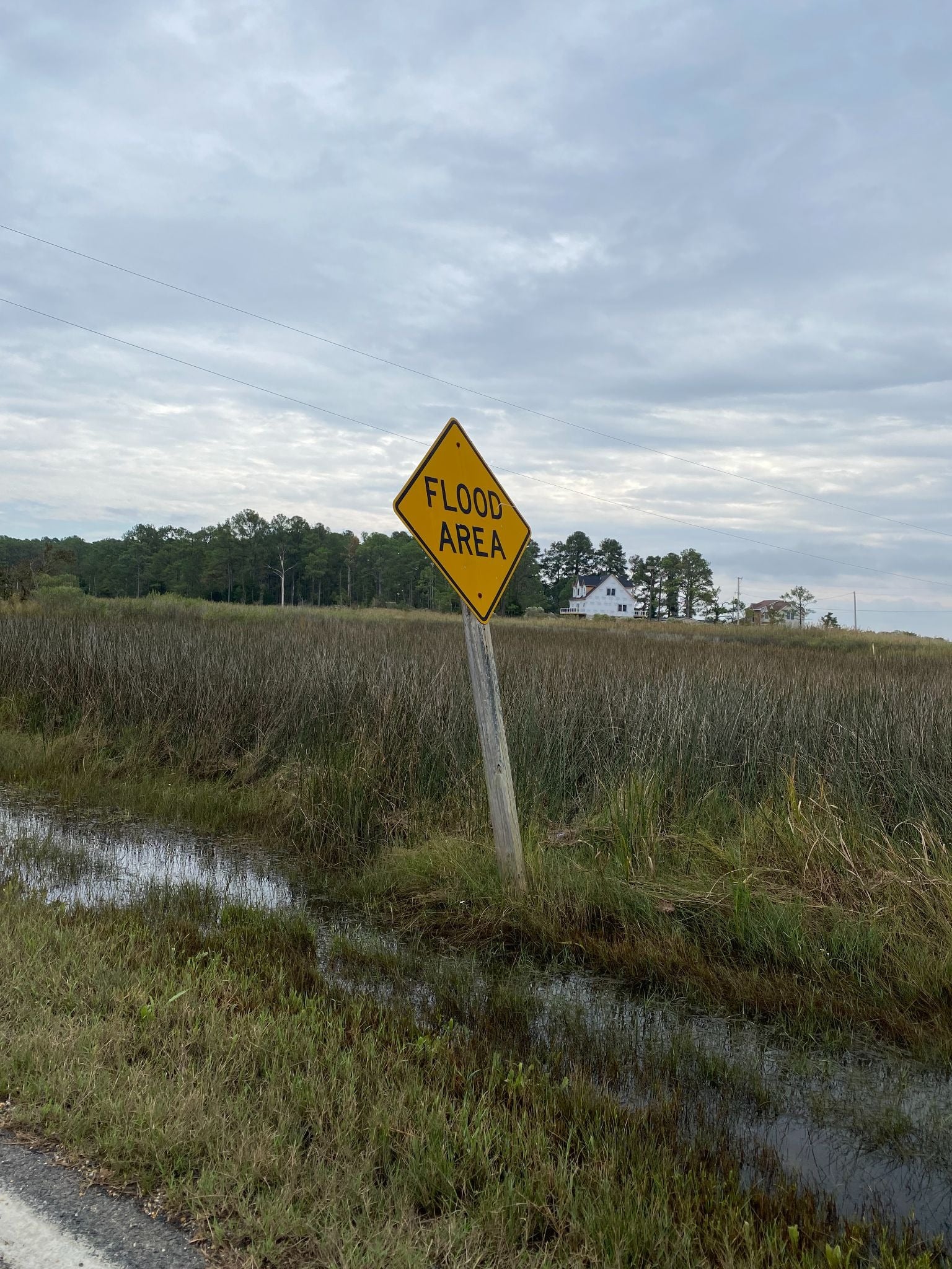
One of many warning signs residents of St. George Island, Maryland, are accustomed to seeing.
(Photo: Michael Wade)
Working with coastal communities
Most coastal community members have lived on the water their entire life, and are experienced with paper maps, GPS systems, and weather tracking equipment. Many Maryland coastal communities are historic, with many multi-generational homes. Every year they watch the storm surge, sunny-day flooding, and crop dieoffs worsen, but do not necessarily correlate these impacts with climate change. This rich but siloed understanding of the environmental field prepares coastal communities to learn through GIS visualizations.
I have had the privilege to bring visualizations to three Maryland coastal communities. My process is simple, and replicable for communities around the world. The first, and arguably most important step, is to establish trust within the community. I often have an “in” with communities through an individual who reaches out to my team, and we use this contact to start building community connections. From this initial connection I branch out and speak with other residents, taking notes and building an understanding of the community’s perceptions, understandings, and goals. Using these notes, I can begin to create visualizations I feel will be most effective for sharing with the community.
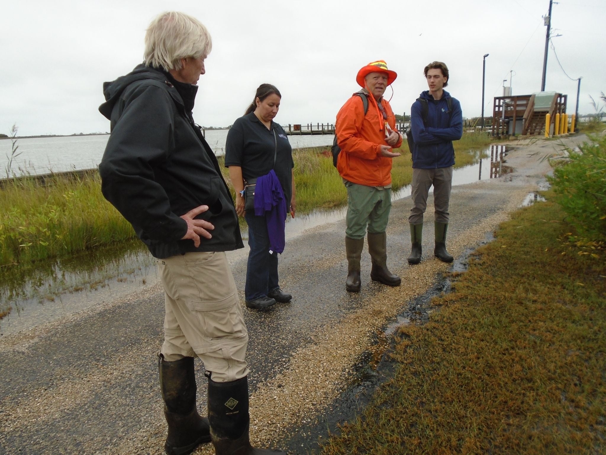
Examining sunny-day flooding with community members on Smith Island, Maryland, in September 2025- that is me on the right!
(Photo: Eric Buehl)
Visualization Process
I prefer the Esri ecosystem for my work, given the flexibility for layering, layout, and sharing. I like to create multiple visualizations to share scientific concepts, before trying to layer them and explain more complex relationships. Say I was trying to explain to a community why some structures in town are more at risk due to storm surge than others. I would first establish geographic location to other communities and waterways, given the inherent place-based nature of my work. From here I individually display elevation maps, projected sea level rise, and extruded building height maps to round out community member’s understanding of the area.
Next, I share my visualizations that combine all these layers and run external simulations with higher and higher storm surges, adjusting symbology to gauge potential damage. These are not complex visualizations to develop in ArcGIS, but they greatly expand capacity for understanding. They are adjusted to meet the needs of the communities I serve, and can be easily embedded into ArcGIS StoryMaps or ArcGIS Online for further outreach.
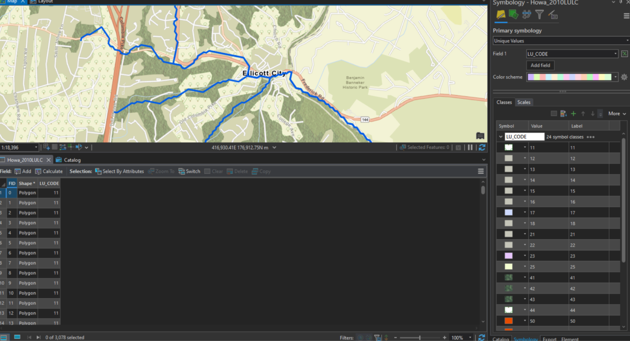
Practicing my skills editing symbology to best analyze and understand how land use change impacts flash flooding for downstream communities.
(Photo: Michael Wade)
Conclusion
I hope reading about my use of data visualization with coastal communities offers a new glimpse into the potential of GIS outreach and impact. These tools are well within reach, but their most effective use requires an intimate understanding of the communities we wish to serve. Utilizing our skills from a place of service is the best way to engage with communities in need, and I look forward to applying these principles wherever I can.
Interested in putting these concepts into practice? I have found NOAA’s Coastal Adaptation Planning Guide and The Nature Conservancy’s Blue Guide to Coastal Resilience integral for finding a place to start when working with coastal communities. I also recommend Esri’s MOOC Program for continuing to brush up on and discover new visualization skills. Additionally, please feel free to reach out on LinkedIn- you never know where these connections can lead- happy mapping!
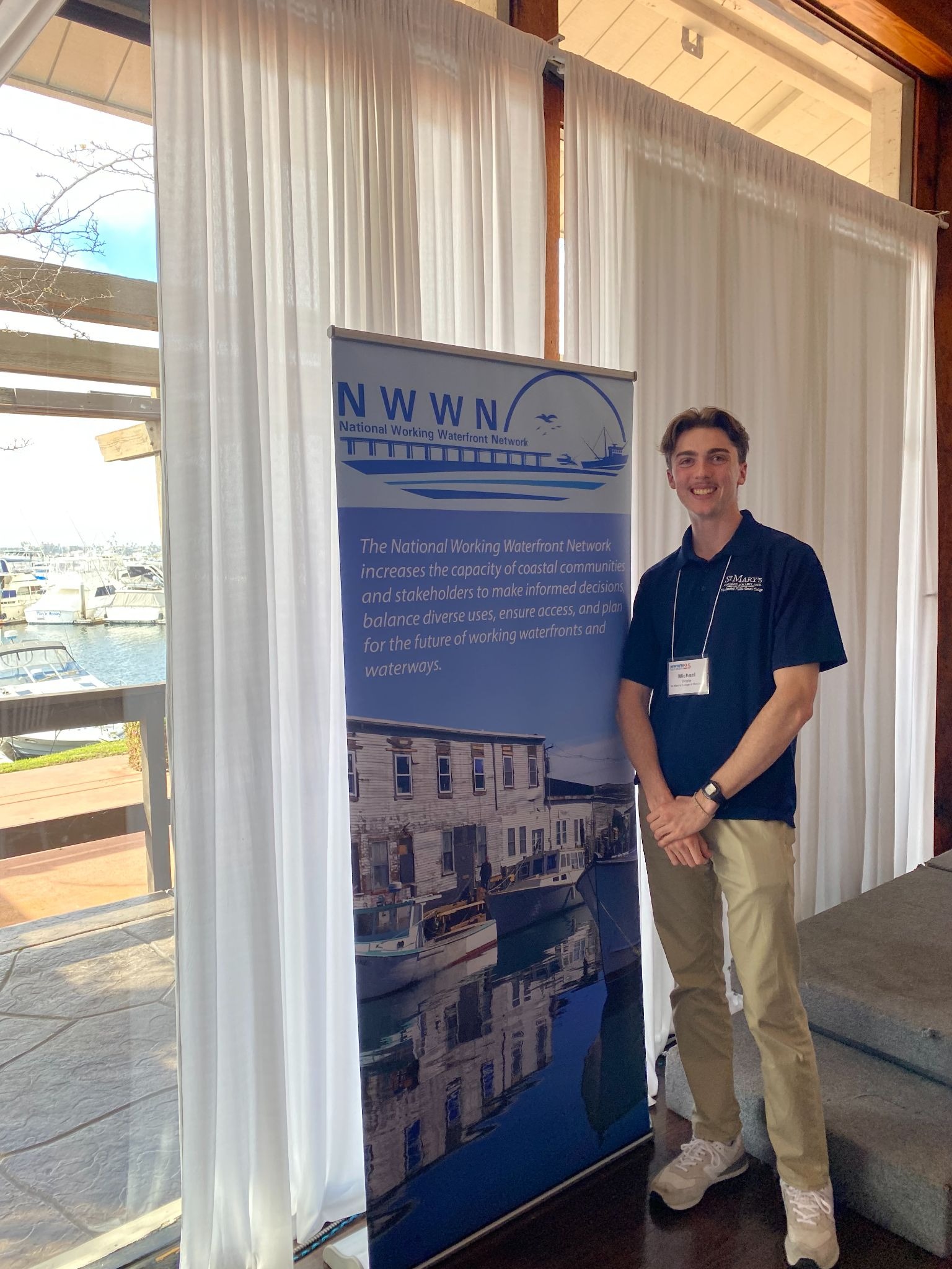
The author after presenting at the 2025 National Working Waterfront Networks conference!

