Hi! I'm a new GIS user and struggling with a Web Map on ArcGIS Online. The map is smoking prevalence and I'd like to display the data in quantiles from low to high, but I cannot figure out how to do this. I created a print version in ArcGIS Pro and this is a screen shot of the Symbology:
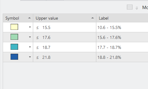
When I upload the map as a web layer to ArcGIS online, the symbology is reversed and the data is categorized high to low as shown:
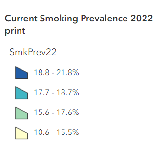
I've tried reversing the data range using the "flip ramp" option, but that just changes the colors and I can't figure out how to reverse the data so that it displays from low to high like in the print version.
I've looked through Esri documentation and tutorials about style properties, etc, but I can't find anything on how to change this. Any help or guidance would be greatly appreciated. Thank you so much 🙂
Jennifer