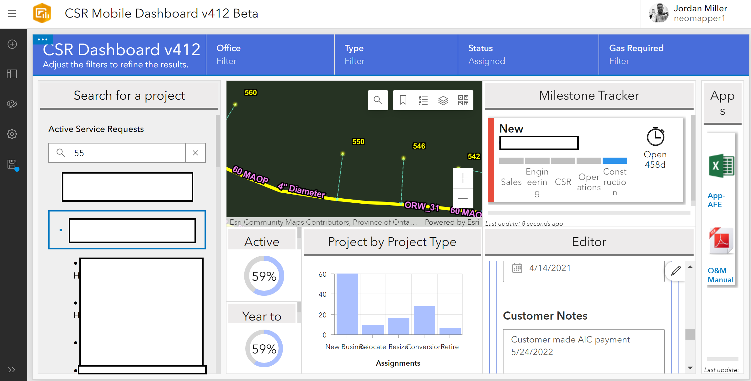
Dashboards are such an incredible tool to utilize but they lack so much more than they could offer if we were able to add CSS formatting. Right now they look clunky and quite undesirable from an organization standpoint for tracking and monitoring work. Is there any solutions that we could use to make these dashboards more design friendly and less clunky?
Les membres connectés peuvent publier, suivre les mises à jour, et plus encore. Nouveau ici ? Inscrivez-vous gratuitement.
Find useful guides, FAQs, and documents to help you navigate and make the most of Esri Community.