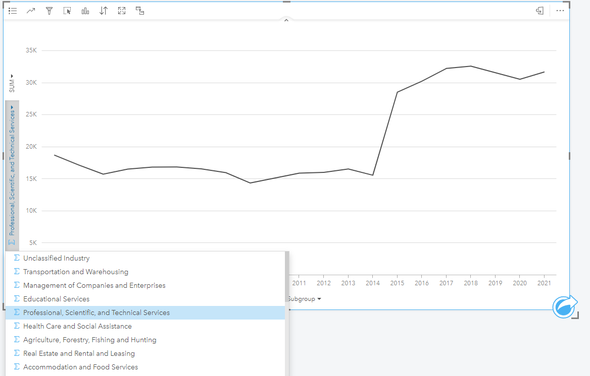
I am attempting to create a line chart from a dataset where I would have multiple series (lines) in the chart. I can do this in excel by customizing the data ranges and designating exactly what I want the x and y axis to be, and what the series should draw from. See the chart below that I produce in excel:
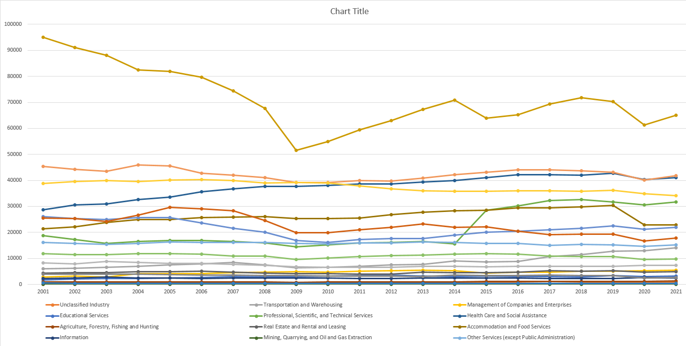
In this example I am able to create a number of series (categories) and display the year and the total number of jobs on the different axes.
However, in Insights, I seem to be constrained to only show one series at a time with a drop down menu on the left hand side to choose to look at a different series one at a time. How can I display multiple series all at once in Insights?