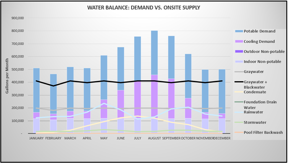
I want to create a chart that looks like the screenshot below. The three demands need to be stacked bar charts and the supply information need to be lines. The value for each demand and supply is calculated for each month and is its own field in the underlying feature layer. The underlying feature layer is an output of a published survey 123 survey that uses submitter input such as project area and project users to calculate the supplies and demands in the project. Is this possible?
I think this could still be doable with a separate standalone table, but it would have to be done outside of Survey123. Imagine a layer like this:
Month | Potable | Stormwater | etc. | etc.------|---------|------------|------|-----Jan | 1000| 900| 250| 25 Feb | 1250| 1100| 100| 33
You could have an automated process pull the values from the main survey dataset, aggregate each value by month, then submit the values to the table. Point the serial chart at that table, and you can symbolize it the way you want.
Thanks for this solution, @jcarlson! I was able to work with @PrachiPatel to write a script using the template you provided.
Instead of setting up a recurring task, I stored it as a Google Cloud Function and then added the URL of the function as a webhook that runs when the survey is submitted. There's a blog post that explains doing this here: Calling Python scripts with Survey123, Integromat,... - Esri Community.
I used this code to get the object id of the submitted survey.
def update_table(request):
  request_json = request.get_json(silent=True)
  object_id = request_json['feature']['result']['objectId']
Then, instead of truncating and recreating the entire chart_table, I filtered the survey_layer by the object id, did my reshaping on just the submitted row, and added the reshaped rows to the chart_table.
survey_data = survey_layer.query(where='objectid = ' + str(object_id), as_df=True)

# In this section (omitted) the submitted row gets pivoted to 12 rows (one per month)

chart_table.edit_features(adds=pivoted_data.spatial.to_featureset())
A chart like that may be possible, depending on how the data is set up. Can you elaborate on the chart, though? Are those monthly values being aggregated from multiple rows in the table?
The only way I'm aware of to do aggregated values in a serial chart is to use the Grouped Values option, and you're only able to aggregate a single field. In order to reference multiple fields in a single chart, you have to use the Features option, but then you end up with a separate set of bars for ever row in your table. Fields can aggregate multiple fields, but not separate them by the date.
In order to accomplish the chart you have pictured there, you'd need a separate table with a row for each month, and have the aggregated values populating the fields. Then you'd be able to use the Features option and achieve what you're going for.
Hi Josh, you are right about the required format of the table with months in rows and the water supply/demand values in columns. In the xls form. however, the value of each month for each kind of water supply/demand is calculated separately and therefore is its own field. I am struggling with how to get the values in the format I need.
One thing I tried was create a separate survey using repeat , filled it manually and it spat out the table in the format I need. However, I need the process to run automatically and haven't quite figured out how to make the repeat function run automatically. Would appreciate any suggestions
Yes, After reading your previous response , I created a table to do so and can create a chart, that is not stacked, but it a combination of lines and bars. Now I need to figure out how to automate the creation of that table because I want the dashboard to update every time a submitter hits submit on the survey 123 survey. Figuring the automation out.
@PrachiPatel Were you able to figure out to create a serial chart in Dashboards with BOTH bars and lines? I have not been able to do this, even with aggregated data. I would appreciate any insights if you made this happen. Thank you!
Janet
Hi @JanetBrewster1 , The chart I was able to make has bars and lines, but the bars represent a single field instead of a stacked bar representing multiple fields. So instead of stacking the bars with data from 4 types of demand, I just have a single bar showing non-potable demand only per month, and then the lines show various non potable supplies per month.
Les membres connectés peuvent publier, suivre les mises à jour, et plus encore. Nouveau ici ? Inscrivez-vous gratuitement.
Find useful guides, FAQs, and documents to help you navigate and make the most of Esri Community.