This isn't specifically related to the June 2026 update but it has gotten worse/more prevalent since the update.
We have a Dashboard configured with rows of grouped indicator elements. The individual indicator elements have a background colour calculated from some data values via the advanced formatting options. By grouping the rows together it presents the individual rows as solid blocks of the same colour even though they are made up of three separate indicator elements:
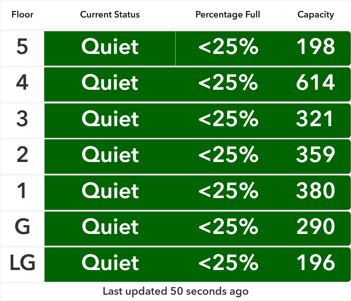
The problem is that for some rows, vertical white lines appear between some of the indicator elements. In the above screen grab, there is a vertical white line on the 5th floor row between the 'Quiet' and '<25%' indicator elements. At different resolutions, vertical white lines appear between different indicator elements:
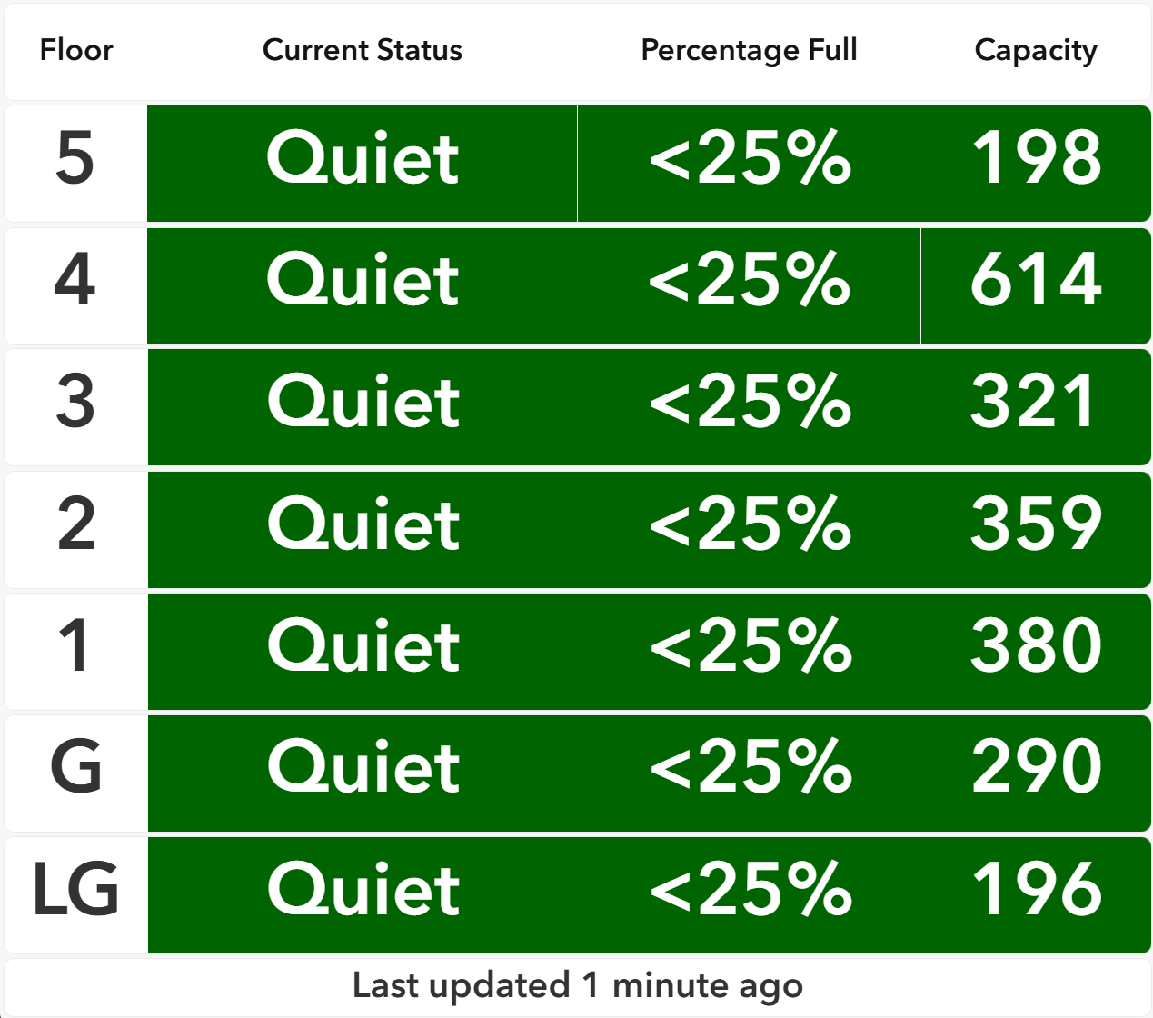
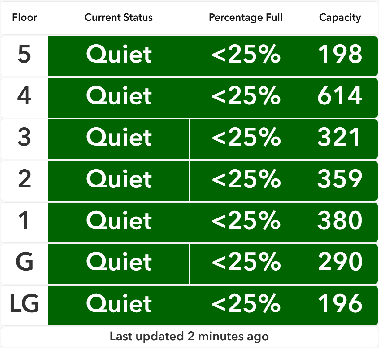
As I said, this did used to happen before the June 2026 update, but prior to the update it was only a problem at a few resolutions, whereas now it's a problem at pretty much every resolution.
Has anyone else experienced this? Has anyone figured out a workaround? The only thing I can think of to do is to ungroup the rows:
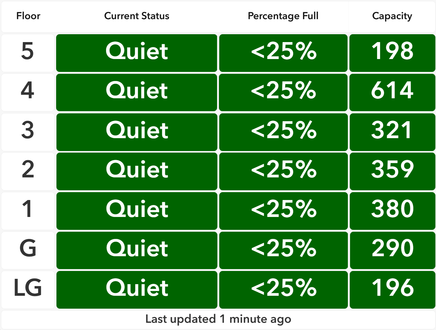
But I much prefer the grouped appearance, if it wasn't for the spurious vertical lines.


