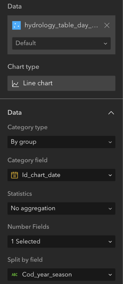
We are experiencing an unusual behavior while building a line chart using ArcGIS Experience Builder, and we would appreciate your assistance in resolving this issue.
Issue Details:
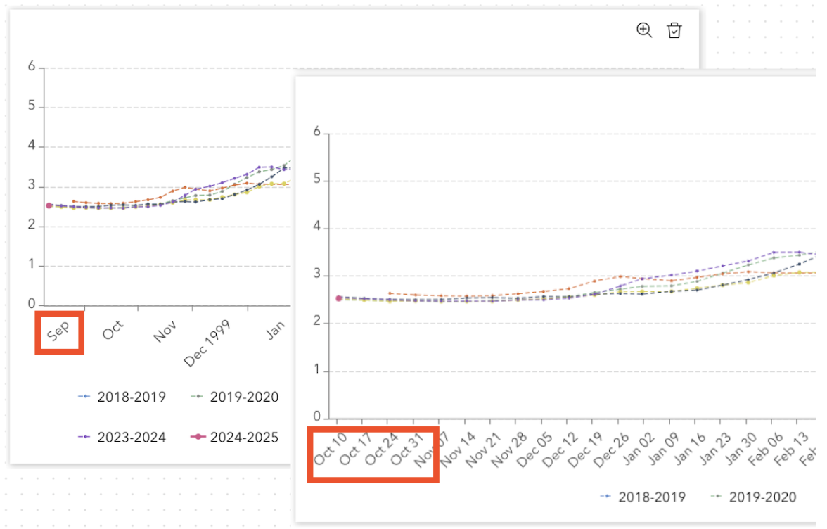
We are creating a line chart using a layer’s date field in the “Category field” for the x-axis. The issue arises when some users attempt to view the chart—the x-axis labels are expected to start in October, but instead, September appears as the starting point.
Investigations and Actions Taken:
- Resolution and Window Adjustments: We noticed that when users zoom in on the chart, the x-axis displays the correct dates, starting from October.
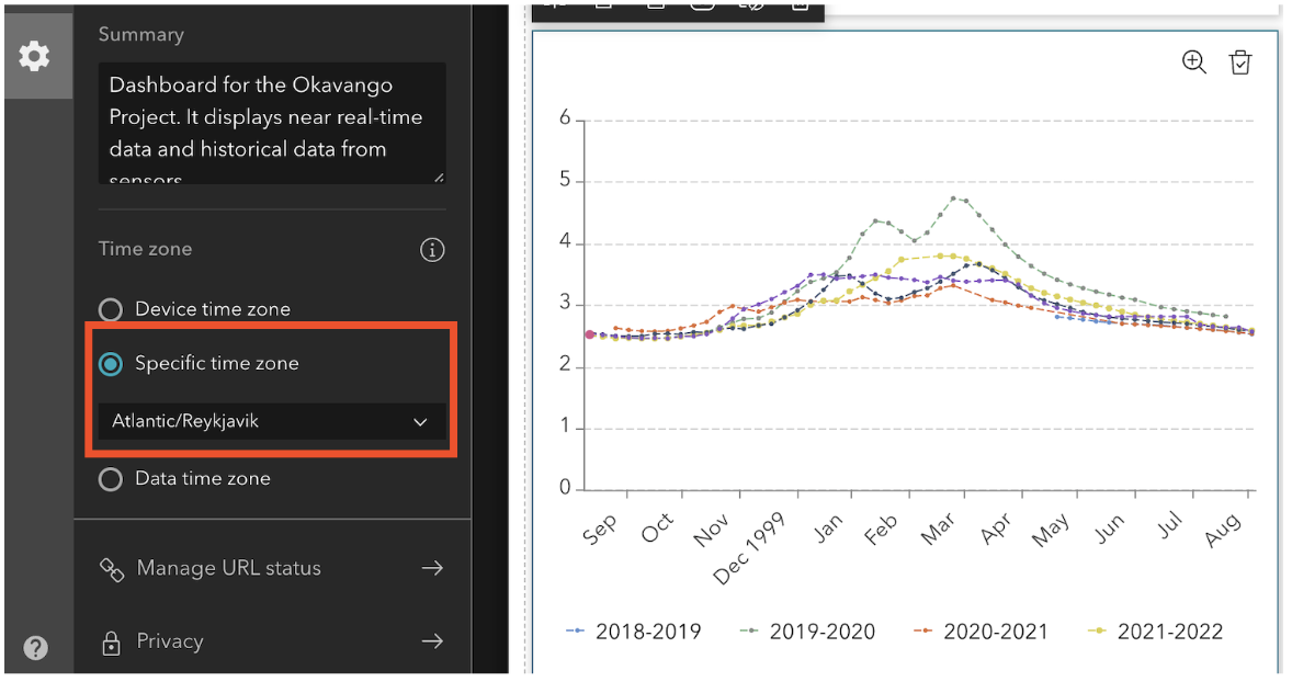
- Timezone Considerations: Given that the behavior seems inconsistent across users in different time zones, we suspected the issue might be related to how time zones are handled. We attempted to align the charts with a specific time zone (the same as the data), but this did not resolve the problem.
Request for Assistance:
We would like to ensure that the axis displays the correct dates, even when zoomed out, without requiring users to zoom in to correct the axis. Is there a way to:
Fix the axis to maintain the correct month (October in this case) regardless of zoom level or screen resolution?
Any guidance or solutions you can provide would be greatly appreciated. Please let us know if you require additional information or data samples for troubleshooting.
Configuration of the chart