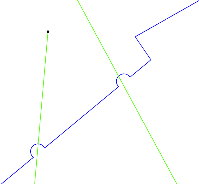
In our water network data we use "loops" in lines to display areas where pipes overlap but do not intersect. We noticed yesterday that in ArcGIS Online (Experience Builder and Field Maps) that the curves are drawing with much less detail.
This is what they look like in ArcGIS Pro:
And this is what they look like in ArcGIS Online:
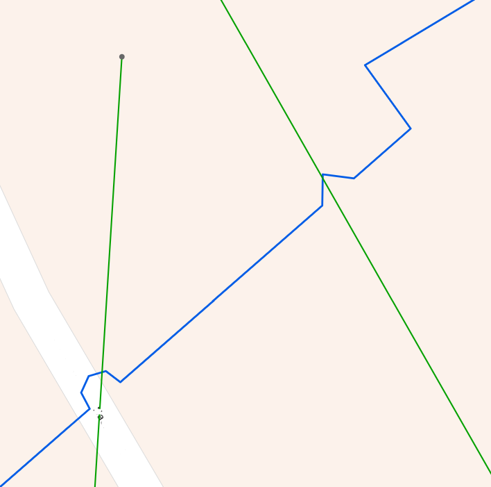
I checked the settings of the layer and confirmed that we are not using the "Optimize layers" setting to increase drawing speed. For reference, the layers in ArcGIS Pro are coming from our enterprise geodatabase via services from ArcGIS Enterprise, and the data is published to a hosted feature layer in ArcGIS Online.