Hi!
When I export charts to graphic, the content of the chart/ graphic gets cut off, like so:
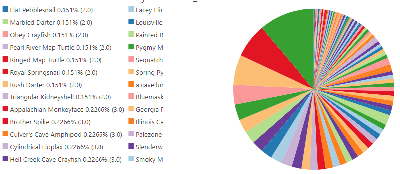
You can see in the second column that the species name and/or the number and percentage gets cut off. There's plenty of space between the columns and the pie chart, but I can't adjust that. I've tried orienting the chart to left and right, but either way it gets cut off. I'd also be happy to get rid of the pie chart itself all together and just have the columns showing species name and number/percentage. The pie chart itself is obviously not super helpful.
I tried exporting to Table and that doesn't produce the results I'm looking for. I can create a chart in xcel, but that presents other problems. I can get a table of names to show up, similar to what's shown above, but not with any numbers or percentages shown along with the names, and that's what I need for a ppt presentation. Providing just a long list of names isn't nearly as visually effective. I'm sure I can figure out some way to just get the data from excel into another kind of table with columns but would love it if I could just export the chart without it cutting off.
Any insight?? Thank you in advance!!